React Native Dropdown
Simple DropDown menu for React Native App!
Introduction
React Native Dropdown is simple, customizable and easy to use dropdown in React Native. Works with both Android and IOS.
Installation
npm i react-native-dropdown --save Usage
Require it inside your Javascript files. Also supporting components using object-deconstructing. Select Option OptionList, Also a positioning utility method updatePosition.
updatePosition should be called in componentDidMount with refs to the <Select /> component and <OptionList />.
This calculates component's PositionX and PositionY and sets it back into the component. The component uses it to position the <OptionList> using this co-ordinates.
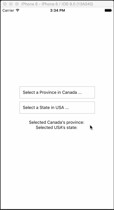
Example
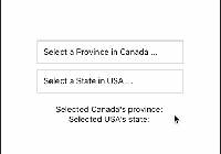
var React = require('react-native'); var { Component, AppRegistry, Text, View, } = React; const DropDown = require('react-native-dropdown'); const { Select, Option, OptionList, updatePosition } = DropDown; class App extends Component { constructor(props) { super(props); this.state = { canada: '' }; } componentDidMount() { updatePosition(this.refs['SELECT1']); updatePosition(this.refs['OPTIONLIST']); } _getOptionList() { return this.refs['OPTIONLIST']; } _canada(province) { this.setState({ ...this.state, canada: province }); } render() { return ( <View style={{ flex: 1, justifyContent: 'center', alignItems: 'center' }}> <Select width={250} ref="SELECT1" optionListRef={this._getOptionList.bind(this)} defaultValue="Select a Province in Canada ..." onSelect={this._canada.bind(this)}> <Option>Alberta</Option> <Option>British Columbia</Option> <Option>Manitoba</Option> <Option>New Brunswick</Option> <Option>Newfoundland and Labrador</Option> <Option>Northwest Territories</Option> <Option>Nova Scotia</Option> <Option>Nunavut</Option> <Option>Ontario</Option> <Option>Prince Edward Island</Option> <Option>Quebec</Option> <Option>Saskatchewan</Option> <Option>Yukon</Option> </Select> <Text>Selected provicne of Canada: {this.state.canada}</Text> <OptionList ref="OPTIONLIST"/> </View> ); } } AppRegistry.registerComponent('App', () => App); For complete implementation checkout example folder.
Configuration
Select:
| Property | Type | Default | Description |
|---|---|---|---|
| width | number | 400 | Width of the selection |
| height | number | 50 | Height of the selection |
| optionListRef | function | required | Reference to <OptionList /> to display the selection menu |
| style | object | null | Custom styles to be applied if supplied |
| defaultValue | string | first option | The value to be displayed if none of the options are selected. |
Option:
| Property | Type | Default | Description |
|---|---|---|---|
| style | object | null | Styles to be applied on 'Option' component |
| styleText | object | null | Styles to be applied on text inside of 'Option' |
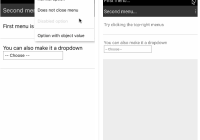
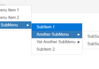
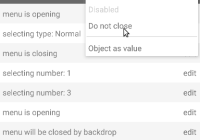
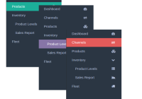
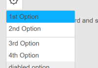
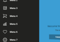
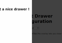
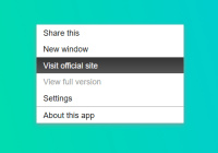
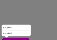
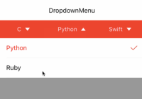
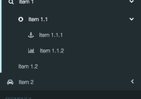
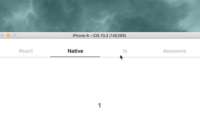
Demo