NOTE: This library is not under active development now.
react-metismenu
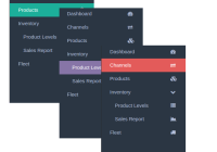
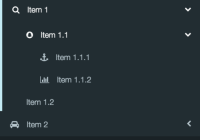
A ready / simple to use, highly customizable, updateable, ajax supported, animated and material designed menu component for React
Demo
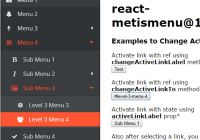
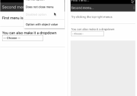
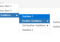
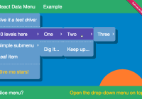
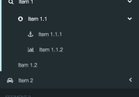
Here is a simple demo to show animations and actions with standart theme. Go to demo
react-metismenu-router-link link component to use with react-router. Go to demo - Extension Page
Install
npm install --save react-metismenuUsage
With Ecma Script 6 and React Loaders
import React from 'react'; import ReactDOM from 'react-dom'; import MetisMenu from 'react-metismenu'; ReactDOM.render(<MetisMenu />, document.getElementById('dom_id'));Without Loaders (ES5)
const React = require('react'); const ReactDOM = require('react-dom'); const MetisMenu = require('react-metismenu'); ReactDOM.render( React.createElement(MetisMenu), document.getElementById('dom_id') );Also you should embed core css file to your html for material design and transition effects to work.
<link rel="stylesheet" type="text/css" href="https://cdn.rawgit.com/alpertuna/react-metismenu/master/dist/react-metismenu-standart.min.css" />You can find this css in your node_modules/react-metismenu/dist to embed locally.
Properties
MetisMenu (React Component) Properties
-
Updateable Properties (by
state)- Properties To Set Content (See Properties For Each Item In Content)
- {Object[]} [
content=[]] - It keeps all recursive structure of Metismenu - {string | Object[]} [
ajax] - Url or ajax settings object to get menu as json from remote. (See Remote Contents)
- {Object[]} [
- Active Link Selectors (Higlights and drops down all parents if it is a submenu item)
- {boolean} [
activeLinkFromLocation] - Automatically highlights link matched itemtoand browser location. - {string | number} [
activeLinkId] - Find and highlight according to itemid. - {string} [
activeLinkTo] - Find and highlight according to itemto. - {string} [
activeLinkLabel] - Find and highlight according to itemlabel.
- {boolean} [
- Properties To Set Content (See Properties For Each Item In Content)
-
Non-Updateable Properties (by
state)- Customizing Styles
-
{string} [
className] - Class name for main metismenu wrapper -
{string|func} [
classNameContainer] - Class name or dynamic class name producer callback for item container (Affectsul) -
{string} [
classNameContainerVisible] - Additional class name when container is visible (Affectsul) -
{string} [
classNameItem] - Class name for items in container (Affectsli) -
{string} [
classNameItemActive] - Additional class name when item link is active (Affectsli) -
{string} [
classNameItemHasActiveChild] - Additional class name when any child or grandchild item link is active (Affectsli) -
{string} [
classNameItemHasVisibleChild] - Additional class name when any child or grandchild item link is visible (Affectsli) -
{string} [
classNameLink] - Class name for links in items (Affectsa) -
{string} [
classNameLinkActive] - Additional class name when link is active (Affectsa) -
{string} [
classNameLinkHasActiveChild] - Additional class name when any child or grandchild link is active (Affectsa) -
{string} [
classNameIcon] - Class name for link icons -
{string} [
classNameStateIcon] - Class name for state indicators of submenu -
{boolean} [
noBuiltInClassNames=false] - When true, core css class names won't be used -
{string} [
iconNamePrefix="fa fa-"] - Prefix for all icon's style class name -
{string} [
iconNameStateHidden="caret-left"] - Icon name for state of collapsed containers -
{string} [
iconNameStateVisible="caret-left rotate-minus-90"] - Icon name for state of opened containers
-
- Customizing Link Component
- {React.Component} [
LinkComponent=DefaultLink] - Handles link components of all items
- {React.Component} [
- Event Listeners
- {callback} [
onSelected] - Function is called when a menu is selected.
- {callback} [
- Using With Redux
- {string} [
reduxStoreName="metisMenuStore"] - Redux store field name forreact-metismenuto use - {object} [
useExternalReduxStore] - Created redux store
- {string} [
- Customizing Styles
Properties For Each Item In Content
- {string} [
icon] - Icon class name of item - {string}
label- Label of item - {string} [
to] - Href address to link (if item has submenu,toproperty will be ignored) - {boolean} [
externalLink] - If true link opens page in new tab/window - {Object[]} [
content] - Sub menu of item. (For Flat Contents you may useidandparentIdproperties instead.) - {string | number} [
id] - Necessary for Flat Contents, or useful when activating a link of menu contains non-unique links. Possbile values are; not empty string, or greater than0if it is number. - {string | number} [
parentId] - Necessary for Flat Contents. If item has no parent, top item,parentIdshould be falsy -one offalse,undefined,null, empty string or number0, not string"0".
Note for all properties
Curly brackets {...} refers to property type. After types, square brackets [...] means that property is optional. Equal sign = in square brackets shows its default value.
Examples
Simple Usage
Simple usage with recursive content object.
import React from 'react'; import ReactDOM from 'react-dom'; import MetisMenu from 'react-metismenu'; const content=[ { icon: 'icon-class-name', label: 'Label of Item', to: '#a-link', }, { icon: 'icon-class-name', label: 'Second Item', content: [ { icon: 'icon-class-name', label: 'Sub Menu of Second Item', to: '#another-link', }, ], }, ]; ReactDOM.render( <MetisMenu content={content} activeLinkFromLocation />, document.getElementById('root') );See Properties For Each Item In Content.
See activeLinkFromLocation property.
Flat Contents
You may get menu content from a sql server. In this case, you can pass the content directly into react-metismenu without processing data. Here is flat json content example;
[ { "id": 1, "icon": "icon-class-name", "label": "Label of Item", "to": "#a-link" }, { "id": 2, "icon": "icon-class-name", "label": "Second Item" }, { "id": 3, "parentId": 2, "icon": "icon-class-name", "label": "Sub Menu of Second Item", "to": "#another-link" } ]Remote Contents
You are able to get json content from remote. Content may be recursive or flat. react-metismenu uses simple-ajax to send ajax request. You can pass just url string or object with these Available Options to ajax prop.
<MetisMenu ajax="/get-menu.php" /><MetisMenu ajax={{ url: "/service.php", method: "POST", data: { "method": "get-menu", }, }} />Active Link Selectors
With Properties
Using properties make you able to update active link via state.
activeLinkFromLocation
Automatically highlight link matched item to and browser location.
It tries these posibilities to match location;
[ window.location.pathname + window.location.search, // /path?search window.location.hash, // #hash window.location.pathname + window.location.search + window.location.hash, // /path?search#hash ]Usage Example
<MetisMenu activeLinkFromLocation />activeLinkId
Find and highlight according to item id. It should be not empty string, or greater than 0 if it is number.
Usage Example
<MetisMenu activeLinkId={this.state.activeLinkId} />activeLinkTo
Find and highlight according to item to.
Usage Example
<MetisMenu activeLinkTo="/users" />activeLinkLabel
Find and highlight according to item label.
Usage Example
<MetisMenu activeLinkLabel="User List" />Note that, if you like to use more than one selector (
activeLinkTo,activeLinkLabel, ...) at the same time, while setting the prop using one of them, you should set other props tonullorundefined. For example;this.setState({ metisMenuActiveLinkId: null, metisMenuActiveLinkLabel: 'A Label' });. Otherwise, your component may not change active link.
With Methods
Also, you can update active links with methods accessed from reference
changeActiveLinkFromLocation()
Same with activeLinkFromLocation property.
Usage Example
class App extends React.Component { //... foo() { //... this.refs.menu.changeActiveLinkFromLocation(); //... } render() { return ( <div> ... <MetisMenu ref="menu" /> ... </div> ); } }changeActiveLinkId(id)
Same with activeLinkId property.
Usage Example
class App extends React.Component { //... foo() { //... this.refs.menu.changeActiveLinkId(3); //... } render() { return ( <div> ... <MetisMenu ref="menu" /> ... </div> ); } }changeActiveLinkTo(to)
Same with activeLinkTo property.
Usage Example
class App extends React.Component { //... foo() { //... this.refs.menu.changeActiveLinkTo('/users'); //... } render() { return ( <div> ... <MetisMenu ref="menu" /> ... </div> ); } }changeActiveLinkLabel(label)
Same with activeLinkLabel property.
Usage Example
class App extends React.Component { //... foo() { //... this.refs.menu.changeActiveLinkLabel('User List'); //... } render() { return ( <div> ... <MetisMenu ref="menu" /> ... </div> ); } }Customizing Styles
After rendering react-metismenu with recursive content, output dom structure will be like this;
<div> - main wrapper ====================================== Top container <ul> - container <li> - item <a> - link <i /> - icon " " - label <i /> - state icon (caret icon) </a> ---------------------------------- First depth sub container <ul> - container <li> - item <a> - link <i /> - icon " " - label </a> </li> ... </ul> ---------------------------------- </li> ... </ul> ====================================== </div>Overriding Styles
Metismenu with default setting adds built-in css class names.
These class names are, according to figure above;
- main wrapper -
metismenu - container -
metismenu-containerandvisiblefor opened containers - item -
metismenu-item - link -
metismenu-link,activefor active links, andhas-active-childfor links has active child or grandchild - icon -
metismenu-icon - state icon -
metismenu-state-icon
You can overide these class names to customize with your own css.
Note: Containers' default state is hidden and there is no assigned class to tell.
Using Your Own Class Names
You can tell metismenu to add your own class names by sending them as props.
Property names are, according to figure above;
- main wrapper -
className - container -
classNameContainerandclassNameContainerVisiblefor opened containers - item -
classNameItem,classNameItemActivefor active items, andclassNameItemHasActiveChildfor items has active child or grandchild - link -
classNameLink,classNameLinkActivefor active links, andclassNameLinkHasActiveChildfor links has active child or grandchild - icon -
classNameIcon - state icon -
classNameStateIcon
Using these props not overwrites built-in class names, just appends.
Note: Containers' default state is hidden and there is no prop to tell.
Not Using Built-in Styles
If you don't want use core styles you can remove them completely by setting noBuiltInClassNames prop true. In this case you are responsable for all styling including visibility states of containers.
Icon Framework
By default, metismenu uses Font Awesome for icons and prepends all icon names with fa fa-.
To use another icon framework, you can change prefix with iconNamePrefix prop.
To change state icons (shows submenu is visible or not) you can use these props;
iconNameStateVisibleiconNameStateHidden
These icons are also prepended by iconNamePrefix.
Customizing Style Example
<MetisMenu className="my-menu" clasNameLink="my-menu-link" iconNameStateVisible="minus" iconNameStateHidden="plus" />Customizing Link Component
You are able to change the link component of each item. You may use another html tag, want to inject some properties or change operation logic. In this case, you can customize and use your own link component sending to react-metismenu component as LinkComponent property.
Props to use in your Link Component
- {string}
className- Passes built-in class name andclassNameLinkprop of top component - {string}
classNameActive- Passes built-in class name andclassNameLinkActiveprop of top component - {string}
classNameHasActiveChild- Passes built-in class name andclassNameLinkHasActiveChildprop of top component - {boolean}
active- Active link or not state - {boolean}
hasActiveChild- Has active child or grand child state - {boolean}
hasSubMenu- Has sub menu or not state - {function}
toggleSubMenu- If item has submenu, toggle sub menu callback. Otherwise dead function. - {function}
activateMe- If it is normal link, callback that activates link (to assign active class name) and makes all parents beware they have active link. Also triggersonSelectedand given parameters are passed to listener. - {string} [
to] - Containstoinfo of the item comes from menu content object - {boolean} [
externalLink] - Destination is external or not - {React.Component}
children- Ready to render content of link - contains icon, label and other stuff
An Example
Defining CustomLink Component
class CustomLink extends React.Component { constructor() { super(); this.onClick = this.onClick.bind(this); } onClick(e) { if (this.props.hasSubMenu) this.props.toggleSubMenu(e); else { /* * your own operation using "to" * myGotoFunc(this.props.to); * or * this.props.activateMe(/* Parameters to pass "onSelected" event listener */); */ this.props.activateMe({ newLocation: this.props.to, selectedMenuLabel: this.props.label, }); } } render() { return ( <button className="metismenu-link" onClick={this.onClick}> {this.props.children} </button> ); } };Injecting CustomLink into Menu component
<Menu content={menu} LinkComponent={CustomLink} />Also, as another example, you can look into DefaultLink Component source.
Using With Redux
react-metismenu uses Redux and if you also use Redux in your application, Providers will confilict. That's why you should pass your store using useExternalReduxStore prop. In this case, react-metismenu will use your application's Provider.
An example application;
import { createStore, combineReducers } from 'redux'; import MetisMenu from 'react-metismenu'; import metisMenuReducer from 'react-metismenu/lib/reducers'; const reducers = combineReducers({ yourStore: yourReducers, // Your other reducer assignments... metisMenuStore: metisMenuReducer, // Here "metisMenuStore" is default and it can be changed with "reduxStoreName" prop }); const store = createStore(reducers, { yourStore: { // This name should be the same with above you assigned your reducer // Your application state }, // Your other initial states... // There is no need to initalize "metisMenuStore" }); <MetisMenu ... useExternalReduxStore={store} />You can also use multiple react-metismenu with same external store
Extensions
react-metismenu-router-link
If you use react-router, this extension does the job. It provides link component to use react-metismenu with react-router.
- Npm package
react-metismenu-router-link - Source page
- Demo page
Development / Contributing
If you like to add or improve something, follow these steps.
# Change dir to your playground folder and clone repository. git clone [email protected]:alpertuna/react-metismenu.git # Enter cloned folder and install necessary development node libraries cd react-metismenu npm installFolders and Files
srcfolder keeps all source files ofreact-metismenulessfolder keeps source style files.devis playground folder to developreact-metismenu.
Under dev folder, index.html is index file of our web server. You don't need to touch here if you don't want to add any other external js or css files. App.js file is entry point for our react application, and you can test your alterations in here. There is a working example in App.js and it imports react-metismenu directly from source code, that's why there is no need to build it while developing. Similarly less folder is imported directly through less compiler pipe.
To run dev server,
npm run dev-server # or shortly npm startAnd open localhost:8080 in browser. Dev server uses webpack and it has hot modul replecament plugins, so when you change and save any source file, it will rebuild virtual bundle and send signal browser to refresh page automaticly.
Source Code Writing Standarts
For source code quality, I applied Airbnb rules. Because it focuses on React more than others.
After Develop,
# TESTING # Runs all necessary test scripts (linting and unit-testing) npm test # Or you can test specific parts of project # Lints js files according to Airbnb rules using Eslint npm run lint-confs npm run lint-src npm run lint-dev # Runs unit test using Jest npm run unit-test # BUILDING # Builds lib and dist files together npm run build # Or you can build them seperately # Builds js and css dist files npm run build-dist-js npm run build-dist-js-min npm run build-dist-css npm run build-dist-css-min # Builds lib files for npm npm run build-libYou can correct typos or improve meanings in documents as well as contributing code.
