react-native-simple-tab
A React Native Tab Navigation, made for simplicity, works on both Android and iOS.
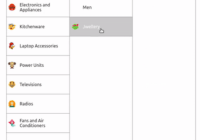
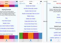
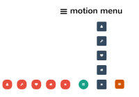
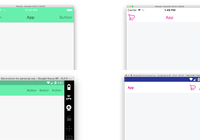
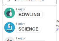
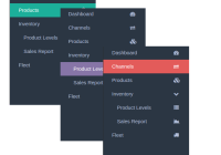
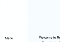
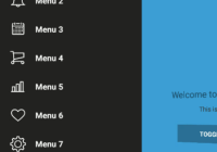
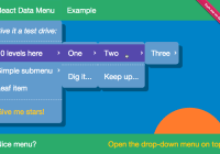
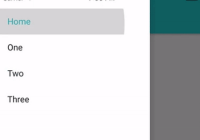
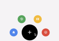
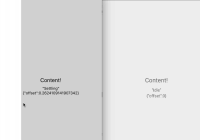
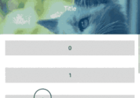
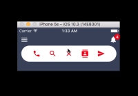
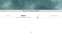
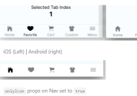
iOS (Left) | Android (right)
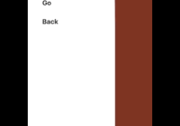
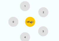
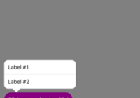
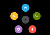
onlyIconprops on Nav set totrue
Features
- worked with (react-native-router-flux) or any kind of navigation solutions
- cross-platform icons by default
- simple and clean UI
Inspiration
Installation
npm install --save react-native-simple-tab react-native-vector-icons
After Installation (this step is required)
react-native link
Basic Usage
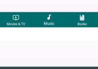
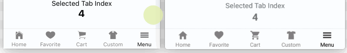
import React, { Component } from 'react'; import { StyleSheet, Text, View, } from 'react-native'; import { Nav, Tab } from 'react-native-simple-tab'; class MyExample extends Component { constructor() { super(); this.state = { page: 0, }; this._onTabChange = this._onTabChange.bind(this); } _onTabChange(tabIndex) { this.setState({ page: tabIndex }); } render() { return ( <View style={styles.container}> <Text style={styles.welcome}> Welcome to React Native! </Text> <Text style={styles.myPackage}> react-native-cross-platform-tab </Text> <View style={{ flex: 1 }}> <Text style={styles.myText}> Selected Tab Index </Text> <Text style={styles.myTabIndex}> {this.state.page} </Text> </View> <Nav selected={this.state.page} onTabChange={this._onTabChange}> <Tab name="home" label="Home" /> <Tab name="heart" label="Favorite" /> <Tab name="cart" label="Cart" /> <Tab name="shirt" label="Custom" /> <Tab name="menu" label="Menu" /> </Nav> </View> ); } } const styles = StyleSheet.create({ container: { flex: 1, backgroundColor: '#F5FCFF', }, welcome: { flex: 1, fontSize: 20, textAlign: 'center', marginTop: 40, }, myPackage: { flex: 1, textAlign: 'center', color: '#333333', marginBottom: 5, }, myText: { textAlign: 'center', }, myTabIndex: { fontSize: 20, textAlign: 'center', fontWeight: 'bold', }, }); export default MyExample;More Icons
Check Out Here and use it's name into Tab name props.
Nav props
| Props | Type | Default | Description |
|---|---|---|---|
| selected | number | - | used to determine what tabIndex that currently selected |
| onTabChange | function | () => {} | event onTabChange with param tabIndex |
| backgroundColor | string | 'white' | Nav background color |
| borderTopColor | string | '#DDDDDD' | Nav border top color |
| height | number | 42 | Nav height |
| onlyIcon | boolean | false | display only icon or icon with label |
| pressOpacity | number | 0.7 | opacity when Tab be pressed (min: 0, max: 1) |
| activeColor | string | 'black' | active color on all Tabs |
| unActiveColor | string | 'gray' | unactive color on all Tabs |
| iconSize | number | 22 | icon size on all Tabs |
| fontSize | number | 11 | font size on all Tabs |
| style | object | - | your own custom style for Nav wrapper |
Tab props
| Props | Type | isRequired? | Description |
|---|---|---|---|
| name | string | Required | used for icon name |
| label | string | Optional | Tab label |
| fontStyle | object | Optional | your own custom style for each Text on Tab |
| style | object | Optional | your own custom style for Tab wrapper |
License
MIT