Material-UI responsive Drawer
Table of Contents
Description
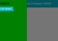
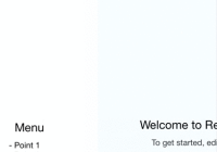
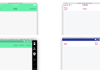
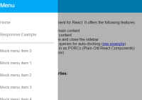
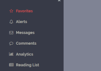
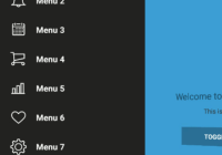
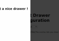
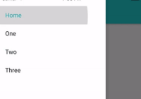
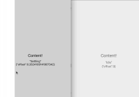
Material-UI responsive Drawer is a React-Redux component that uses Material-UI to create a responsive Drawer.
You can try it out the DEMO.
Installation
This project can be installed as npm module using following command:
npm i -S material-ui-responsive-drawerUsage
Preparation
Material-UI
For the project components to work in your application after the npm installation you have to be sure that everything is correctly setup for Material-UI to work. You can find more about that here.
Redux responsive
We also need to add the responsiveStoreEnhancer from redux-responsive into our store:
import {responsiveStoreEnhancer} from 'redux-responsive'; const store = createStore(reducers, responsiveStoreEnhancer); You can find more about the redux-responsive project here.
Reducers
No matter where you store your reducers the ResponsiveDrawer needs access to a specific reducer and its state. For that we add to our reducers index.js file where we combine all our reducers the following two reducers:
import {responsiveStateReducer} from 'redux-responsive'; import {combineReducers} from 'redux'; import {responsiveDrawer} from 'material-ui-responsive-drawer'; const reducers = combineReducers({ browser: responsiveStateReducer, responsiveDrawer: responsiveDrawer }) export default reducers; We are now at the point where we can use this module in our application.
Examples
The module contains three main parts:
- ResponsiveDrawer the responsive Drawer
- BodyContainer the responsive body that is adjusting its position according to the drawer
- ResponsiveAppBar the responsive AppBar that works with the ResponsiveDrawer together
All can be imported like this:
import { ResponsiveDrawer, BodyContainer, ResponsiveAppBar } from 'material-ui-responsive-drawer' All of them are just containers in which you can put all your other application components:
<div> <ResponsiveDrawer> <div> //all your components you want to have in the drawer part </div> </ResponsiveDrawer> <BodyContainer> <ResponsiveAppBar title={'Responsive Material-UI Drawer DEMO'} iconElementRight={<FlatButton label="Demo" />} /> <div> //all your components you want to have in the body part </div> </BodyContainer> </div> The ResponsiveDrawer has the same properties as the Material-UI Drawer. The ResponsiveAppBar has the same properties as the Material-UI AppBar.
There are some properties that should always be the same in the three components:
- width - if the width of the drawer is set to a specific value the width of the BodyContainer should be set to the same to avoid overlapping. Default is 256.
- openSecondary - defines which side the Drawer will open from so the BodyContainer should also have the same value for this property. Default is false.
- breakPoint - defines the size of the window where the Drawer will close (small windows) or open/docked (large windows). Default is 'medium'. You can add custom break points to the
redux-responsiveimplementation and change the breakPoint for the ResponsiveDrawer. More about this can be found here
All of these properties are optional.
To use the actions for changing the drawer properties we will need some more code. For example we can change the responsive state of the drawer by calling the action setResponsive, which takes a boolean as parameter and defines if the drawer is responsive or not.
The actions available in this module are: toggleDrawerOpen, toggleDrawerDock, setDrawerOpen(open), setResponsive(responsive).
We can import them from the module like this:
import { ResponsiveDrawer, BodyContainer, ResponsiveAppBar, toggleDrawerOpen, toggleDrawerDock, setResponsive } from 'material-ui-responsive-drawer' A complete example with all actions called can be found in the App.js file of the demo project.
Contributing
All help no matter if it is a critique, suggestion or pull request is welcome :)
