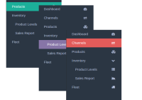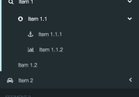
react-sidemenu
Lightweight side menu component written in React.js. No jQuery, just CSS3.

Features
- Pure React.js, no external dependencies
- Configure via JS objects or via React components
- Packed with default ready-to-use styling
- Easy to customize styling guide
- Custom rendering, collapse control, right-to-left etc.
- Flow type checking support
Usage
Install the component with NPM:
npm install react-sidemenu --save Import the component in your React.js application:
import SideMenu from 'react-sidemenu'; Flow
If you want to have access to Flow typed components, include SideMenu.js from dist folder when installing via npm.
Styling!!!
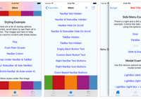
To use default styling include side-menu.css to your project. You can find it in dist folder when installing via npm. For an idea on how to customize styling see Demo.
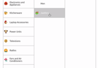
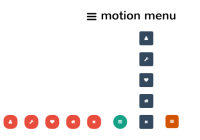
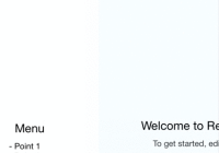
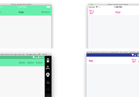
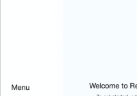
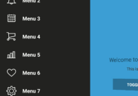
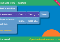
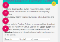
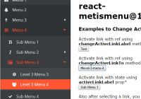
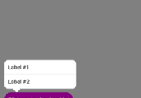
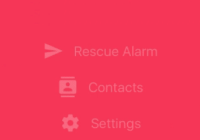
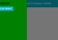
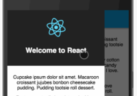
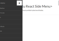
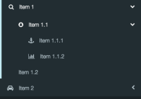
Demo & Examples
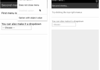
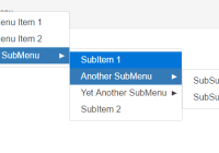
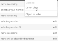
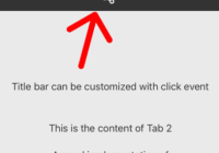
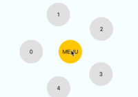
Demo showcasing the functionalities & code examples. In the examples we use Font Awesome icons (from a CDN).
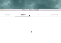
You can run examples by yourself. Clone the repo and do:
npm install npm start The examples are run using Webpack development server.
Options
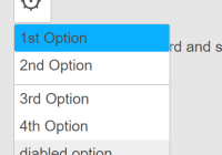
<SideMenu> - main component
| Option | Default | Description |
|---|---|---|
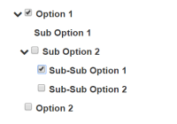
| items | null | Property for the JS Object configuration of the component SideMenu component. Check out Demo to find out how it works. |
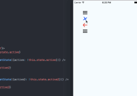
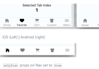
| activeItem | null | Preset starting active item. Also used for opening and closing menu items from code (e.g. from a button). When using this option, make sure to always keep the controlling variable (e.g. variable in state) from the parent component of the menu in sync with the actual activeItem (i.e. override onMenuItemClick and update the variable) |
| collapse | true | This property gives you the capability to enable or disable collapsing menu when other elements of the menu are clicked. |
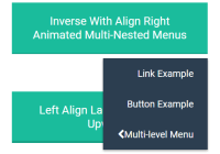
| theme | 'default' | This sets a class for the component that you can use to apply custom styling. The class will be Side-menu-[theme_name]. Note: our default theme uses Font Awesome icons. See Demo for an detailed example. |
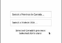
| renderMenuItemContent({ icon: icon, value: value, label: label }) | null | This property enables you to provide a custom render method for items. Function is passed one parameter, representing the menu item being rendered. It receives an object with attributes: icon, label and value. Demo |
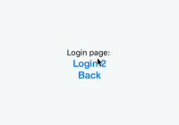
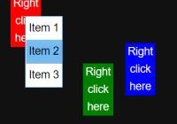
| onMenuItemClick | (value, extras) => window.location.href = '#' + value | This property enables you to provide custom onClick method for items. The function gets passed the value of the clicked item and item extras (object). Demo |
| rtl | false | This property enables you to use the sidemenu in a right-to-left page. Demo |
| shouldTriggerClickOnParents | false | This property enables triggering 'onMenuItemClick' on parent items that have children. |
<Item> - this component is for the non-JS object config of the menu
| Option | Description |
|---|---|
| value | The href where you will be redirected after you click the item if no onMenuItemClick is provided. If onMenuItemClick is provided, it is the value being passed to the function call. |
| label | Just a label. |
| icon | This is the icon of the item. It should be a font-awesome class name. |
| onClick | Custom on click method specific for this item (overrides onMenuItemClick). |
| extras | Optional container for additional data. |
Roadmap
Any contribution is welcome.
TODO:
- split code into two units: JS object configuration and Component configuration
- tests & CI support
- refactor examples code