react-dd-menu
A React dropdown menu
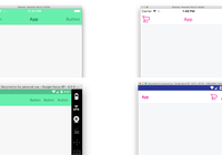
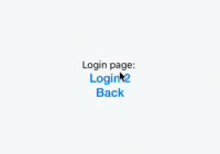
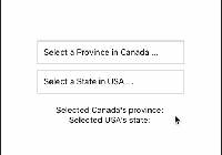
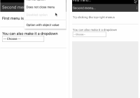
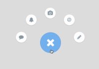
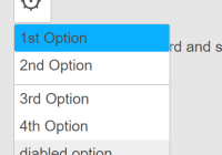
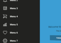
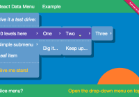
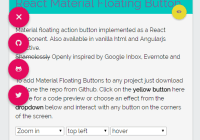
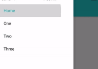
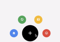
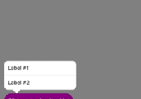
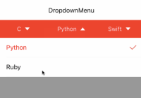
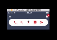
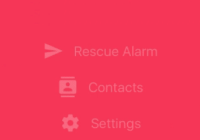
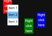
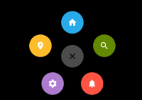
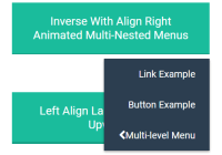
Live Example: React Dropdown Menu
NOTE: I am no longer actively developing this project since it has met most of the initial goals and I will be spending most of my time developing the bigger project react-md. I am more than happy to keep review/accepting pull requests with new features/bugfixes though.
Installation
$ npm install -S react-dd-menu \ # If you haven't installed already react \ react-dom \ react-transition-groupProps
DropdownMenu
static MENU_SIZES = ['sm', 'md', 'lg', 'xl'] static ALIGNMENTS = ['center', 'right', 'left'] static propTypes = { isOpen: PropTypes.bool.isRequired, close: PropTypes.func.isRequired, toggle: PropTypes.node.isRequired, children: PropTypes.node, inverse: PropTypes.bool, align: PropTypes.oneOf(ALIGNMENTS), animAlign: PropTypes.oneOf(ALIGNMENTS), textAlign: PropTypes.oneOf(ALIGNMENTS), menuAlign: PropTypes.oneOf(ALIGNMENTS), className: PropTypes.string, size: PropTypes.oneOf(MENU_SIZES), upwards: PropTypes.bool, animate: PropTypes.bool, enterTimeout: PropTypes.number, leaveTimeout: PropTypes.number, closeOnInsideClick: PropTypes.bool, closeOnOutsideClick: PropTypes.bool, } static defaultProps = { inverse: false, align: 'center', animAlign: null, textAlign: null, menuAlign: null, className: null, size: null, upwards: false, animate: true, enterTimeout: 150, leaveTimeout: 150, closeOnInsideClick: true, closeOnOutsideClick: true, }isOpen- Boolean for telling if the menu is open. This was passed in as a prop instead of having the component's own state so you can decide when to close the menu on your own.close- a function to call that turns theisOpenboolean to falsetoggle- any renderable item that will be used to toggle the menu open. So normally a button or any other content.inverse- boolean if it is an inversed color menualign- the alignment for the animation, text, and menu if the specific props are not given. Defaults tocenteranimAlign- the alignment/direction that the menu will appear fromtextAlign- the alignment of each list item's textmenuAlign- the alignment of the menu to thetoggleelementsize- the size of the menu. Defaults to auto size.className- any additional css classes to add the the dropdown menu container. (.dd-menu)upwards- boolean if the menu should go upwards. Defaults tofalseanimate- boolean if the menu should animate on open and close. Defaults totrueenterTimeout- the amount of time in ms to end the CSSTransitionGroup. Defaults to150leaveTimeout- the amount of time in ms to end the CSSTransitionGroup. Defaults to150closeOnInsideClick- a boolean if the menu should close when you click inside the menu. Defaults totruecloseOnOutsideClick- a boolean if the menu should close when you click elsewhere on the page. Defaults totrue
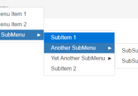
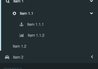
NestedDropdownMenu
static propTypes = { toggle: PropTypes.node.isRequired, children: PropTypes.node, nested: PropTypes.oneOf(['inherit', 'reverse', 'left', 'right']), animate: PropTypes.bool, direction: PropTypes.oneOf(['left', 'right']), upwards: PropTypes.bool, delay: PropTypes.number, enterTimeout: PropTypes.number, leaveTimeout: PropTypes.number, openOnMouseover: PropTypes.bool, } static defaultProps = { nested: 'reverse', animate: false, direction: 'right', upwards: false, delay: 500, enterTimeout: 150, leaveTimeout: 150, openOnMouseover: true, }toggle- an renderable item that will open the nested menu on hover. It gets wrapped in alielement, so it might be best to have a button or a link tag.nested- the nested menu's expansion direction. The default case should hopefully be the only used case.- Inherit - If the main dropdown menu is aligned left, the nested menu will appear to the left as well.
- Reverse - If the main dropdown menu is aligned left, the nested menu will appear to the right.
- Left - Force the menu to appear to the left of the menu.
- Right - Force the menu to appear to the right of the menu.
animate- boolean if the nested menu should animate when appearing. Defaults tofalsedirection- The animation direction.upwards- boolean if the nested menu should render upwards. Defaults tofalsedelay- A number in ms to allow the mouse to be off of the dropdown menu to close it. Defaults to500msenterTimeout- the amount of time in ms to end the CSSTransitionGroup. Defaults to150leaveTimeout- the amount of time in ms to end the CSSTransitionGroup. Defaults to150openOnMouseover- boolean if the menu can be opened/close by mouseover/mouseleave events
Styling
In the dist folder, there is a react-dd-menu.css and a react-dd-menu.min.css with the default css stylings. If you have SASS, the source is located in src/scss.
If you don't want the default css or to edit the default, the layout is this:
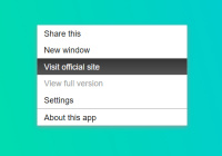
.dd-menu | -- toggle component | -- .dd-menu-items | | -- ul | | | [role="separator"], .separator The separator can be any element with a classname of .separator or any element with a role of separator (or both). To get the best styling, it should probably be applied to an li element.
Usage
import React from 'react'; import DropdownMenu from 'react-dd-menu'; export default class Example extends React.Component { constructor() { super(); this.state = { isMenuOpen: false }; this.click = this.click.bind(this); this.toggle = this.toggle.bind(this); this.close = this.close.bind(this); } toggle() { this.setState({ isMenuOpen: !this.state.isMenuOpen }); } close() { this.setState({ isMenuOpen: false }); } click() { console.log('You clicked an item'); } render() { const menuOptions = { isOpen: this.state.isMenuOpen, close: this.close, toggle: <button type="button" onClick={this.toggle}>Click me!</button>, align: 'right' }; return ( <DropdownMenu {...menuOptions}> <li><a href="#">Example 1</a></li> <li><button type="button" onClick={this.click}>Example 2</button></li> </DropdownMenu> ); } }or..
var React = require('react'); var DropdownMenu = require('react-dd-menu'); var Example = React.createClass({ getInitialState: function() { return { isMenuOpen: false }; }, toggle: function() { this.setState({ isMenuOpen: !this.state.isMenuOpen }); }, close: function() { this.setState({ isMenuOpen: false }); }, click: function() { console.log('You clicked an item'); }, render: function() { var menuOptions = { isOpen: this.state.isMenuOpen, close: this.close, toggle: <button type="button" onClick={this.toggle}>Click me!</button>, align: 'right' } return ( <DropdownMenu {...menuOptions}> <li><a href="#">Example 1</a></li> <li><button type="button" onClick={this.click}>Example 2</button></li> </DropdownMenu> ); } });Nested Menu Example
'use strict'; import React from 'react'; import DropdownMenu, { NestedDropdownMenu } from 'react-dd-menu'; class Example extends React.Component { state = { isMenuOpen: false }; toggle = () => { this.setState({ isMenuOpen: !this.state.isMenuOpen }); } close = () => { this.setState({ isMenuOpen: false }); }; click = () => { console.log('You clicked an item'); }; render() { const menuOptions = { isOpen: this.state.isMenuOpen, close: this.close, toggle: <button type="button" onClick={this.toggle}>Click me!</button>, align: 'right', }; const nestedProps = { toggle: <a href="#">Hover me for Nested Menu!</a>, animate: true, }; return ( <DropdownMenu {...menuOptions}> <li><a href="#">Example 1</a></li> <li><button type="button" onClick={this.click}>Example 2</button></li> <li role="separator" className="separator" /> <NestedDropdownMenu {...nestedProps}> <li><a href="#">I am in a Nested Menu!</a></li> </NestedDropdownMenu> </DropdownMenu> ); } }Contributors/Local Changes
To rebuild the source:
$ npm run buildThis will output all the css and js files into ./dist;
Versions
- 0.0.2 - Fixed removing the click event listener
- 0.0.3 - Positioning fixes and convenience props for different dropdown menu configs
- 0.0.4 - Fixed width for firefox and added convenience props for sizes
- 0.0.5 - Fixed Button font size, added examples
- 1.0.0 - Added nested dropdown menus, a separator class, drop-up? menus.
- 1.0.1 - Fixed exports for ES5 :(
- 1.0.2 - Added delay to nested dropdown menu closing and added github page for examples.
- 1.0.3 - Fixed problem with multiple menus and added ability to disable animation
- 1.0.4 - Upgraded to React 0.14.0
- 1.0.5 - Added ability to disable onClickInside and onClickOutside close of the menus. Added Touch/click support for nested menus.
- 1.0.6 - No new features. Upgraded dev stuff to babel 6 and separated example
- 1.0.7 - Updated to support React 15 as peer dependencies. No real changes needed
- 2.0.0 - Removed PureRenderMixin peerDependecy and switched to PureComponent instead.
- 2.0.1 - Updated for React 15.5
- 2.0.2 - Small bugfix for any child elements that had onClick handlers. [#52]