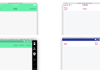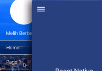
React Native TabBar Navigator (iOS only)

A component which builds excellent Navigator(NavigationController) + TabBar(TabBarController) based application, have a good solution for implementing hidesBottomBarWhenPushed in iOS.

SPECIAL NOTE FOR 0.4.0
Please don't update to 0.4.0 if you are using previous version of this plugin, because the way to use it is completely different.
UPDATEs
0.4.0 Supports React Native 0.40, optimized usages.
0.3.0 Test with several projects, and no obviously bug, so 0.3.0 will be a stable version.
0.2.8 Added a shadow style, make it more native, preview
0.2.7 Remove the hack on last commit, reason
0.2.6 Disabling the wired Y scale when pushing the view, which make it more similar to NavigatorIOS
0.2.4 Fixed a logical bug which caused a re-render issue.
0.2.3 New feature by @aerofs, title component can be customize now.
0.2 Stable Version
0.1 Project First Commit
Installation
cd to your React Native project directory and run
npm i --save react-native-tabbar-navigator
Usage
import { TabNavigator } from 'react-native-tabbar-navigator';The basic usages:
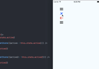
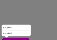
function RootView() { let navItems = [ { leftItem: { component: (<NavItemText/>), onPress: (isRoot, pop) => { ActionSheetIOS.showActionSheetWithOptions({ options: ['View Account Info', 'My Orders', 'Sign Out'], destructiveButtonIndex: 2 }, () => {}); } }, rightItem: { component: (<NavItemIcon/>), onPress: (isRoot, pop) => { ActionSheetIOS.showActionSheetWithOptions({ options: ['Share', 'Scan QR Code', 'Cancel'], destructiveButtonIndex: 2 }, () => {}); } } }, { title: { component: (<NavItemSegmentCtrl/>) }, rightItem: { component: (<NavItemIconSettings/>), onPress: (isRoot, pop) => { ActionSheetIOS.showActionSheetWithOptions({ options: ['Account Settings', 'App Settings', 'Cancel'], destructiveButtonIndex: 2 }, () => {}); } } } ]; return ( <TabNavigator tintColor='#FF2D55'> <TabNavigator.Item title='Tab One' icon={{uri: tabOneIcon, scale: 3}} navItems={navItems[0]} defaultTab> <TabOneIndex/> </TabNavigator.Item> <TabNavigator.Item title='Tab Two' icon={{uri: tabTwoIcon, scale: 3}} navItems={navItems[1]} badge='999+'> <TabTwoIndex/> </TabNavigator.Item> </TabNavigator> ); }API
NOTE Be sure to know the basic usage of <Navigator/> and <TabBarIOS/>
For this plugin, there are 2 components that you need to know.
<TabNavigator/>
| Property | Description | Type | Default |
|---|---|---|---|
| navBarTintColor | Default font color of navigation bar. | string | '#FFFFFF' |
| navTintColor | Default background color of navigation bar. | string | '#FF2D55' |
| children | ONLY accepts <TabNavigator.Item/>s as children components. | Array<React.Component> | [] |
| ...props | The other props that passed to this Component is directly passed to the corresponding <Navigator/> and override any default props in this plugin. Be sure to read the source code first, or you should not override the props below: style, initialRoute, renderScene, navigationBar, sceneStyle. |
<TabNavigator.Item/>
| Property | Description | Type | Default |
|---|---|---|---|
| title | Title of the corresponding Tab and Navigation Title. You can customize Navigation Title by navItems property. | string | |
| defaultTab | Set this Item as default selcted tab. | bool | false |
| navItems | Detailed API below. | Array<NavItemConfig> | REQUIRED |
| children | ONLY accepts single child element. | React.Component | REQUIRED |
| ...props | The other props that passed to this Component is directly passed to the corresponding <TabBarIOS.Item/>. |
NavItemConfig
| Property | Description | Type | Default |
|---|---|---|---|
| leftItem | Component settings for TopLeft navigation item. | NavigationItem | |
| rightItem | Component settings for TopRight navigation item. | NavigationItem | |
| title | Navigation title for corresponding Tab. | string | NavigationItem | TabNavigator.Item.props.title |
NavigationItem
| Property | Description | Type | Default | Example |
|---|---|---|---|---|
| component | React Component for corresponding position. | React.Component | null | <Text>More</Text> |
| onPress | This function is passed to the component onPress prop, make sure to receive onPress in component and handle it. | NavigationItemEvent | () => {} | (isRoot, pop) => { if (isRoot) pop() } |
NavigationItemEvent
This is actually a function type. When this function is called, it will pass 3 arguments.
| Order | Argument | Description | Type |
|---|---|---|---|
| 1 | isRoot | Is root route or not, if it is root route, you should not call the 2nd popHandler argument. | bool |
| 2 | popHandler | A shortcut to navigator.pop, calling this can pop the current navigator. | function |
| 3 | navigator | The current navigator. |
Advanced usage
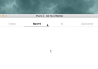
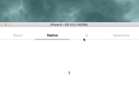
For more advanced examples, please check out the example app.
How to run the example App?
Xcode.
Questions
If something is undocumented here, and it is not clear with you, feel free to create an issue here, I will tried my best to answer you.
Anything else
Open a new issue to report bugs or request new features. Feel free to create Pull Request, I will be happy to merge if it is a good PR.
My email [email protected]
Facebook Dicky Tsang
Sina Weibo @桐乃