A beautiful, customizable and easy-to-use
Material Design Bottom Navigation for react-native.
- Pure JavaScript. No native dependencies. No linking. No obstacles.
- Looks beautiful. Stunning and fluid animations. You won't believe it's not a native view.
- Customize it. You can adjust nearly everything to make it fit perfectly to your app.
- Easy to use. Uses established React patterns for both simple and advanced usage.
- Pluggable. Includes customizable Tabs and Badges. Not enough? Create and use your own!
Installation
Using npm:
npm install react-native-material-bottom-navigationOr using yarn:
yarn add react-native-material-bottom-navigationTable of Contents
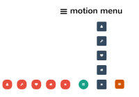
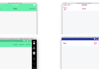
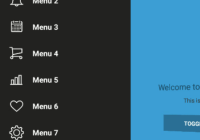
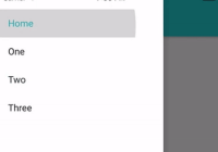
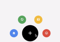
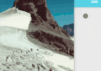
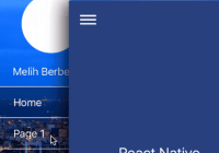
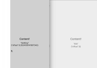
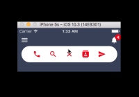
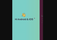
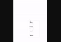
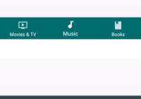
Demo

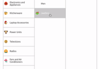
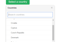
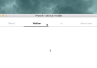
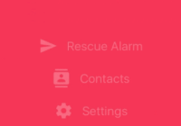
Shifting Tab

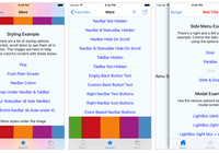
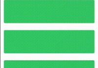
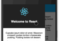
Full Tab
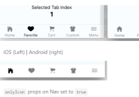
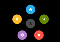
Icon Tab
Usage
This library uses "render props" as established pattern for component composition. The example below illustrates the basic usage of the Bottom Navigation. All available Props are listed in the Documentation.
Dive into the example below, check out the example app and take a look at the Usage Documentation.
import BottomNavigation, { FullTab } from 'react-native-material-bottom-navigation' export default class App extends React.Component { tabs = [ { key: 'games', icon: 'gamepad-variant', label: 'Games', barColor: '#388E3C', pressColor: 'rgba(255, 255, 255, 0.16)' }, { key: 'movies-tv', icon: 'movie', label: 'Movies & TV', barColor: '#B71C1C', pressColor: 'rgba(255, 255, 255, 0.16)' }, { key: 'music', icon: 'music-note', label: 'Music', barColor: '#E64A19', pressColor: 'rgba(255, 255, 255, 0.16)' } ] renderIcon = icon => ({ isActive }) => ( <Icon size={24} color="white" name={icon} /> ) renderTab = ({ tab, isActive }) => ( <FullTab isActive={isActive} key={tab.key} label={tab.label} renderIcon={this.renderIcon(tab.icon)} /> ) render() { return ( <View style={{ flex: 1 }}> <View style={{ flex: 1 }}> {/* Your screen contents depending on current tab. */} </View> <BottomNavigation onTabPress={newTab => this.setState({ activeTab: newTab.key })} renderTab={this.renderTab} tabs={this.tabs} /> </View> ) } }Note: Out-of-the-box support for React Navigation (called NavigationComponent in earlier releases) was removed with v1. You can still use an earlier version, or integrate the Bottom Navigation on your own. Read more...
Documentation
You can also view the entire documentation on GitBook: https://timomeh.gitbook.io/material-bottom-navigation/
Notes
React Navigation Support
In contrary to earlier releases, this library does not support React Navigation out of the box (called NavigationComponent in earlier releases). React Navigation now ships with an own Material Bottom Navigation: createMaterialBottomTabNavigator.
The API of React Navigation changes quite frequently, and (until now) it wasn't always easy to keep track of changes and be up-to-date. Also I don't want to favor and promote React Navigation over other Navigation Libraries.
You can still implement the Bottom Navigation on your own, for example by using React Navigation's Custom Navigator.
If you integrate material-bottom-navigation with a navigation library in your project, feel free to share your knowledge by contributing to the Documentation or event create your own module which uses react-native-material-bottom-navigation.
Updated Material Design Specs
Google updated the Material Guidelines on Google I/O 2018 with new specifications, including a slightly changed Bottom Navigation and a new "App Bar Bottom" with a FAB in a centered cutout. react-native-material-bottom-navigation uses the older specs.
Contribute
Contributions are always welcome. Read more in the Contribution Guides.
Please note that this project is released with a Contributor Code of Conduct. By participating in this project you agree to abide by its terms.
Contributors
Thanks goes to these wonderful people (emoji key):
Timo Mämecke | Shayan Javadi | David | Jayser Mendez | Peter Kottas | Matt Oakes | Keeley Carrigan |
|---|---|---|---|---|---|---|
Sean Holbert | Alessandro Parolin | Prashanth Acharya M | Alexey Tcherevatov | Trevor Atlas |
This project follows the all-contributors specification. Contributions of any kind welcome!
License
MIT, © 2017 - present Timo Mämecke