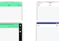
NavbarNative
A fully customizable Navbar component for React-Native.
It works for both iOS and Android!
Content
- Installation
- Exported components
- Getting started
- Images as title
- Transparent navbar
- Container API
- Navbar API
- Demo
Installation
npm i navbar-native --savePay attention
This package depends on the beautiful Vector Icons for React Native.
After installing NavbarNative, in order to have icons working, please follow instructions about HOW TO INSTALL AND LINK VECTOR ICONS in your project.
Exported components
This package exports two main components:
- Container - a container component to use as the first component in a render() method. It accepts the "Navbar" component and the rest of the page content.
- Navbar - the components which generates the bar on top.
Helper components
- Icon - a Vector Icons for React Native wrapper
Getting started
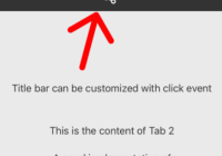
Basically, the Navbar component accepts a title prop and left and/or right objects (or array of objects) which describe each button that the navbar has to render in the specific position.
Using icons
In order to use the correct set of icons, please use ios- prefix in icon prop name for iOS and md- prefix for Android.
The following chunk of code shows a typical iOS NavbarNative usage:
import React, { Component } from 'react'; import { View } from 'react-native'; import { Container, Navbar } from 'navbar-native'; class ReactNativeProject extends Component { render() { return ( <Container> <Navbar title={"Navbar Native"} left={{ icon: "ios-arrow-back", label: "Back", onPress: () => {alert('Go back!')} }} right={[{ icon: "ios-search", onPress: () => {alert('Search!')} },{ icon: "ios-menu", onPress: () => {alert('Toggle menu!')} }]} /> ... other stuff ... </Container> ); } }Image as a title
You can also use a remote or local image instead of the text title:
class ReactNativeEmpty extends Component { render() { return ( <Container type="list" data={["first", "second", "third"]}> <Navbar user={true} image={{ source:'https://facebook.github.io/react/img/logo_og.png', type: 'remote', resizeMode: 'cover', style: {width: 50, height: 44} }} statusBar={{ style: "default", hideAnimation: Navbar.FADE, showAnimation: Navbar.SLIDE, }} left={{ icon: "ios-arrow-back", label: "Back", onPress: () => {alert('Go back!')} }} right={[{ icon: "ios-search", onPress: () => {alert('Search!')} },{ icon: "ios-menu", onPress: () => {alert('Toggle menu!')} }]} /> </Container> ); } }Image as background
Images can be used in background also:
class ReactNativeEmpty extends Component { render() { return ( <Container type="list" data={["first", "second", "third"]}> <Navbar user={true} title={"Navbar Native"} titleColor="white" imageBackground={{ source:'https://facebook.github.io/react/img/logo_og.png', type: 'remote', resizeMode: 'cover' }} statusBar={{ style: "light-content", hideAnimation: Navbar.FADE, showAnimation: Navbar.SLIDE, }} left={{ icon: "ios-arrow-back", iconColor: "white", label: "Back", onPress: () => {alert('Go back!')}, style:{color: 'white'} }} right={[{ icon: "ios-search", iconColor: "white", onPress: () => {alert('Search!')} },{ icon: "ios-menu", iconColor: "white", onPress: () => {alert('Toggle menu!')} }]} /> </Container> ); } }Transparent Navbar
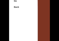
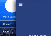
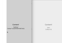
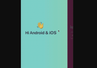
Do you need a transparent navbar and a full-page content beneath it? No problem! We've got you covered...
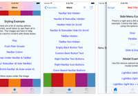
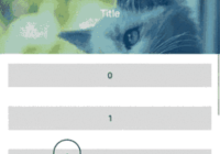
Just set bgColor="transparent" and theme="dark" and you can achieve something like this:
Using badges
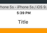
export default class ReactNativeEmpty extends Component { render() { const left = { role: 'menu', badge: { value: 4, bgColor: '#ffcc00', textColor: 'black' } }; return ( <Container> <Navbar left={left} title={"Title"} /> </Container> ); } }Container API
- bgColor - (String def. '#ffffff') - Background color for the Container, the one you see overscrolling
- data - (Array of strings or Array of Objects opt.) - data source for ListView
- row - (Function opt.) - A function that renders the single row element in ListView (accepts 'rowData', 'sectionID')
- style - (Object opt.) - Custom styles for the container
- loading - (Object opt.) - Prop to use in order to trigger the included loading screen SPINNER INSTALLATION INSTRUCTIONS
- spinner - (String def. 'ThreeBounce') - Type of spinner animation from HERE
- spinnerColor - (String def. '#ffffff') - Color of the spinner
- spinnerSize - (Number def. 50) - Size of the spinner
- bgColor - (String def. 'rgba(0,0,0,.8)') - Color to apply in the background
- message - (String opt.) - Loading text message to display
- messageColor - (String def. '#ffffff') - Color of the loading text message
- styleContainer - (Object opt.) - Additional style for the loading screen
- styleText - (Object opt.) - Additional style for the loading text
- type - ('scroll' or 'list' def. 'scroll') - How to render Container children content
- height - (Number def. screen height) - Set the height of the container
Navbar API
- theme - ('light' or 'dark' - def. 'light' iOS / 'dark' Android) - Base theme for the NavigationBar
- title - (String or Component opt.) - The title element. Component needs to be styled accordingly.
- titleColor - (String opt.) - The title string color
- bgColor - (String def. light: ios #f2f2f2 android #f5f5f5 dark: ios #2b2b2b android #212121 ) - NavigationBar's background color
- image - (Object opt.) - Local/remote image instead of the title
- source - (require(String) for local or String for remote uri) - Local/remote image location
- type - ('local' or 'remote' def. 'local') - Origin of the image
- resizeMode - ('cover', 'contain', 'stretch', 'repeat', 'center' def. 'cover' local - 'contain' remote)
- style - (Object opt.) - Additional styles for image title
- imageBackground - (Object opt.) - Local/remote image in navbar background
- source - (String) - Local/remote image location
- type - ('local' or 'remote' def. 'local') - Origin of the image
- resizeMode - ('cover', 'contain', 'stretch', 'repeat', 'center' def. 'cover')
- style - (Object opt.) - Additional styles for image background
- statusBar - (Object opt.):
- style - ('light-content' or 'default') - Style of StatusBar
- hidden - (Boolean) - Show or not StatusBar
- bgColor - (String) - StatusBar background color
- animation - (Boolean def. true) - Animation between StatusBar transitions
- transition - ('fade' or 'slide' def. 'fade') - Type of StatusBar transition animation when hiding it
- left / right - (Object or Array of Objects or React component / return function):
- icon - (String opt.) - Vector Icon's icon name
- iconFamily - (String def. Ionicons) - Vector Icon's icon library
- iconPos - ('left' or 'right' def. left/right position) - Icon's position towards the label
- iconSize - (Number def. 30 ios - 28 android) - Icon's size
- iconColor - (String def. light: ios #387afe android #707070 dark: ios #ffffff android #ffffff ) - Icon's color
- label - (String opt.) - Button's label
- badge - (Number, String or Object opt.)
- value - (Number or String) - The value in the badge
- bgColor - (String opt.) - Badge background color
- textColor - (String opt.) - Badge text color
- position - ('left' or 'right' def. 'right') - Badge position in the button
- onPress - (Function) - onPress function handler
- disabled - (Boolean def. false) - It renders a button in a disabled status
- role - (String opt. - 'back' | 'close' | 'login' | 'menu') - Button's pre-defined aspect
- style - (Object opt.) - Button's override styles
- style - (Object) - Custom styles for the navbar
- user - (Object, Bool) - Authenticated user
- elevation - (Number) - (Android-only) Elevation of the toolbar
Icon API
- family - (String def. 'Ionicons') - Font family for icons
- name - (String) - Name of the icon to show
- color - (String def. iOS '#387afe' android '#707070') - Color of the icon
Demo
MeteorNative is a full featured boilerplate which brings together React-Native and Meteor js.
In this project I implement navbar-native in many ways and you can see in action specific usages of this package.
