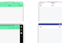
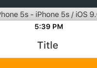
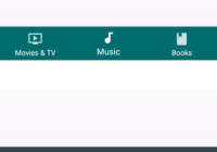
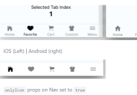
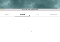
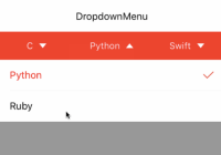
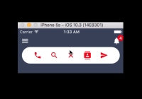
A cross-platform (iOS / Android), fully customizable, React Native Navigation Bar component.
I created this project after going through the navbars contained in Awesome React and not finding any that were cross-platform, customizable, and integrated the status bar. This project is a spiritual successor to react-native-navbar (I forked it and ended up changing like 90% of it).
To find a preview of all examples go to the examples folder.
Note
This library of components require the use of React Native's Babel transpiler to work. If you are using the most up to date version of React Native, it should just work out of the box.
Content
Installation
First of all, make sure you're using [email protected]+ and [email protected]+ for version 1.1.1 or above. For version 2.0.0 and above, you will need to be using [email protected] or greater.
npm install --save react-native-navGetting started
Start a new React Native Project. Then, npm install --save react-native-nav.
iOS
import React, { Component } from 'react-native' import NavBar, { NavButton, NavButtonText, NavTitle } from 'react-native-nav' export default class NavBarIOSLight extends Component { render() { return ( <NavBar> <NavButton onPress={() => alert('hi')}> <NavButtonText> {"Button"} </NavButtonText> </NavButton> <NavTitle> {"App"} </NavTitle> <NavButton onPress={() => alert('hi')}> <NavButtonText> {"Button"} </NavButtonText> </NavButton> </NavBar> ) } }Android
import React, { Component } from 'react-native' import NavBar, { NavGroup, NavButton, NavButtonText, NavTitle } from 'react-native-nav' export default class NavBarAndroidLight extends Component { render() { return ( <NavBar> <NavTitle> {"App"} </NavTitle> <NavGroup> <NavButton onPress={() => alert('hi')}> <NavButtonText> {"Button"} </NavButtonText> </NavButton> <NavButton onPress={() => alert('hi')}> <NavButtonText> {"Button"} </NavButtonText> </NavButton onPress={() => alert('hi')}> <NavButton> <NavButtonText> {"Button"} </NavButtonText> </NavButton> </NavGroup> </NavBar> ) } }API
NavBar
The NavBar component is the main wrapper of all the other components. It creates the base navigation bar in iOS and Android and includes the StatusBar. You can pass any valid React Element or set of elements into it, making it very configurable.
To use it:
import NavBar from 'react-native-nav' <NavBar> // Pass any React element(s) here </NavBar>Props
style
The best option is to use the Stylesheet object in React Native to create your styles
style = StyleSheet.create({ statusBar: { // StatusBar styles here (all view styles are valid) // default iOS styles: height: IOS_STATUS_BAR_HEIGHT, backgroundColor: '#f5f5f5', // default Android styles: height: ANDROID_STATUS_BAR_HEIGHT, backgroundColor: '#f5f5f5', }, navBarContainer: { // NavBarContainer styles here (all view styles are valid) // unlikely that you will need to add any styles here }, navBar: { // NavBar styles here (all view styles are valid) // default shared styles: borderTopWidth: 0, borderBottomColor: 'rgba(0, 0, 0, 0.1)', borderBottomWidth: 1, flexDirection: 'row', justifyContent: 'space-between', alignItems: 'center', // default iOS styles: backgroundColor: '#f5f5f5', height: IOS_NAV_BAR_HEIGHT, paddingLeft: 8, paddingRight: 8, // default Android styles: backgroundColor: '#f5f5f5', height: ANDROID_NAV_BAR_HEIGHT, padding: 16, } })statusBar
This is using the default StatusBar in React Native. It shares the same set of props that you can override.
StatusBarConfig = { // put any configuration for the StatusBar here // default iOS configuration: animated: true, hidden: false, barStyle: 'default', networkActivityIndicatorVisible: false, showHideTransition: 'fade', // default Android configuration: animated: true, hidden: false, showHideTransition: 'fade', backgroundColor: 'rgba(0, 0, 0, 0.2)', translucent: true, // I recommend you leave this true by default and // set the backgroundColor to a non-translucent // color if you don't want translucency }Note
The StatusBar props allow you to edit the backgroundColor for only the Android StatusBar. You can set a backgroundColor on it that is or isn't translucent. from within the configuration. You can also style it by passing a backgroundColor to styles.statusBar above. Setting the backgroundColor from the style will allow you to achieve cross-platform statusBar background color change.
NavTitle (optional)
The NavTitle component is a Text-based component that produces a nicely styled component for titles. Note: you don't have to use the NavTitle component. Since you can put any React Element in the NavBar, you could use an image or any other element, including the default Text component.
To use it:
import { NavTitle } from 'react-native-nav' <NavTitle> {"My App"} </NavTitle>Props
style
The best option is to use the Stylesheet object in React Native to create your styles
style = StyleSheet.create({ title: { // NavTitle styles here (all text styles are valid) // default styles: fontSize: 17, letterSpacing: 0.5, color: '#626262', fontWeight: '500', textAlign: 'center', }, })NavButton (optional)
The NavButton component is a TouchableOpacity-based component that includes an onPress handler for performing actions when pressed. In general, react-native-nav is very flexible and should be easy to configure with just about any flux-like architecture such as flux and redux. You should be able to pass any method to the onPress handler such as a redux action.
In addition, the NavButton object can have any valid React component or set of components passed into it as children. You can use the NavButtonText component, but if you want to pass it an image, you can do that too.
To use it:
import { NavButton } from 'react-native-nav' <NavButton> // Pass any React element(s) here </NavButton>Props
disabled
Setting this to true will disable the button and use the disabledStyle to style the button.
<NavButton disabled> // Pass any React element(s) here </NavButton>style
The best option is to use the Stylesheet object in React Native to create your styles.
style = StyleSheet.create({ title: { // NavButton styles here (all view styles are valid) // default iOS styles: marginLeft: 0, // default Android styles: marginLeft: 16, }, })disabledStyle
The best option is to use the Stylesheet object in React Native to create your styles.
style = StyleSheet.create({ title: { // disabled NavButton styles here (all view styles are valid) // no default styles }, })onPress
onPress takes a function that will be executed when the button is pressed. Example:
<NavButton onPress={() => alert('Hi!')}> <NavButtonText> {"Say Hi!"} </NavButtonText> </NavButton>NavButtonText (optional)
The NavButtonText component is a Text-based component that provides an easy wrapper for text buttons. However, the NavButton object can have any valid React element set of elements as its children, so you don't have to use this component.
To use it:
import { NavButtonText } from 'react-native-nav' <NavButtonText> {"Button"} </NavButtonText>Props
style
The best option is to use the Stylesheet object in React Native to create your styles
style = StyleSheet.create({ title: { // NavButtonText styles here (all text styles are valid) // default styles: fontSize: 17, letterSpacing: 0.5, color: '#939393', }, })NavGroup (optional)
The NavGroup component is a View-based component that provides an easy wrapper for grouping a set of components. It can group all optional components in this library as well as any other valid React component. The main use case for NavGroup is when, for example on Android, you want a NavTitle on the left side and many NavButtons on the right side.
To use it:
import { NavGroup } from 'react-native-nav' <NavGroup> // Pass any React element(s) here </NavGroupProps
style
The best option is to use the Stylesheet object in React Native to create your styles
style = StyleSheet.create({ title: { // NavGroup styles here (all text styles are valid) // default styles: flexDirection: 'row', }, })Examples
To find a preview of all examples go to the examples folder.
- iOS Light
- iOS Dark
- iOS Colored
- iOS Icons Buttons
- Android Light
- Android Dark
- Android Colored
- Android Icons Buttons
Questions?
Feel free to contact me via
License
The MIT License (MIT)
Copyright (c) 2015 Jinesh Shah
Permission is hereby granted, free of charge, to any person obtaining a copy of this software and associated documentation files (the "Software"), to deal in the Software without restriction, including without limitation the rights to use, copy, modify, merge, publish, distribute, sublicense, and/or sell copies of the Software, and to permit persons to whom the Software is furnished to do so, subject to the following conditions:
The above copyright notice and this permission notice shall be included in all copies or substantial portions of the Software.
THE SOFTWARE IS PROVIDED "AS IS", WITHOUT WARRANTY OF ANY KIND, EXPRESS OR IMPLIED, INCLUDING BUT NOT LIMITED TO THE WARRANTIES OF MERCHANTABILITY, FITNESS FOR A PARTICULAR PURPOSE AND NONINFRINGEMENT. IN NO EVENT SHALL THE AUTHORS OR COPYRIGHT HOLDERS BE LIABLE FOR ANY CLAIM, DAMAGES OR OTHER LIABILITY, WHETHER IN AN ACTION OF CONTRACT, TORT OR OTHERWISE, ARISING FROM, OUT OF OR IN CONNECTION WITH THE SOFTWARE OR THE USE OR OTHER DEALINGS IN THE SOFTWARE.
