Customizable navbar for react-native
Content
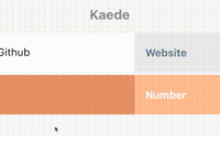
Examples
Getting started
-
Install
react-native-navbar:- By using
yarn:$ yarn add react-native-navbar - By using
npm:$ npm install react-native-navbar --save
- By using
-
Import it in the file where you want to use it:
import NavigationBar from 'react-native-navbar';
-
Add it to your React element tree:
const styles = { container: { flex: 1, }, }; const rightButtonConfig = { title: 'Next', handler: () => alert('hello!'), }; const titleConfig = { title: 'Hello, world', }; function ComponentWithNavigationBar() { return ( <View style={styles.container}> <NavigationBar title={titleConfig} rightButton={rightButtonConfig} /> </View> ); }That's it, you're ready to go!
API
- style - (Object, Array) - Style object or array of style objects
- containerStyle - (Object) - Style object for styling navbar container
- tintColor - (String) - NavigationBar's tint color
- statusBar - (Object):
- style - ('light-content' or 'default') - Style of statusBar
- hidden - (Boolean)
- tintColor - (String) - Status bar tint color
- hideAnimation - ('fade', 'slide', 'none') - Type of statusBar hide animation
- showAnimation - ('fade', 'slide', 'none') - Type of statusBar show animation
- leftButton / rightButton - (Object, React Element) - Either plain object with configuration, or React Element which will be used as a custom left/right button element. Configuration object has following keys:
- title - (String) - Button's title
- tintColor - (String) - Button's text color
- style - (Object, Array) - Style object or array of style objects
- handler - (Function) - onPress function handler
- disabled - (Boolean) - If true, disable interactions for this button.
- accessible - (Boolean) - Indicates that the view is an accessibility element
- accessibilityLabel - (String, React Element) - Overrides the text that's read by the screen reader for the button.
- title - (Object, React Element) - Either plain object with configuration, or React Element which will be used as a custom title element. Configuration object has following keys:
Usage with Webpack
This module uses JSX syntax and requires a compiler such as babel. React Native's packager runs this automatically but if you use Webpack be sure to compile this module from your dependencies
loaders: [{ test: /\.js$/, include: [ path.resolve(__dirname, "src"), path.resolve(__dirname, "node_modules/react-native-navbar") ], loader: 'babel', query: { stage: 0, plugins: [] } }]Questions?
Feel free to ping me on twitter If you want to report a bug, please submit an issue!
