react-native-menu
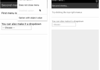
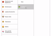
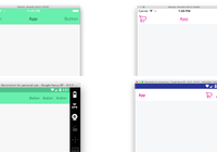
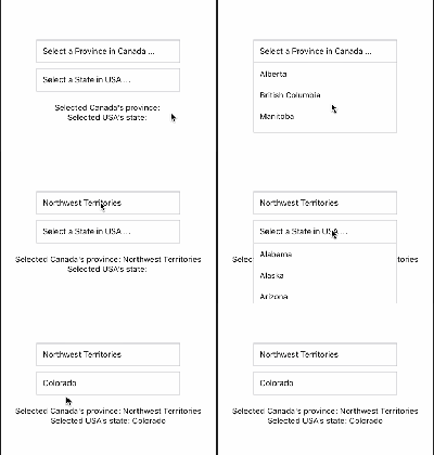
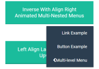
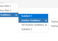
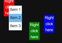
A menu component for Android and iOS that provides a dropdown similar to Android's Spinner, but does not retain a persistent selection.
The API is very flexible so you are free to extend the styling and behaviour.
Installation
$ npm install react-native-menu --save Or with yarn:
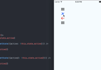
$ yarn add react-native-menu Demo
| iOS | Android |
|---|---|
 |  |
Basic Usage
import React, { View, Text, AppRegistry } from 'react-native'; import Menu, { MenuContext, MenuOptions, MenuOption, MenuTrigger } from 'react-native-menu'; const App = () => ( // You need to place a MenuContext somewhere in your application, usually at the root. // Menus will open within the context, and only one menu can open at a time per context. <MenuContext style={{ flex: 1 }}> <TopNavigation/> <View style={{ flex: 1, justifyContent: 'center', alignItems: 'center' }}><Text>Hello!</Text></View> </MenuContext> ); const TopNavigation = () => ( <View style={{ padding: 10, flexDirection: 'row', backgroundColor: 'pink' }}> <View style={{ flex: 1 }}><Text>My App</Text></View> <Menu onSelect={(value) => alert(`User selected the number ${value}`)}> <MenuTrigger> <Text style={{ fontSize: 20 }}>⋮</Text> </MenuTrigger> <MenuOptions> <MenuOption value={1}> <Text>One</Text> </MenuOption> <MenuOption value={2}> <Text>Two</Text> </MenuOption> </MenuOptions> </Menu> </View> ); AppRegistry.registerComponent('Example', () => App);Important: In order for the <Menu/> to work, you need to mount <MenuContext/> as an ancestor to <Menu/>. This allows the menu to open on top of all other components mounted under <MenuContext/> -- basically, the menu will be moved to be the last child of the context.
You must also have a <MenuTrigger/> and a <MenuOptions/> as direct children under <Menu/>. The MenuTrigger component opens the menu when pressed. The MenuOptions component can take any children, but you need at least one MenuOption child in order for the menu to actually do anything.
The MenuOption component can take any children.
Please refer to the full working example here.
Adding feedback to MenuTrigger and MenuOption components
By default, the MenuTrigger and MenuOption components render with a TouchableWithoutFeedback component, however this may make the menu feel unnatural in your app.
To override this, both components will take a renderTouchable property, which should be a function which returns an alternate component to use. For example:
import { TouchableOpacity, Text } from 'react-native'; import Menu, { MenuOptions, MenuOption, MenuTrigger } from 'react-native-menu'; const renderTouchable = () => <TouchableOpacity/>; const menu = () => ( <Menu> <MenuTrigger renderTouchable={renderTouchable}> <Text>Trigger</Text> </MenuTrigger> <MenuOptions> <MenuOption value={1} renderTouchable={renderTouchable}> <Text>One</Text> </MenuOption> <MenuOption value={2} renderTouchable={renderTouchable}> <Text>Two</Text> </MenuOption> </MenuOptions> </Menu> );API
MenuContext
Methods:
- isMenuOpen() -- Returns
trueif menu is open - openMenu() -- Opens the menu
- closeMenu() -- Closes the menu
- toggleMenu() -- Toggle the menu between open and close
Props:
- 'detectBackHandler' -- If true, menu context detects an Android hardware back press, closes menu and stops it from propagating and potentially causing bugs. (Default: true)
style-- Overrides default style properties (user-defined style will take priority)onCloseMenu-- Handler that will be called with the state ofMenuContext, if defined.
Menu
Methods:
- getName() -- Returns the menu name (e.g. useful to get auto generated name)
Props:
onSelect-- This function is called with the value theMenuOptionthat has been selected by the user
MenuTrigger
Props:
disabled-- If true, then this trigger is not pressablestyle-- Overrides default style properties (user-defined style will take priority)renderTouchable-- A function which can override the defaultTouchableWithoutFeedbackcomponent by returning a different component. See an example here.
MenuOptions
Props:
optionsContainerStyle-- Provides custom styling for options containerrenderOptionsContainer-- A function that renders takes in theMenuOptionselement and renders a container element that contains the options. Default function wraps options with aScrollView.
For example, if you want to change the options width to 300, you can use <MenuOptions optionsContainerStyle={{ width: 300 }}>. To further customize the rendered content you can do something like <MenuOptions renderOptionsContainer={(options) => <SomeCustomContainer>{options}</SomeCustomContainer>}>.
MenuOption
Props:
disabled-- If true, then this option is not selectablestyle-- Overrides default style properties (user-defined style will take priority)renderTouchable-- A function which can override the defaultTouchableWithoutFeedbackcomponent by returning a different component. See an example here.
Latest Changes
0.23.0
- Compatible with latest react-native version. Thanks to all the people who submitted a PR! (@amensouissi, SkipperEl)
0.20.1
- Changed menu elevation as per material design spec (thanks @heydabop!)
0.20.0
- Fixes compatibility with React Native 0.27.2 (thanks @Froelund)
0.19.0
- Fixes a performance issue where registering menu options on already rendered and opened menu causes infinite render loop (Closes #5, #9).
0.18.15
- Fixes issue where multiple unnamed
Menucomponents under one `MenuContext causes bad positioning.
0.18.14
- Lazily calculate menu position on open -- fixes stale calculation issues.
Roadmap
Features
- Allow positioning of menu to be customized (currently only anchors to top-right of
Menu). - Detect if the menu will be rendered off-screen, and adjust positioning accordingly.
Testing
Install dev modules:
yarn Run unit tests
yarn test:unit Run integration tests
Make sure you have a connected android device. You find list devices using adb devices.
yarn test:integration Contributing
Contributions are welcome! Just open an issues with any ideas or pull-requests. I will take a look when I have time. :)
