React Social Login Buttons
Live demo https://codesandbox.io/s/3rpq558rv5
A simple package to display social login buttons using React.
Buttons do not provide any social logic. They are only visual components listening to some events triggered by the user.
Install
npm
npm install --save react-social-login-buttons yarn
yarn add react-social-login-buttons Importing
ES6 imports:
import { FacebookLoginButton } from "react-social-login-buttons";ES6 imports optimized (deprecated):
import FacebookLoginButton from "react-social-login-buttons/lib/buttons/FacebookLoginButton";Usage
Default button content - "Login with Facebook"
<FacebookLoginButton onClick={() => alert("Hello")} />Custom button content
<FacebookLoginButton onClick={() => alert("Hello")}> <span>Custom text</span> </FacebookLoginButton>Social Button Types
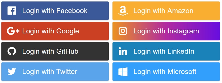
We currently support just a few login buttons. Others will be implemented later.
FacebookLoginButton
<FacebookLoginButton onClick={() => alert("Hello")} />GoogleLoginButton
<GoogleLoginButton onClick={() => alert("Hello")} />GithubLoginButton
<GithubLoginButton onClick={() => alert("Hello")} />TwitterLoginButton
<TwitterLoginButton onClick={() => alert("Hello")} />AmazonLoginButton
<AmazonLoginButton onClick={() => alert("Hello")} />InstagramLoginButton
<InstagramLoginButton onClick={() => alert("Hello")} />LinkedInLoginButton
<LinkedInLoginButton onClick={() => alert("Hello")} />MicrosoftLoginButton
<MicrosoftLoginButton onClick={() => alert("Hello")} />BufferLoginButton
<BufferLoginButton onClick={() => alert("Hello")} />Create your own button
You can create your own button.
You do not have to wait for us to implement all of them.
You can also use your own icons, let's say from font-awesome.
You can also pass a component to the icon prop.
import React from "react"; import {createButton} from "react-social-login-buttons"; const config = { text: "Login with Facebook", icon: "facebook", iconFormat: name => `fa fa-${name}`, style: { background: "#3b5998" }, activeStyle: { background: "#293e69" } }; /** My Facebook login button. */ const MyFacebookLoginButton = createButton(config); export default MyFacebookLoginButton;Config can also look like.
import svgIcon from "./my-svg.svg"; import {createSvgIcon} from "react-social-login-buttons"; const config = { text: "Login with Facebook", icon: createSvgIcon(svgIcon), iconFormat: name => `fa fa-${name}`, style: { background: "#3b5998" }, activeStyle: { background: "#293e69" } };Props
Props for every Button
onClick {function} (optional)
Will be triggered when clicked on the button.
style {Object} (optional)
Custom button styles
className {String} (optional)
Custom button class
children {React.children} (optional)
You can pass any children to our buttons.
activeStyle {Object} (optional)
activeStyle styles will be applied instead of style when mouse hovers above the element
icon {String|Node} (optional)
This icon will be displayed.
If you pass a string, <i className={format(name)}/> will be rendered.
iconSize {String} (optional)
Icon will have this size. Eg. "26px"
size {String} (optional)
Box will have this size. Eg. "150px"
iconFormat {function} (optional)
Format icon className. Eg. (name) => "fa-icon fa-icon-" + name
align {"left" | "right" | "center"} (optional)
Align the text on the button (default is left).
preventActiveStyles {Boolean} (optional) default: false
If set to true, activeStyles won't be used and will be used styles from the style prop.
Events
onClickonMouseEnteronMouseLeave
Why react-social-login-buttons ?
react-social-login-buttons is focused on speed and simplicity.
Contribution
I welcome issues and pull requests on https://github.com/MichalSzorad/react-social-login-buttons
Versions
version 2.3.0
- Add support for styled-components
version 2.2.0
- Added Buffer login button
- Exposed createSvgIcon util
version 2.1.2
- Added TypeScript definition for createButton util
- Deprecate optimized imports
version 2.1.1
- Fixed TypeScript definitions
version 2.1.0
- Add TypeScript definitions
- Add Travis CI
version 2.0.1
- Fixed importing
version 2.0.0
- Using flexbox instad of floating styles
- Using SVGs for smaller build sizes
- Easier api for development
- Removed SocialLoginButtonProvider
- Using createButton util to create buttons
- onMouseEnter, onMouseLeave handlers
- preventActiveStyles for easier styling
version 1.3.5
- Change react version
version 1.3.4
- Fix package.json error
version 1.3.3
- Removed react from dependency
version 1.3.1
- Fixed README.md syntax highlighting
version 1.3.0
- Allowed to pass children into
SocialLoginButton
version 1.2.1
- Fixed a bug when react-social-login-buttons don't compile
version 1.2.0
- Added new buttons for: Instagram, LinkedIn, Microsoft
- New development api - SocialLoginButtonProvider
Thanks
Special thanks to people creating awesome svg icons


