react-native-svg


react-native-svg provides SVG support to React Native on iOS and Android, and a compatibility layer for the web.
Features
- Supports most SVG elements and properties (Rect, Circle, Line, Polyline, Polygon, G ...).
- Easy to convert SVG code to react-native-svg.
- Installation
- Troubleshooting
- Usage
- Common props
- Supported elements
- Touch Events
- Run example
- TODO
- Known issues
Installation
Automatically
With Expo, this is pre-installed. Jump ahead to Usage
-
Install library from
npmnpm i react-native-svg
-
Link native code
react-native link react-native-svg
NOTICE:
Due to breaking changes in react-native, the version given in the left column (and higher versions) of react-native-svg only supports the react-native version in the right column (and higher versions, if possible).
It is recommended to use the version of react given in the peer dependencies of the react-native version you are using.
The latest version of react-native-svg should always work in a clean react-native project.
| react-native-svg | react-native |
|---|---|
| 3.2.0 | 0.29 |
| 4.2.0 | 0.32 |
| 4.3.0 | 0.33 |
| 4.4.0 | 0.38 |
| 4.5.0 | 0.40 |
| 5.1.8 | 0.44 |
| 5.2.0 | 0.45 |
| 5.3.0 | 0.46 |
| 5.4.1 | 0.47 |
| 5.5.1 | >=0.50 |
| >=6 | >=0.50 |
| >=7 | >=0.57.4 |
| >=8 | >=0.57.4 |
| >=9 | >=0.57.4 |
Or, include this PR manually for v7+ stability on android for older RN ( included in 0.57-stable and newer).
The latest version of v6, v7, v8 and v9 should all work in the latest react-native version.
v7 and newer requires the patch for making android thread safe, to get native animation support.
Manually
Android
-
npm install react-native-svg --save -
Append the following lines to
android/settings.gradle:include ':react-native-svg' project(':react-native-svg').projectDir = new File(rootProject.projectDir, '../node_modules/react-native-svg/android') -
Insert the following lines inside the dependencies block in
android/app/build.gradle:implementation project(':react-native-svg') -
Open up
android/app/src/main/java/[...]/MainApplication.java
- Add
import com.horcrux.svg.SvgPackage;to the imports at the top of the file - Add
new SvgPackage()to the list returned by thegetPackages()method. Add a comma to the previous item if there's already something there.
iOS
To install react-native-svg on iOS visit the link referenced above or do the following:
- Open your project in XCode and drag the
RNSVG.xcodeprojfile (located in.../node_modules/react-native-svg/ios) into the Libraries directory shown in XCode. - Expand the
RNSVG.xcodeprojfile you just added to XCode until you see:libRNSVG.a(located inRNSVG.xcodeproj>Products) - Drag
libRNSVG.ainto the Link Binary With Libraries section (located in Build Phases which may be found at the top of the XCode window)
CocoaPods
Alternatively, you can use CocoaPods to manage your native (Objective-C and Swift) dependencies:
- Add RNSVG to your Podfile
pod 'RNSVG', :path => '../node_modules/react-native-svg' If cocoapods is used and if error RNSVGImage.m:12:9: 'React/RCTImageLoader.h' file not found occurs:
Add the following entry in Podfile:
pod 'React', :path => '../node_modules/react-native', :subspecs => [ [...] 'RCTImage', # <-- Add RCTImage ]and run pod install from ios folder
Troubleshooting
If you have build errors, then it might be caused by caching issues, please try:
watchman watch-del-all rm -fr $TMPDIR/react-* npm start -- --reset-cache Or, rm -rf node_modules npm i npm start -- --reset-cacheIf the new build system in XCode 10 is failing, either use the legacy system, or uncheck "Parallelize build", clean the project, and build again.
If you have unexpected behavior, please create a clean project with the latest versions of react-native and react-native-svg
react-native init CleanProject cd CleanProject/ npm i react-native-svg react-native linkMake a reproduction of the problem in App.js
react-native run-ios react-native run-androidVerify that it is still an issue with the latest version. If so, open a new issue, include the entire App.js file, specify what platforms you've tested, and the results of running this command:
react-native infoIf you suspect that you've found a spec conformance bug, then you can test using your component in a react-native-web project by forking this codesandbox, to see how different browsers render the same content: https://codesandbox.io/s/pypn6mn3y7
Usage
Here's a simple example. To render output like this:

Use the following code:
import Svg,{ Circle, Ellipse, G, Text, TSpan, TextPath, Path, Polygon, Polyline, Line, Rect, Use, Image, Symbol, Defs, LinearGradient, RadialGradient, Stop, ClipPath, Pattern, Mask, } from 'react-native-svg'; /* Use this if you are using Expo import { Svg } from 'expo'; const { Circle, Rect } = Svg; */ import React from 'react'; import { View, StyleSheet } from 'react-native'; export default class SvgExample extends React.Component { render() { return ( <View style={[ StyleSheet.absoluteFill, { alignItems: 'center', justifyContent: 'center' }, ]}> <Svg height="50%" width="50%" viewBox="0 0 100 100"> <Circle cx="50" cy="50" r="45" stroke="blue" strokeWidth="2.5" fill="green" /> <Rect x="15" y="15" width="70" height="70" stroke="red" strokeWidth="2" fill="yellow" /> </Svg> </View> ); } }Use with content loaded from uri
import * as React from 'react'; import SvgUri from 'react-native-svg-uri'; export default () => ( <SvgUri width="200" height="200" source={{ uri: 'http://thenewcode.com/assets/images/thumbnails/homer-simpson.svg', }} /> );Use with svg files
Try react-native-svg-transformer to get compile time conversion and cached transformations. https://github.com/kristerkari/react-native-svg-transformer#installation-and-configuration https://github.com/kristerkari/react-native-svg-transformer#for-react-native-v057-or-newer--expo-sdk-v3100-or-newer
metro.config.js
const { getDefaultConfig } = require("metro-config"); module.exports = (async () => { const { resolver: { sourceExts, assetExts } } = await getDefaultConfig(); return { transformer: { babelTransformerPath: require.resolve("react-native-svg-transformer") }, resolver: { assetExts: assetExts.filter(ext => ext !== "svg"), sourceExts: [...sourceExts, "svg"] } }; })();Import your .svg file inside a React component:
import Logo from "./logo.svg";You can then use your image as a component:
<Logo width={120} height={40} />Alternatively, you can use react-native-svg-uri with babel-plugin-inline-import, but with transforms done at run-time.
.babelrc
{ "presets": ["module:metro-react-native-babel-preset"], "plugins": [ ["babel-plugin-inline-import", { "extensions": [ ".svg" ] }] ] }App.js
import * as React from 'react'; import SvgUri from 'react-native-svg-uri'; import testSvg from './test.svg'; export default () => ( <SvgUri width="200" height="200" svgXmlData={testSvg} /> );Common props:
| Name | Default | Description |
|---|---|---|
| fill | '#000' | The fill prop refers to the color inside the shape. |
| fillOpacity | 1 | This prop specifies the opacity of the color or the content the current object is filled with. |
| fillRule | nonzero | The fillRule prop determines what side of a path is inside a shape, which determines how fill will paint the shape, can be nonzero or evenodd |
| stroke | 'none' | The stroke prop controls how the outline of a shape appears. |
| strokeWidth | 1 | The strokeWidth prop specifies the width of the outline on the current object. |
| strokeOpacity | 1 | The strokeOpacity prop specifies the opacity of the outline on the current object. |
| strokeLinecap | 'square' | The strokeLinecap prop specifies the shape to be used at the end of open subpaths when they are stroked. Can be either 'butt', 'square' or 'round'. |
| strokeLinejoin | 'miter' | The strokeLinejoin prop specifies the shape to be used at the corners of paths or basic shapes when they are stroked. Can be either 'miter', 'bevel' or 'round'. |
| strokeDasharray | [] | The strokeDasharray prop controls the pattern of dashes and gaps used to stroke paths. |
| strokeDashoffset | null | The strokeDashoffset prop specifies the distance into the dash pattern to start the dash. |
| x | 0 | Translate distance on x-axis. |
| y | 0 | Translate distance on y-axis. |
| rotation | 0 | Rotation degree value on the current object. |
| scale | 1 | Scale value on the current object. |
| origin | 0, 0 | Transform origin coordinates for the current object. |
| originX | 0 | Transform originX coordinates for the current object. |
| originY | 0 | Transform originY coordinates for the current object. |
Supported elements:
Svg
<Svg height="100" width="100" > <Rect x="0" y="0" width="100" height="100" fill="black" /> <Circle cx="50" cy="50" r="30" fill="yellow" /> <Circle cx="40" cy="40" r="4" fill="black" /> <Circle cx="60" cy="40" r="4" fill="black" /> <Path d="M 40 60 A 10 10 0 0 0 60 60" stroke="black" /> </Svg>Colors set in the Svg element are inherited by its children:
<Svg width="130" height="130" fill="blue" stroke="red" color="green" viewBox="-16 -16 544 544" > <Path d="M318.37,85.45L422.53,190.11,158.89,455,54.79,350.38ZM501.56,60.2L455.11,13.53a45.93,45.93,0,0,0-65.11,0L345.51,58.24,449.66,162.9l51.9-52.15A35.8,35.8,0,0,0,501.56,60.2ZM0.29,497.49a11.88,11.88,0,0,0,14.34,14.17l116.06-28.28L26.59,378.72Z" strokeWidth="32" /> <Path d="M0,0L512,512" stroke="currentColor" strokeWidth="32" /> </Svg>
Code explanation:
- The fill prop defines the color inside the object.
- The stroke prop defines the color of the line drawn around the object.
- The color prop is a bit special in the sense that it won't color anything by itself, but define a kind of color variable that can be used by children elements. In this example we're defining a "green" color in the Svg element and using it in the second Path element via stroke="currentColor". The "currentColor" is what refers to that "green" value, and it can be used in other props that accept colors too, e.g. fill="currentColor".
Rect
The element is used to create a rectangle and variations of a rectangle shape:
<Svg width="200" height="60" > <Rect x="25" y="5" width="150" height="50" fill="rgb(0,0,255)" strokeWidth="3" stroke="rgb(0,0,0)" /> </Svg>
Code explanation:
- The width and height props of the element define the height and the width of the rectangle.
- The x prop defines the left position of the rectangle (e.g. x="25" places the rectangle 25 px from the left margin).
- The y prop defines the top position of the rectangle (e.g. y="5" places the rectangle 5 px from the top margin).
Circle
The element is used to create a circle:
<Svg height="100" width="100" > <Circle cx="50" cy="50" r="50" fill="pink" /> </Svg>
Code explanation:
- The cx and cy props define the x and y coordinates of the center of the circle. If cx and cy are omitted, the circle's center is set to (0,0)
- The r prop defines the radius of the circle
Ellipse
The element is used to create an ellipse.
An ellipse is closely related to a circle. The difference is that an ellipse has an x and a y radius that differs from each other, while a circle has equal x and y radius.
<Svg height="100" width="110" > <Ellipse cx="55" cy="55" rx="50" ry="30" stroke="purple" strokeWidth="2" fill="yellow" /> </Svg>
Code explanation:
- The cx prop defines the x coordinate of the center of the ellipse
- The cy prop defines the y coordinate of the center of the ellipse
- The rx prop defines the horizontal radius
- The ry prop defines the vertical radius
Line
The element is an SVG basic shape, used to create a line connecting two points.
<Svg height="100" width="100" > <Line x1="0" y1="0" x2="100" y2="100" stroke="red" strokeWidth="2" /> </Svg>
Code explanation:
- The x1 prop defines the start of the line on the x-axis.
- The y1 prop defines the start of the line on the y-axis.
- The x2 prop defines the end of the line on the x-axis.
- The y2 prop defines the end of the line on the y-axis.
Polygon
The element is used to create a graphic that contains at least three sides. Polygons are made of straight lines, and the shape is "closed" (all the lines connect up).
<Svg height="100" width="100" > <Polygon points="40,5 70,80 25,95" fill="lime" stroke="purple" strokeWidth="1" /> </Svg>
Code explanation:
- The points prop defines the x and y coordinates for each corner of the polygon
Polyline
The element is used to create any shape that consists of only straight lines:
<Svg height="100" width="100" > <Polyline points="10,10 20,12 30,20 40,60 60,70 95,90" fill="none" stroke="black" strokeWidth="3" /> </Svg>
Code explanation:
- The points prop defines the x and y coordinates for each point of the polyline
Path
The element is used to define a path.
The following commands are available for path data:
- M = moveto
- L = lineto
- H = horizontal lineto
- V = vertical lineto
- C = curveto
- S = smooth curveto
- Q = quadratic Bézier curve
- T = smooth quadratic Bézier curveto
- A = elliptical Arc
- Z = closepath
Note: All of the commands above can also be expressed with lower letters. Capital letters means absolutely positioned, lower cases means relatively positioned. See Path document of SVG to know parameters for each command.
<Svg height="100" width="100" > <Path d="M25 10 L98 65 L70 25 L16 77 L11 30 L0 4 L90 50 L50 10 L11 22 L77 95 L20 25" fill="none" stroke="red" /> </Svg>
Text
The element is used to define text.
<Svg height="60" width="200" > <Text fill="none" stroke="purple" fontSize="20" fontWeight="bold" x="100" y="20" textAnchor="middle" >STROKED TEXT</Text> </Svg>
TSpan
The element is used to draw multiple lines of text in SVG. Rather than having to position each line of text absolutely, the element makes it possible to position a line of text relatively to the previous line of text.
<Svg height="160" width="200" > <Text y="20" dx="5 5"> <TSpan x="10" >tspan line 1</TSpan> <TSpan x="10" dy="15">tspan line 2</TSpan> <TSpan x="10" dx="10" dy="15">tspan line 3</TSpan> </Text> <Text x="10" y="60" fill="red" fontSize="14"> <TSpan dy="5 10 20" >12345</TSpan> <TSpan fill="blue" dy="15" dx="0 5 5"> <TSpan>6</TSpan> <TSpan>7</TSpan> </TSpan> <TSpan dx="0 10 20" dy="0 20" fontWeight="bold" fontSize="12">89a</TSpan> </Text> <Text y="140" dx="0 5 5" dy="0 -5 -5">delta on text</Text> </Svg>
TextPath
In addition to text drawn in a straight line, SVG also includes the ability to place text along the shape of a element. To specify that a block of text is to be rendered along the shape of a , include the given text within a element which includes an href attribute with a reference to a element.
<Svg height="100" width="200" > <Defs> <Path id="path" d={path} /> </Defs> <G y="20"> <Text fill="blue" > <TextPath href="#path" startOffset="-10%"> We go up and down, <TSpan fill="red" dy="5,5,5">then up again</TSpan> </TextPath> </Text> <Path d={path} fill="none" stroke="red" strokeWidth="1" /> </G> </Svg>
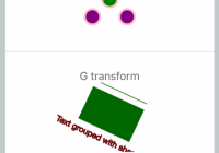
G
The element is a container used to group other SVG elements. Transformations applied to the g element are performed on all of its child elements, and any of its props are inherited by its child elements. It can also group multiple elements to be referenced later with the <Use /> element.
<Svg height="100" width="200" > <G rotation="50" origin="100, 50" > <Line x1="60" y1="10" x2="140" y2="10" stroke="#060" /> <Rect x="60" y="20" height="50" width="80" stroke="#060" fill="#060" /> <Text x="100" y="75" stroke="#600" fill="#600" textAnchor="middle" > Text grouped with shapes</Text> </G> </Svg>
Use
The element can reuse an SVG shape from elsewhere in the SVG document, including elements and elements. The reused shape can be defined inside the <Defs> element (which makes the shape invisible until used) or outside.
<Svg height="100" width="300" > <Defs> <G id="shape"> <G> <Circle cx="50" cy="50" r="50" /> <Rect x="50" y="50" width="50" height="50" /> <Circle cx="50" cy="50" r="5" fill="blue" /> </G> </G> </Defs> <Use href="#shape" x="20" y="0"/> <Use href="#shape" x="170"y="0" /> </Svg>This example shows a element defined inside a <Defs> element. This makes the invisible unless referenced by a element.
Before the element can be referenced, it must have an ID set on it via its id prop. The element references the element via its href prop. Notice the # in front of the ID in the prop value.
The element specifies where to show the reused shapes via its x and y props. Notice that the shapes inside the element are located at 0,0. That is done because their position is added to the position specified in the element.

Symbol
The SVG element is used to define reusable symbols. The shapes nested inside a are not displayed unless referenced by a element.
<Svg height="150" width="110" > <Symbol id="symbol" viewBox="0 0 150 110" width="100" height="50"> <Circle cx="50" cy="50" r="40" strokeWidth="8" stroke="red" fill="red"/> <Circle cx="90" cy="60" r="40" strokeWidth="8" stroke="green" fill="white"/> </Symbol> <Use href="#symbol" x="0" y="0" /> <Use href="#symbol" x="0" y="50" width="75" height="38" /> <Use href="#symbol" x="0" y="100" width="50" height="25" /> </Svg>
Defs
The element is used to embed definitions that can be reused inside an SVG image. For instance, you can group SVG shapes together and reuse them as a single shape.
Image
The element allows a raster image to be included in an Svg componenet.
<Svg height="100" width="100" > <Defs> <ClipPath id="clip"> <Circle cx="50%" cy="50%" r="40%"/> </ClipPath> </Defs> <Rect x="0" y="0" width="100%" height="100%" fill="red" /> <Rect x="5%" y="5%" width="50%" height="90%" /> <Image x="5%" y="5%" width="50%" height="90%" preserveAspectRatio="xMidYMid slice" opacity="0.5" href={require('../image.jpg')} clipPath="url(#clip)" /> <Text x="50" y="50" textAnchor="middle" fontWeight="bold" fontSize="16" fill="blue" >HOGWARTS</Text> </Svg>
ClipPath
The SVG element defines a clipping path. A clipping path is used/referenced using the clipPath property
<Svg height="100" width="100" > <Defs> <RadialGradient id="grad" cx="50%" cy="50%" rx="50%" ry="50%" fx="50%" fy="50%" gradientUnits="userSpaceOnUse"> <Stop offset="0%" stopColor="#ff0" stopOpacity="1" /> <Stop offset="100%" stopColor="#00f" stopOpacity="1" /> </RadialGradient> <ClipPath id="clip"> <G scale="0.9" x="10"> <Circle cx="30" cy="30" r="20"/> <Ellipse cx="60" cy="70" rx="20" ry="10" /> <Rect x="65" y="15" width="30" height="30" /> <Polygon points="20,60 20,80 50,70" /> <Text x="50" y="30" fontSize="32" fonWeight="bold" textAnchor="middle" scale="1.2" >Q</Text> </G> </ClipPath> </Defs> <Rect x="0" y="0" width="100" height="100" fill="url(#grad)" clipPath="url(#clip)" /> </Svg>
LinearGradient
The element is used to define a linear gradient. The element must be nested within a <Defs> tag. The <Defs> tag is short for definitions and contains definition of special elements (such as gradients).
Linear gradients can be defined as horizontal, vertical or angular gradients:
- Horizontal gradients are created when y1 and y2 are equal and x1 and x2 differ
- Vertical gradients are created when x1 and x2 are equal and y1 and y2 differ
- Angular gradients are created when x1 and x2 differ and y1 and y2 differ
<Svg height="150" width="300" > <Defs> <LinearGradient id="grad" x1="0" y1="0" x2="170" y2="0"> <Stop offset="0" stopColor="rgb(255,255,0)" stopOpacity="0" /> <Stop offset="1" stopColor="red" stopOpacity="1" /> </LinearGradient> </Defs> <Ellipse cx="150" cy="75" rx="85" ry="55" fill="url(#grad)" /> </Svg>Code explanation:
- The id prop of the tag defines a unique name for the gradient
- The x1, x2, y1,y2 props of the tag define the start and end position of the gradient
- The color range for a gradient can be composed of two or more colors. Each color is specified with a tag. The offset prop is used to define where the gradient color begin and end
- The fill prop links the ellipse element to the gradient

NOTICE: LinearGradient also supports percentage as prop:
<LinearGradient id="grad" x1="0%" y1="0%" x2="100%" y2="0%"> <Stop offset="0%" stopColor="rgb(255,255,0)" stopOpacity="0" /> <Stop offset="100%" stopColor="red" stopOpacity="1" /> </LinearGradient>This result is same as the example before. But it's recommend to use exact number instead; it has performance advantages over using percentages.
RadialGradient
The element is used to define a radial gradient. The element must be nested within a <Defs> tag. The <Defs> tag is short for definitions and contains definition of special elements (such as gradients).
<Svg height="150" width="300" > <Defs> <RadialGradient id="grad" cx="150" cy="75" rx="85" ry="55" fx="150" fy="75" gradientUnits="userSpaceOnUse"> <Stop offset="0" stopColor="#ff0" stopOpacity="1" /> <Stop offset="1" stopColor="#83a" stopOpacity="1" /> </RadialGradient> </Defs> <Ellipse cx="150" cy="75" rx="85" ry="55" fill="url(#grad)" /> </Svg>Code explanation:
- The id prop of the tag defines a unique name for the gradient
- The cx, cy and r props define the outermost circle and the fx and fy define the innermost circle
- The color range for a gradient can be composed of two or more colors. Each color is specified with a tag. The offset prop is used to define where the gradient color begin and end
- The fill prop links the ellipse element to the gradient

Mask
In SVG, you can specify that any other graphics object or ‘G’ element can be used as an alpha mask for compositing the current object into the background.
A mask is defined with a ‘Mask’ element. A mask is used/referenced using the ‘mask’ property.
A ‘Mask’ can contain any graphical elements or container elements such as a ‘G’.
The element must be nested within a <Defs> tag. The <Defs> tag is short for definitions and contains definition of special elements (such as gradients).
https://www.w3.org/TR/SVG11/images/masking/mask01.svg
<Svg width="100%" height="100%" viewBox="0 0 800 300"> <Defs> <LinearGradient id="Gradient" gradientUnits="userSpaceOnUse" x1="0" y1="0" x2="800" y2="0" > <Stop offset="0" stopColor="white" stopOpacity="0" /> <Stop offset="1" stopColor="white" stopOpacity="1" /> </LinearGradient> <Mask id="Mask" maskUnits="userSpaceOnUse" x="0" y="0" width="800" height="300" > <Rect x="0" y="0" width="800" height="300" fill="url(#Gradient)" /> </Mask> <Text id="Text" x="400" y="200" fontFamily="Verdana" fontSize="100" textAnchor="middle" > Masked text </Text> </Defs> <Rect x="0" y="0" width="800" height="300" fill="#FF8080" /> <Use href="#Text" fill="blue" mask="url(#Mask)" /> <Use href="#Text" fill="none" stroke="black" stroke-width="2" /> </Svg>Code explanation: https://www.w3.org/TR/SVG11/masking.html#MaskElement

Pattern
A pattern is used to fill or stroke an object using a pre-defined graphic object which can be replicated ("tiled") at fixed intervals in x and y to cover the areas to be painted. Patterns are defined using a ‘pattern’ element and then referenced by properties ‘fill’ and ‘stroke’ on a given graphics element to indicate that the given element shall be filled or stroked with the referenced pattern. The element must be nested within a <Defs> tag. The <Defs> tag is short for definitions and contains definition of special elements (such as gradients).
https://www.w3.org/TR/SVG11/images/pservers/pattern01.svg
<Svg width="100%" height="100%" viewBox="0 0 800 400"> <Defs> <Pattern id="TrianglePattern" patternUnits="userSpaceOnUse" x="0" y="0" width="100" height="100" viewBox="0 0 10 10" > <Path d="M 0 0 L 7 0 L 3.5 7 z" fill="red" stroke="blue" /> </Pattern> </Defs> <Rect fill="none" stroke="blue" x="1" y="1" width="798" height="398" /> <Ellipse fill="url(#TrianglePattern)" stroke="black" stroke-width="5" cx="400" cy="200" rx="350" ry="150" /> </Svg>Code explanation: https://www.w3.org/TR/SVG11/pservers.html#PatternElement

Touch Events
Touch events are supported in react-native-svg. These include:
disabledonPressonPressInonPressOutonLongPressdelayPressIndelayPressOutdelayLongPress
You can use these events to provide interactivity to your react-native-svg components.
<Circle cx="50%" cy="50%" r="38%" fill="red" onPress={() => alert('Press on Circle')} />
For more examples of touch in action, checkout the TouchEvents.js examples.
Run example:
git clone https://github.com/magicismight/react-native-svg-example.git cd react-native-svg-example npm i # run Android: react-native run-android # run iOS: react-native run-ios TODO:
- Add Native methods for elements.
- Marker element.
- Filters
Known issues:
- Unable to apply focus point of RadialGradient on Android.


