
React-Darkroom component
See the live demo: http://blog.mmcfarland.net/react-darkroom/
Inspired by a jquery component called "Darkroom.JS" https://mattketmo.github.io/darkroomjs/
View example
Clone the github project first.
npm install && npm start Usage
To use, install via npm first.
npm install react-darkroom --save Clone the github project first.
npm install && npm start Once installed, you can access the different parts of react-darkroom as follows:
import { Darkroom, Canvas, History, Toolbar, FilePicker, CropMenu } from 'react-darkroom'; react-darkroom was built using composition, so it can be modified more easily. However this increases the amount of steps necessary to render the component.
A simple example:
Each component that comes with react-darkroom has some settings you can modify:
Canvas
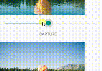
If crop is set to false, then it will not show the crop handles, set crop to true to enable cropping.
source can either be file image or base64 data image.
angle is set to determine rotation of the image.
width and height are used to contrain proportions of an image to a specific rectangle
<Canvas crop={false} source="/myimage.png" angle=0 width=500 height=500> History
History component uses step and length to determine where user is in history, and looks for children with action prop back or next - it also uses the ifEmpty tag to disable or hide the button if user is at beginning or end of history.
<History step={this.state.step} length={this.state.thread.length-1}> <button action="back" onClick={this.onUndo} data-ifEmpty="disable"> Undo </button> <button action="forward" onClick={this.onRedo} data-ifEmpty="disable"> Redo </button> </History>Toolbar
The toolbar goes over each child node and wraps them in a menu ul li tag
<Toolbar> <button id="foo"/> <button id="bar"/> </Toolbar translates to:
<menu class="darkroom-toolbar"> <ul> <li key=0><button id="foo"/></li> <li key=0><button id="bar"/></li> </ul> </menu> FilePicker
Filepicker can be used to upload files, but not needed, it is used in the kitchensink demo.
<FilePicker hasFile={hasFile} onChange={this.onFileChange}/> CropMenu
To add crop functionality, you can create a cropmenu, the buttons can be configured to showOnlyWhen a value of croppingIsOff or croppingIsOn. The CropMenu is entirely optional, and you can create your own composition for the crop menu if you choose.
<CropMenu isCropping={crop}> <button disabled={!hasFile} data-showOnlyWhen='croppingIsOff' onClick={this.onCropStart} data-tipsy="Crop" className="tipsy tipsy--sw"> <span className="icon icon-crop"/> </button> <button disabled={!hasFile} data-showOnlyWhen='croppingIsOn' style={{color: 'cyan'}}> <span className="icon icon-crop"/> </button> <button disabled={!hasFile} data-showOnlyWhen='croppingIsOn' onClick={this.onCropConfirm} style={{color: 'green'}} data-tipsy="Confirm" className="tipsy tipsy--sw"> <span className="icon icon-checkmark"/> </button> <button disabled={!hasFile} data-showOnlyWhen='croppingIsOn' onClick={this.onCropCancel} style={{color: 'red'}} data-tipsy="Cancel" className="tipsy tipsy--sw"> <span className="icon icon-cross"/> </button> </CropMenu> Example Component
<Darkroom> <Toolbar> <button onClick={selectFile} data-tipsy="Select Image" className="tipsy tipsy--s"> <span className="icon icon-image"/> <input type="file" ref="fileselect" onChange={this.onFileChange} style={{display: 'none'}}/> </button> <History step={this.state.step} length={this.state.thread.length-1}> <button action="back" onClick={this.onUndo} ifEmpty="disable" data-tipsy="Undo" className="tipsy tipsy--sw"> <span className="icon icon-undo2"/> </button> <button action="forward" onClick={this.onRedo} ifEmpty="disable" data-tipsy="Redo" className="tipsy tipsy--sw"> <span className="icon icon-redo2"/> </button> </History> <button disabled={!hasFile} onClick={this.onRotateLeft} data-tipsy="Rotate Left" className="tipsy tipsy--sw"> <span className="icon icon-undo"/> </button> <button disabled={!hasFile} onClick={this.onRotateRight} data-tipsy="Rotate Right" className="tipsy tipsy--sw"> <span className="icon icon-redo"/> </button> <CropMenu isCropping={crop}> <button disabled={!hasFile} data-showOnlyWhen='croppingIsOff' onClick={this.onCropStart} data-tipsy="Crop" className="tipsy tipsy--sw"> <span className="icon icon-crop"/> </button> <button disabled={!hasFile} data-showOnlyWhen='croppingIsOn' style={{color: 'cyan'}}> <span className="icon icon-crop"/> </button> <button disabled={!hasFile} data-showOnlyWhen='croppingIsOn' onClick={this.onCropConfirm} style={{color: 'green'}} data-tipsy="Confirm" className="tipsy tipsy--sw"> <span className="icon icon-checkmark"/> </button> <button disabled={!hasFile} data-showOnlyWhen='croppingIsOn' onClick={this.onCropCancel} style={{color: 'red'}} data-tipsy="Cancel" className="tipsy tipsy--sw"> <span className="icon icon-cross"/> </button> </CropMenu> <button disabled={!hasFile} onClick={this.onSave} data-tipsy="Save" className="tipsy tipsy--sw"> <span className="icon icon-floppy-disk"/> </button> </Toolbar> <Canvas ref="canvasWrapper" crop={crop} source={source} angle={angle} width={canvasWidth} height={canvasHeight}> <FilePicker hasFile={hasFile} onChange={this.onFileChange}/> </Canvas> </Darkroom> State
Component state is managed by you, and each of the different sub-components that react-component comes with are considered "dumb" components, so you have to explicitly define and update each component.
Changelog
0.3
- Remove gulp
- Reduce Dependency amount
- Update all dependencies to latest.
- Implement CI system
0.2.0-2
- Expose utils to components list
- Update build pipeline to transpile es6 to es5
- add example to cloud9 ide


