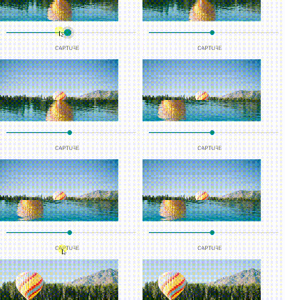
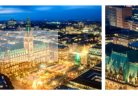
react-image-magnify
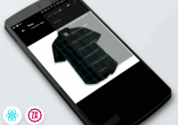
A responsive React image zoom component for touch and mouse.
Designed for shopping site product detail.
Features Include:
- In-place and side-by-side image enlargement
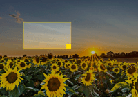
- Positive or negative space guide lens options
- Interaction hint
- Configurable enlarged image dimensions
- Optional enlarged image external render
- Hover intent
- Long-press gesture
- Fade transitions
- Basic react-slick carousel support
Status
Demo
Please visit the react-image-magnify demo site
Experiment with react-image-magnify live on CodePen. Use the Change View button to select editing mode or for different layout options. Use the Fork button to save your changes.
Installation
npm install react-image-magnifyUsage
If you are upgrading from v1x to v2x, please see the release notes.
import ReactImageMagnify from 'react-image-magnify'; ... <ReactImageMagnify {...{ smallImage: { alt: 'Wristwatch by Ted Baker London', isFluidWidth: true, src: watchImg300 }, largeImage: { src: watchImg1200, width: 1200, height: 1800 } }} /> ...See more usage examples in the example project.
Required Props
| Prop | Type | Default | Description |
|---|---|---|---|
| smallImage | Object | N/A | Small image information. See Small Image below. |
| largeImage | Object | N/A | Large image information. See Large Image below. |
Optional Styling Props
| Prop | Type | Default | Description |
|---|---|---|---|
| className | String | N/A | CSS class applied to root container element. |
| style | Object | N/A | Style applied to root container element. |
| imageClassName | String | N/A | CSS class applied to small image element. |
| imageStyle | Object | N/A | Style applied to small image element. |
| lensStyle | Object | N/A | Style applied to tinted lens. |
| enlargedImageContainerClassName | String | N/A | CSS class applied to enlarged image container element. |
| enlargedImageContainerStyle | Object | N/A | Style applied to enlarged image container element. |
| enlargedImageClassName | String | N/A | CSS class applied to enlarged image element. |
| enlargedImageStyle | Object | N/A | Style applied to enlarged image element. |
Optional Interaction Props
| Prop | Type | Default | Description |
|---|---|---|---|
| fadeDurationInMs | Number | 300 | Milliseconds duration of magnified image fade in/fade out. |
| hoverDelayInMs | Number | 250 | Milliseconds to delay hover trigger. |
| hoverOffDelayInMs | Number | 150 | Milliseconds to delay hover-off trigger. |
| isActivatedOnTouch | Boolean | false | Activate magnification immediately on touch. May impact scrolling. |
| pressDuration | Number | 500 | Milliseconds to delay long-press activation (long touch). |
| pressMoveThreshold | Number | 5 | Pixels of movement allowed during long-press activation. |
Optional Behavioral Props
| Prop | Type | Default | Description |
|---|---|---|---|
| enlargedImagePosition | String | beside (over for touch) | Enlarged image placement. Can be 'beside' or 'over'. |
| enlargedImageContainerDimensions | Object | {width: '100%', height: '100%'} | Specify enlarged image container dimensions as an object with width and height properties. Values may be expressed as a percentage (e.g. '150%') or a number (e.g. 200). Percentage is based on small image dimension. Number is pixels. Not applied when enlargedImagePosition is set to 'over', the default for touch input. |
| enlargedImagePortalId | String | N/A | Render enlarged image into an HTML element of your choosing by specifying the target element id. Requires React v16. Ignored for touch input by default - see isEnlargedImagePortalEnabledForTouch. |
| isEnlargedImagePortalEnabledForTouch | Boolean | false | Specify portal rendering should be honored for touch input. |
| hintComponent | Function | (Provided) | Reference to a component class or functional component. A Default is provided. |
| shouldHideHintAfterFirstActivation | Boolean | true | Only show hint until the first interaction begins. |
| isHintEnabled | Boolean | false | Enable hint feature. |
| hintTextMouse | String | Hover to Zoom | Hint text for mouse. |
| hintTextTouch | String | Long-Touch to Zoom | Hint text for touch. |
| shouldUsePositiveSpaceLens | Boolean | false | Specify a positive space lens in place of the default negative space lens. |
| lensComponent | Function | (Provided) | Specify a custom lens component. |
Small Image
{ src: String, (required) srcSet: String, sizes: String, width: Number, (required if isFluidWidth is not set) height: Number, (required if isFluidWidth is not set) isFluidWidth: Boolean, (default false) alt: String, onLoad: Function, onError: Function } For more information on responsive images, please try these resources:
Responsive Images 101
Responsive Images - The srcset and sizes Attributes
Large Image
{ src: String, (required) srcSet: String, sizes: String, width: Number, (required) height: Number, (required) alt: String, (defaults to empty string) onLoad: Function, onError: Function } Support
Please open an issue.
Example Project
git clone https://github.com/ethanselzer/react-image-magnify.git cd react-image-magnify npm install npm run build cd example yarn yarn start If your default browser does not start automatically, open a new browser window and go to localhost:3000
Development
git clone https://github.com/ethanselzer/react-image-magnify.git cd react-image-magnify npm install npm run #See available commands The Example Project may be used in development.
To rebuild the source automatically when changes are made, run yarn run build-watch.
Contributing
Please contribute using Github Flow. Create a branch, add commits, and open a pull request.
Attribution
Thanks to the following community members for opening Issues and Pull Requests.
@damien916
@colepatrickturner
@andreatosatto90
@nathanziarek
@hombrew
@smashercosmo
@sk1e
@vidries
@ionutzp
@sbloedel
@spiderbites
@Akarshit
@eddy20vt
@evannoronha
@benjaminadk
@nilsklimm
@m4recek
@yaser-ali-vp
@carlgunderson
@tojvan
@kskonecka
@Coriou
You are awesome!
License
MIT
