react-lazy-card
A lighweight image lazy-loading component written in React


It supports both manual and automatic image lazy-loading.
Demo is available here.
Installation
npm install --save react-lazy-card Basic Usage
JSX:
import LazyCard from 'react-lazy-card'; <LazyCard image="b.jpg" autoLoad={true} defaultImage="default2.jpg">Text 2</LazyCard>CSS
@import "react-lazy-card/dist/slide"Options
| prop | default | description |
|---|---|---|
| className | string | custom classname for lazy-card component |
| image | string | final image to be loaded |
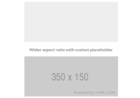
| defaultImage | string | pre-loader image to be shown |
| autoLoad | false | should the component automatically lazyLoad the image |
| attributes | {} | Additional attributes for component root |
| title | '' | serves like alt attribute for img tag |
| lazyLoad | true | enable/disable lazy load |
.load()
If autoload is set to false the you have to manually call .load() to load the image
// This will not load `image` automatically. Will load default1.jpg const a = <LazyCard image="a.jpg" defaultImage="default1.jpg">Text 1</LazyCard> a.load() // now image will be loaded // Alternatively set `autoLoad` to true. So `a.jpg` will automatically replace // default1.jpg when it is loaded. <LazyCard image="a.jpg" defaultImage="default1.jpg" autoLoad={true}>Text 1</LazyCard>Development
git clone https://github.com/housinghq/react-lazy-card cd react-lazy-card npm install npm run storybook Open an issue before opening a PR. This package is optimised for mobile so its hard to include all the features.
###License MIT @ Loconsolutions


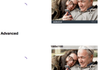


