react-medium-image-zoom


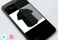
This library is a different implementation of Medium.com's image zoom that allows for a low-res and high-res images to work together for “zooming” effects and works regardless of parent elements that have overflow: hidden or parents with transform properties. Versions >=3.0.0 are compatible with React.js >=16.x; if you need compatibility with react@^0.14.0 || ^15.0.0, please use version 2.x.
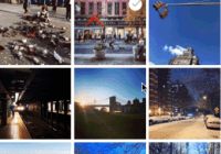
You can view the demo here.

Installation
$ npm install --save react-medium-image-zoom Usage
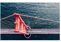
import ImageZoom from 'react-medium-image-zoom' function MyComponent(props) { return ( <div> <p>Some text...</p> <ImageZoom image={{ src: 'bridge.jpg', alt: 'Golden Gate Bridge', className: 'img', style: { width: '50em' } }} zoomImage={{ src: 'bridge-big.jpg', alt: 'Golden Gate Bridge' }} /> <p>Some text...</p> </div> ) }| Prop | Type | Required | Default | Details |
|---|---|---|---|---|
image | object | yes | none | The original image |
zoomImage | object | no | image | The image to be used for zooming |
zoomMargin | number | no | 40 | Pixel number to offset zoomed image from the window |
isZoomed | boolean | no | false | For more direct control over the zoom state |
shouldHandleZoom | func | no | (event) => true | Pass this callback to intercept a zoom click event and determine whether or not to zoom. Function must return a truthy or falsy value |
shouldReplaceImage | boolean | no | true | Once the image has been "zoomed" and downloaded the larger image, this replaces the original image with the zoomImage |
shouldRespectMaxDimension | boolean | no | false | When true, don't make the zoomed image's dimensions larger than the original dimensions. Only supported if no zoomImage is provided. Will also disable the zooming if the image's is already rendered at its maximum width & height |
defaultStyles | object | no | {} | For fine-grained control over all default styles (zoomContainer, overlay, image, zoomImage) |
onZoom | func | no | () => {} | Pass this callback to respond to a zoom interaction. |
onUnzoom | func | no | () => {} | Pass this callback to respond to an unzoom interaction. |
Each one of these image props accepts normal image props, for example:
| Prop | Type | Required | Details |
|---|---|---|---|
src | string | yes | The source for the image |
alt | string | no | The alt text for the image |
className | string | no | Classes to apply to the image |
style | object | no | Additional styles to apply to the image |
| ... | ... | no | ... |
Controlled vs Uncontrolled Modes
Similar to how an <input /> works in React, if the consumer initially chooses to control the isZoomed value, then this means the consumer is now responsible for telling the component the value of isZoomed. If the consumer instantiates the component with a non-null isZoomed value and subsequently does not pass a value for it on updates, then an error will be thrown notifying the consumer that this is a controlled component.
The reverse is true, as well. If the component is instantiated without an isZoomed value, then the component will handle its own isZoomed state. If a non-null isZoomed prop is passed after instantiation, then an error will be thrown notifying the consumer that this component controls its own state.
Browser Support
Currently, this has only been tested on the latest modern browsers. Pull requests are welcome.
Development
The source code is located within the src directory. Use $ npm run build to build the main file as well as the example during development and/or use $ npm run dev to have it watch for changes to src/ and example/src.
You can view the built example as a file via $ open example/build/index.html, or you can use $ npm run dev to start a local dev server and navigate to http://localhost:3000.
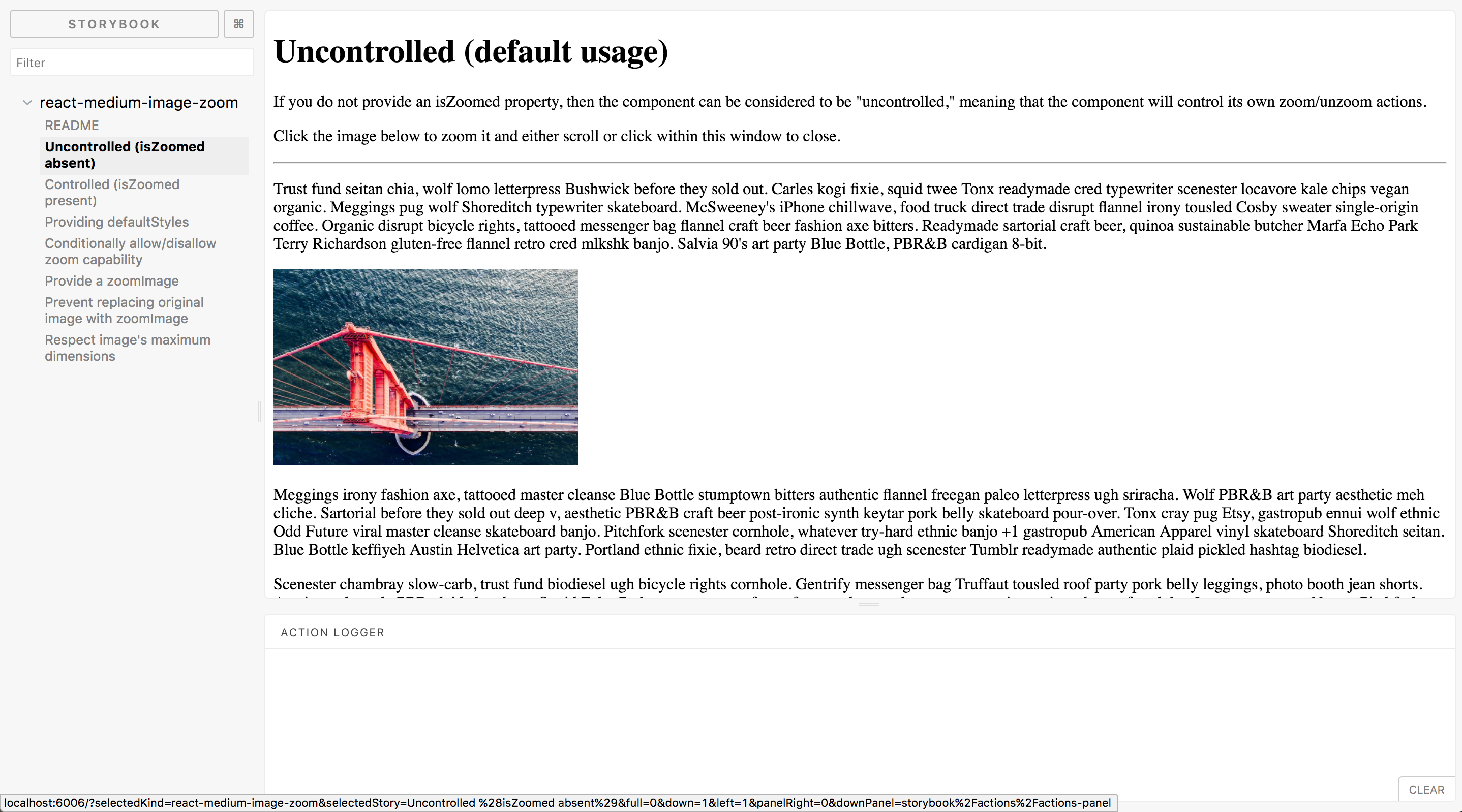
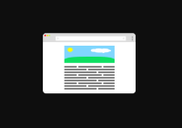
Storybook
This project's different options and use cases are documented in storybook. You can use this in dev like so:
$ yarn run storybook(or$ npm run storybook)- navigate to http://localhost:6006
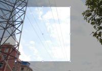
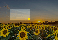
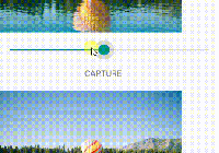
The page should look like this:
Contributing
- Check out the issues
- Fork this repository
- Clone your fork
- Check out a feature branch (
$ git checkout -b my-feature) - Make your changes
- Run
$ yarn run buildto compile your changes and build the example - Test your example (see the "Development" section above)
- Push your branch to your GitHub repo
- Create a pull request from your branch to this repo's
X-0-stablebranch (whereXis the correct major version you're targeting) - When all is merged, pull down the upstream changes to your master
$ git remote add upstream [email protected]:rpearce/react-medium-image-zoom.git$ git fetch upstream$ git merge upstream/master
- Delete your feature branch
Contributors
Thanks goes to these wonderful people (emoji key):
This project follows the all-contributors specification. Contributions of any kind welcome!


