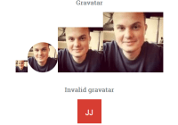
react-avatar
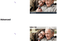
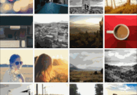
Demo
Demo website
Install
npm i react-avatar-edit
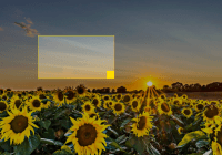
Usage
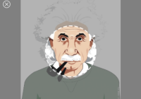
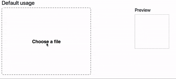
import React from 'react' import ReactDOM from 'react-dom' import Avatar from 'react-avatar-edit' class App extends React.Component { constructor(props) { super(props) const src = './example/einshtein.jpg' this.state = { preview: null, src } this.onCrop = this.onCrop.bind(this) this.onClose = this.onClose.bind(this) this.onBeforeFileLoad = this.onBeforeFileLoad.bind(this) } onClose() { this.setState({preview: null}) } onCrop(preview) { this.setState({preview}) } onBeforeFileLoad(elem) { if(elem.target.files[0].size > 71680){ alert("File is too big!"); elem.target.value = ""; }; } render () { return ( <div> <Avatar width={390} height={295} onCrop={this.onCrop} onClose={this.onClose} onBeforeFileLoad={this.onBeforeFileLoad} src={this.state.src} /> <img src={this.state.preview} alt="Preview" /> </div> ) } } ReactDOM.render(<App /> , document.getElementById('root'))Component properties
| Prop | Type | Description |
|---|---|---|
| img | Image | The Image object to display |
| src | String/Base64 | The url to base64 string to load (use urls from your domain to prevent security errors) |
| width | Number | The width of the editor |
| height | Number | The height of the editor (image will fit to this height if neither imageHeight, nor imageWidth is set) |
| imageWidth | Number | The desired width of the image, can not be used together with imageHeight |
| imageHeight | Number | The desired height of the image, can not be used together with imageWidth |
| cropRadius | Number | The crop area radius in px (default: calculated as min image with/height / 3) |
| cropColor | String | The crop border color (default: white) |
| lineWidth | Number | The crop border width (default: 4) |
| minCropRadius | Number | The min crop area radius in px (default: 30) |
| backgroundColor | Sting | The color of the image background (default: white) |
| closeIconColor | String | The close button color (default: white) |
| shadingColor | String | The shading color (default: grey) |
| shadingOpacity | Number | The shading area opacity (default: 0.6) |
| mimeTypes | String | The mime types used to filter loaded files (default: image/jpeg,image/png) |
| label | String | Label text (default: Choose a file) |
| labelStyle | Object | The style object for preview label (use camel case for css properties fore example: fontSize) |
| borderStyle | Object | The style for object border preview (use camel case for css properties fore example: fontSize) |
| onImageLoad(image) | Function | Invoked when image based on src prop finish loading |
| onCrop(image) | Function | Invoked when user drag&drop event stop and return croped image in base64 sting |
| onBeforeFileLoad(file) | Function | Invoked when user before upload file with internal file loader (etc. check file size) |
| onFileLoad(file) | Function | Invoked when user upload file with internal file loader |
| onClose() | Function | Invoked when user clicks on close editor button |
Contributing
- To start developer server please use
npm run start - To build production bundle use
npm run build


