Material UI Image
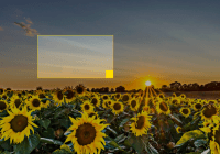
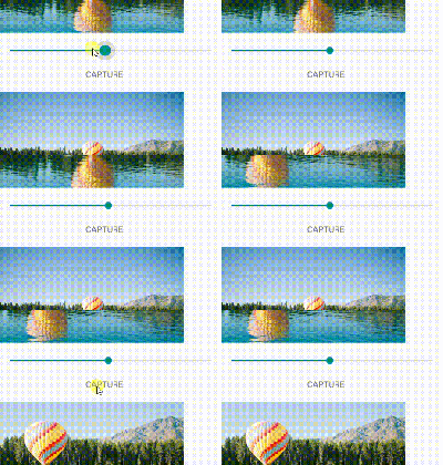
Images are ugly until they're loaded. Materialize it with material image! It will fade in like the material image loading pattern suggests.
Installation
npm install material-ui-imageNote: This is the version for Material-UI 1.0.0-rc.0 or later. If you are using Material-UI 1.0.0-beta, you should update to the latest version. If you are still using Material-UI 0.x, you can use our legacy version.
Usage
Use this component just like a regular img tag.
import Image from 'material-ui-image' // ... render() { return ( <div> <Image src="http://loremflickr.com/300/200" /> </div> ) }Material UI Image Properties
| Name | Type | Default | Description |
|---|---|---|---|
| animationDuration | number | 3000 | Duration of the fading animation, in milliseconds. |
| aspectRatio | float | (1/1) | Specifies the aspect ratio of the image. |
| color | string | white | Override the background color. |
| disableError | bool | false | Disables the error icon if set to true. |
| disableSpinner | bool | false | Disables the loading spinner if set to true. |
| disableTransition | bool | false | Disables the transition if set to true. |
| errorIcon | node | Override the error icon. | |
| iconContainerStyle | object | Override the inline-styles of the container that contains the loading spinner and the error icon. | |
| imageStyle | object | { width: 'inherit', height: 'inherit' } | Override the inline-styles of the image. |
| loading | node | Override the loading component. | |
| onClick | func | Fired when the user clicks on the image happened. | |
| src* | string | Specifies the URL of an image. | |
| style | object | Override the inline-styles of the root element. |
* required property
All other props are passed through to the underlying img element after the image is loaded.
License
The files included in this repository are licensed under the MIT license.


