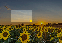
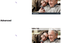
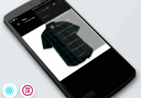
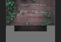
#react-crop# An accessible image cropper where the image is stationary and a resizable, draggable box represents the cropped image
For example usage check out the docs folder. Demo: http://instructure-react.github.io/react-crop/
###Basic usage###
import React, { Component } from 'react'; import Cropper from 'react-crop'; import 'react-crop/css'; // You'll need to use async functions import "babel-core/register"; import "babel-polyfill"; export default class MyComponent extends Component { constructor() { super(); this.state = { image: null, previewImage: null }; } onChange(evt) { this.setState({ image: evt.target.files[0] }) } async crop() { let image = await this.refs.crop.cropImage() this.setState({ previewUrl: window.URL.createObjectURL(image) }) } clear() { this.refs.file.value = null this.setState({ previewUrl: null, image: null }) } imageLoaded(img) { if (img.naturalWidth && img.naturalWidth < 262 && img.naturalHeight && img.naturalHeight < 147) { this.crop() } } render() { return ( <div> <input ref='file' type='file' onChange={this.onChange} /> { this.state.image && <div> <Cropper ref='crop' image={this.state.image} width={100} height={80} onImageLoaded={this.imageLoaded} /> <button onClick={this.crop}>Crop</button> <button onClick={this.clear}>Clear</button> </div> } { this.state.previewUrl && <img src={this.state.previewUrl} /> } </div> ); } }###Props###
####width#### This is the desired width that you would like the image to be cropped to. The width of the cropper will be scaled to fit this size. This prop also helps determine the minimum width that the cropper can be.
####height#### This is the desired height that you would like the image to be cropped to. The height of the cropper will be scaled to fit this size. This prop also helps determine the minimum height that the cropper can be. The width and height aspect ratio will be preserved while resizing the cropper.
####image#### A blob of the original image that you wish to crop.
####widthLabel#### The label to use next to the width input used for keyboard users. This is especially useful if you need to localize the text. The default is "Width".
####heightLabel#### The label to use next to the height input used for keyboard users. This is especially useful if you need to localize the text. The default is "Height".
####offsetXLabel#### The label to use next to the offset X input used for keyboard users. This is especially useful if you need to localize the text. The default is "Offset X".
####offsetYLabel#### The label to use next to the offset Y input used for keyboard users. This is especially useful if you need to localize the text. The default is "Offset Y".
###Running the Example###
- Clone the repo
npm inpm run docs- Visit
localhost:8080


