react-easy-crop
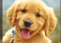
A React component to crop images with easy interactions
Demo
Check out the examples:
- Basic example with hooks
- Basic example with class
- Example with output of the cropped image
- Example with image selected by the user
- Example with round crop area and no grid
- Example without restricted position
- Example with crop saved/loaded to/from local storage
Features
- Supports drag and zoom interactions
- Provides crop dimensions as pixels and percentages
- Supports any images format (JPEG, PNG, even GIF) as url or base 64 string
- Mobile friendly
Installation
yarn add react-easy-cropor
npm install react-easy-crop --saveBasic usage
The Cropper is styled with
position: absoluteto take the full space of its parent. Thus, you need to wrap it with an element that usesposition: relativeor the Cropper will fill the whole page.
import Cropper from 'react-easy-crop' class App extends React.Component { state = { image: 'your-image-url or as base64', crop: { x: 0, y: 0 }, zoom: 1, aspect: 4 / 3, } onCropChange = crop => { this.setState({ crop }) } onCropComplete = (croppedArea, croppedAreaPixels) => { console.log(croppedArea, croppedAreaPixels) } onZoomChange = zoom => { this.setState({ zoom }) } render() { return ( <Cropper image={this.state.image} crop={this.state.crop} zoom={this.state.zoom} aspect={this.state.aspect} onCropChange={this.onCropChange} onCropComplete={this.onCropComplete} onZoomChange={this.onZoomChange} /> ) } }Props
| Prop | Type | Required | Description |
|---|---|---|---|
image | string | ✓ | The image to be cropped. |
crop | { x: number, y: number } | ✓ | Position of the image. { x: 0, y: 0 } will center the image under the cropper. |
zoom | number | Zoom of the image between minZoom and maxZoom. Defaults to 1. | |
rotation (experimental) | number (in degrees) | Rotation of the image. Defaults to 0. Experimental for now because the output crop area might not be correct when rotation is used. I need to build a proper demo first. | |
aspect | number | Aspect of the cropper. The value is the ratio between its width and its height. The default value is 4/3 | |
minZoom | number | Minimum zoom of the image. Defaults to 1. | |
maxZoom | number | Maximum zoom of the image. Defaults to 3. | |
cropShape | 'rect' | 'round' | Shape of the crop area. Defaults to 'rect'. | |
cropSize | { width: number, height: number } | Size of the crop area (in pixels). If you don't provide it, it will be computed automatically using the aspect prop and the image size. Warning: this cannot be changed once the component is displayed. If you need to change it (based on some user inputs for instance), you can force the component to be reset by using a key. | |
showGrid | boolean | Whether to show or not the grid (third-lines). Defaults to true. | |
zoomSpeed | number | Multiplies the value by which the zoom changes. Defaults to 1. | |
crossOrigin | string | Allows setting the crossOrigin attribute on the image. | |
onCropChange | Function | ✓ | Called everytime the crop is changed. Use it to update your crop state. |
onZoomChange | Function | Called everytime the zoom is changed. Use it to update your zoom state. | |
onCropComplete | Function | Called when the user stops moving the image or stops zooming. It will be passed the corresponding cropped area on the image in percentages and pixels | |
onImgError | Function | Called when error occurs while loading an external image | |
style | { containerStyle: object, imageStyle: object, cropAreaStyle: object } | Custom styles to be used with the Cropper. Styles passed via the style prop are merged with the defaults. | |
classes | { containerClassName: string, imageClassName: string, cropAreaClassName: string } | Custom class names to be used with the Cropper. Classes passed via the classes prop are merged with the defaults. | |
restrictPosition | boolean | Whether the position of the image should be restricted to the boundaries of the cropper. Useful setting in case of zoom < 1 or if the cropper should preserve all image content while forcing a specific aspect ratio for image throughout the application. Example: https://codesandbox.io/s/1rmqky233q. | |
initialCroppedAreaPixels | { width: number, height: number, x: number, y: number} | Use this to set the initial crop position/zoom of the cropper (for example, when editing a previously cropped image). The value should be the same as the croppedAreaPixels passed to onCropComplete Example: https://codesandbox.io/s/pmj19vp2yx. | |
onInteractionStart | Function | Called everytime a user starts a wheel, touch or mousedown event. | |
onInteractionEnd | Function | Called everytime a user ends a wheel, touch or mousedown event. |
onCropComplete(croppedArea, croppedAreaPixels)
This callback is the one you should use to save the cropped area of the image. It's passed 2 arguments:
croppedArea: coordinates and dimensions of the cropped area in percentage of the image dimensioncroppedAreaPixels: coordinates and dimensions of the cropped area in pixels.
Both arguments have the following shape:
const area = { x: number, // x/y are the coordinates of the top/left corner of the cropped area y: number, width: number, // width of the cropped area height: number, // height of the cropped area }Development
yarn yarn startNow, open http://localhost:3001/index.html and start hacking!
License
Contributors
Thanks goes to these wonderful people (emoji key):
Valentin Hervieu | Juntae Kim | tafelito | Nicklas | Kyle Poole | Nathaniel Bibler | TheRealSlapshot |
Claudiu Andrei | MattyBalaam | Christian Kehr | Christopher Albanese |
This project follows the all-contributors specification. Contributions of any kind welcome!
