Fluid Transitions for React Navigation


Introduction
This project aims to implement a simple yet powerful set of constructs for building fluid transitions between elements when navigating with React Navigation.
The library is JavaScript only - no linking required.

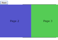
The library implements a new navigator component called FluidNavigator with the same interface and routing configuration as the StackNavigator. The library has a component called Transition which can be used to build different types of transitions that will automatically be run when navigating between screens using the regular navigation actions.
The Navigator's API is identical to the StackNavigator except that it does not support a header component. It can easily be integrated with redux and your existing navigation setups.
Medium article
React Native Animation Challenge #1
Installation
To install the library into your project, run yarn or npm:
yarn add react-navigation-fluid-transitions
or
npm i -S react-navigation-fluid-transitions
Compatible versions with react-navigation:
| react-navigation-fluid-transitions | react-navigation |
|---|---|
| 0.3.x | 3.x |
| 0.2.x | 2.x |
| 0.1.x | 1.x |
Future improvements and development will be on [email protected].
Examples
Examples are included in the project and should be runnable from the root of the project folder.
To start the example run the following commands from the terminal:
npm i or yarn
To start the project run
react-native run-ios or react-native run-android
Shared Element Transitions
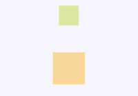
This example shows how two elements can be set up to automatically transition between each other when navigating between screens. A more detailed edition of this example can be found in the file SharedElements.js.
Note that a shared transition happens between two elements that looks the same. The library animates position and scale between the two hence using different styles and content between the two elements will result in strange transitions.
const Screen1 = (props) => ( <View style={styles.container}> <Text>Screen 1</Text> <View style={styles.screen1}> <Transition shared='circle'> <View style={styles.circle}/> </Transition> </View> <Button title='Next' onPress={() => props.navigation.navigate('screen2')} /> </View> ); const Screen2 = (props) => ( <View style={styles.container}> <Text>Screen 2</Text> <View style={styles.screen2}> <Transition shared='circle'> <View style={styles.circle2}/> </Transition> </View> <Button title='Back' onPress={() => props.navigation.goBack()} /> </View> ); const Navigator = createFluidNavigator({ screen1: { screen: Screen1 }, screen2: { screen: Screen2 }, }); Transitions
The library also supports transitions for elements wrapped in the Transition component. You can provide appear/disappear transitions that will be animated during navigation.
The Transition element supports appear and disappear transitions (appear will be used if disappear is not set), and these can either be one of the predefined transitions - or functions where you provide your own transitions.
<Transition appear='scale' disappear='bottom'> <View style={styles.circle}/> </Transition>Transition Types
| Name | Description |
|---|---|
| scale | Scales the element in and out |
| top | Translates the element in/out from the top of the screen |
| bottom | Translates the element in/out from the bottom of the screen |
| left | Translates the element in/out from the left of the screen |
| right | Translates the element in/out from the right of the screen |
| horizontal | Translates the element in/out from the left/right of the screen |
| vertical | Translates the element in/out from the top/bottom of the screen |
| flip | Flips the element in/out |
Custom transitions
It is easy to provide custom transitions - just add the transition function to your component's appear or disappear property. The following example creates a transition that will scale in from 88 times the original size of the wrapped component:
<Transition appear={myCustomTransitionFunction}> <View style={styles.circle}/> </Transition> myCustomTransitionFunction = (transitionInfo) => { const { progress, start, end } = transitionInfo; const scaleInterpolation = progress.interpolate({ inputRange: [0, start, end, 1], outputRange: [88, 80, 1, 1], }); return { transform: [{ scale: scaleInterpolation }] }; }Read more about the parameters and functionality for building custom transitions.
Native driver support
For achieving the best experience it's vital to get rid of JS evaluation during animation run. React-native Animated API allows for scaling in both axis using native drivers, but it's not possible to resize width and height (which calls for a layout computation). Thus the native driver is used only when the ratio of source and target component are the same and it's recommended for the best quality of animations.
API
Credit
Some of the concepts in the library builds on ideas from @lintonye's pull request and suggestion found here: Shared element transition #941.
Contributors
Christian Falch (@chrfalch), Yuuki Arisawa (@uk-ar), Joe Goodall (@joegoodall1), sonaye, David Chavez, muhaimincs, KingTayTay, pedrobullo, Nathan James, Filip Engberg, DadImScared, fabriziogiordano, kelset, rewieer, Dan Alloway, Alexander Zizzo, Monica He, Avi Patel, Julian Hundeloh, Luong Dang Hai, Peter Henderson
Sponsors
Fram X - a cross platform app company from Norway.


