React Rebound
A spring-based React animation library that animates elements directly in the DOM for maximum performance. Hooks and component-based API available. Spring physics are based on rebound.
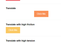
Check out some demos here.
The useAnimation hook
useAnimation takes a “ref” to the element you want to animate, and an object containing the end values for the spring animation.
import {useAnimation} from 'react-rebound'; function Example() { const [hovered] = React.useState(false); const ref = React.useRef(); // A little “pop” on hover useAnimation(ref, {scaleX: hovered ? 1.1 : 1, scaleY: hovered ? 1.1 : 1}); return ( <button ref={ref} onMouseEnter={() => setHovered(true)} onMouseLeave={() => setHovered(false)}> Hover Me </button> ); }The Animate component
The Animate component wraps the DOM element you want to animate. It takes the end values for the spring animation as props.
import {Animate} from 'react-rebound'; function Example() { const [hovered] = React.useState(false); return ( <Animate scaleX={hovered ? 1.1 : 1} scaleY={hovered ? 1.1 : 1}> <button onMouseEnter={() => setHovered(true)} onMouseLeave={() => setHovered(false)}> Hover Me </button> </Animate> ); }Configuring springs
You can configure the tension and friction for the spring that’s driving the animation. Use props on Animate, and a third parameter to useAnimation.
A delay parameter is also available. It defers the animation by the specified number of milliseconds. This is useful for cascading animations.
// Using useAnimation useAnimation(ref, {translateX: clicked ? 200 : 0}, {tension: 200, friction: 400, delay: 100}); <button ref={ref}>Click Me</button> // Using Animate <Animate translateX={clicked ? 200 : 0} tension={200} friction={400} delay={100}> <button>Click Me</button> </Animate>Animating colors
You can animate between two colors by representing colors as RGB(A) arrays. See Supported properties for the list of color properties supported.
<Animate color={hovered ? [238, 85, 34] : [0, 0, 0]}> <a href="#">Hover Me</a> </Animate>Render function with animating parameter
Sometimes it’s useful to render children differently during animations. To do that, provide a function as the only child. The function takes one parameter, a boolean that tells you whether an animation is in progress.
This option is only avaliable with the Animate component. If you’re using the useAnimation hook, use start and end callbacks.
<Animate scaleX={expanded ? 3 : 1} scaleY={expanded ? 3 : 1}> {animating => <img style={{zIndex: expanded || animating ? 1 : 0}} />} </Animate>Start and end callbacks
In complex situations it might be useful to be notified when an animation starts or ends. useCallback and Animate provide two callbacks: onStart and onEnd.
// Using useAnimation useAnimation( ref, {scaleX: expanded ? : 5 : 1, scaleY: expanded ? 5 : 1}, {onStart: onExpandStart, onEnd: onExpandEnd}, ); // Using Animate <Animate scaleX={expanded ? 5 : 1} scaleY={expanded ? 5 : 1} onStart={onExpandStart} onEnd={onExpandEnd}> <img /> </Animate>Animating on first render
To animate an element in on mount, first render with the initial value, then trigger an animation using componentDidMount or useEffect:
// Using useAnimation const ref = React.useRef(); const [visible, setVisible] = React.useState(false); React.useEffect(() => setVisible(true), []); useAnimation(ref, {opacity: visible ? 1 : 0}); <button ref={ref}>Hover Me</button>; // Using Animate const [visible, setVisible] = React.useState(false); React.useEffect(() => setVisible(true), []); <Animate opacity={visible ? 1 : 0}> <button>Hover Me</button> </Animate>;Setting initial values
Spring animations should always start from their previous value: this is why with react-rebound you only specify the end value of the animation.
In some special cases, it might be necessary to override the start value. You have two options:
- Use the
setCurrentValueimperative API (see Setting current values and velocity). - Render with an initial value and
animate={false}, then render again with your end value andanimate={true}.
// Using useAnimation const [visible, setVisible] = React.useState(false); const instantHide = React.useCallback(() => setVisible(false)); const fadeIn = React.useCallback(() => setVisible(true)); useAnimation(ref, {opacity: visible ? 1 : 0}, {animate: visible}); <button ref={ref}>Hover Me</button>; // Using Animate const [visible, setVisible] = React.useState(false); const instantHide = React.useCallback(() => setVisible(false)); const fadeIn = React.useCallback(() => setVisible(true)); <Animate opacity={visible ? 1 : 0} animate={visible}> <button>Hover Me</button> </Animate>;Setting current values and velocity
useAnimation returns an object containing all the Rebound springs, indexed by property name. This gives you full control if you need it, including the option of calling setCurrentValue and setVelocity on the springs directly. This is useful for swipes and drags, where you want to override the spring animation while dragging, and preserve velocity when the drag ends.
const ref = React.useRef(); const springs = useAnimation(ref, {translateX: restingPosition}); const onSwipeMove = React.useCallback(() => { springs.translateX.setCurrentValue(currentPosition); }); const onSwipeEnd = React.useCallback(() => { springs.translateX.setVelocity(200); }); <img ref={ref} />;When using Animate, you can override the current value and velocity of an animation using the public methods setCurrentValue and setVelocity on the component instance.
const animation = React.useRef(); const onSwipeMove = React.useCallback(() => { animation.current.setCurrentValue('translateX', currentPosition); }); const onSwipeEnd = React.useCallback(() => { animation.current.setVelocity('translateX', 200); }); <Animate ref={animation} translateX={restingPosition}> <img /> </Animate>;Supported properties
This is the full list of properties you can animate:
Transforms
- translateX: number in px
- translateY: number in px
- translateZ: number in px
- scaleX: number representing the scale ratio (1 is the default)
- scaleY: number representing the scale ratio (1 is the default)
- rotateX: number in deg
- rotateY: number in deg
- rotateZ: number in deg
- skewX: number in deg
- skewY: number in deg
Position and opacity
- top: number in px
- left: number in px
- right: number in px
- bottom: number in px
- width: number in px
- height: number in px
- opacity: number between 0 and 1
Colors
Warning: animating colors causes a paint on every frame. Consider animating using opacity instead.
- color: array of numbers, either [r, g, b] or [r, g, b, a]
- background: array of numbers, either [r, g, b] or [r, g, b, a]
- backgroundColor: array of numbers, either [r, g, b] or [r, g, b, a]
- borderBottomColor: array of numbers, either [r, g, b] or [r, g, b, a]
- borderColor: array of numbers, either [r, g, b] or [r, g, b, a]
- borderLeftColor: array of numbers, either [r, g, b] or [r, g, b, a]
- borderRightColor: array of numbers, either [r, g, b] or [r, g, b, a]
- borderTopColor: array of numbers, either [r, g, b] or [r, g, b, a]
- outlineColor: array of numbers, either [r, g, b] or [r, g, b, a]
- textDecorationColor: array of numbers, either [r, g, b] or [r, g, b, a]
Text
Warning: animating text properties can create slow and jittery animations. Consider using scale and translate transforms instead.
- fontSize: number in px
- lineHeight: number in px
- letterSpacing: number in px
