
react-native-toggle-switch
A toggle switch with a label inside, on top of that it animates smoothly. Click and drag or just click it toggles either way.
Motivation
Toggle switches are quite common in almost every application, and we have so many UX variations of it. Based on different variations, different libraries with its own design and animation has been created by contributors.
Our UX demanded a Toggle with a label, which has both click and slide behavior. None of the existing libraries offered this complete solution. Some had the toggle behavior but the sliding behavior was missing, some had the swipe behavior but did not offer to have a label in it. This library has been created to fill that gap.
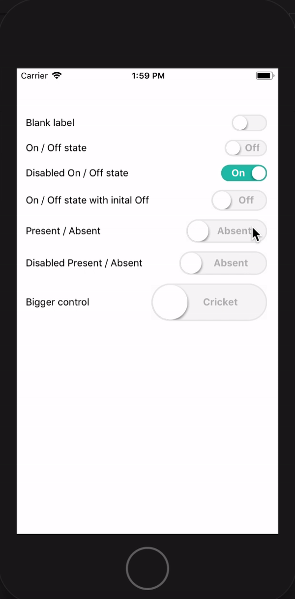
Working demo
Install
npm install --save rn-toggle-switchUsages
import ToggleSwitch from 'rn-toggle-switch' class Demo extends ... { ... render() { return ( ... <ToggleSwitch text={{on: 'PRESENT', off: 'ABSENT', activeTextColor: 'white', inactiveTextColor: '#B7B8BA'}} textStyle={{fontWeight: 'bold'}} color={{ indicator: 'white', active: 'rgba(32, 193, 173, 1)', inactive: 'rgba( 247, 247, 247, 1)', activeBorder: '#41B4A4', inactiveBorder: '#E9E9E9'}} active={true} disabled={false} width={80} radius={25} onValueChange={(val) => { /* your handler function... */ }} /> ... ); } }Properties
| Attribute | Description |
|---|---|
| text.on | Text to be displayed when Switch is in Active state |
| text.off | Text to be displayed when Switch in in inactive state |
| text.activeTextColor | Active text color |
| text.inactiveTextColor | Inactive text color |
| textStyle | Any valid text style supported by RN |
| color.indicator | The color of the Slider / Indicator |
| color.active | Background color of the Switch when it is in active state |
| color.inactive | Background color of the Switch when it is in inactive state |
| color.activeBorder | The border color when Switch is in active state |
| color.inactiveBorder | The border color when Switch is in inactive state |
| active | Initial state of the Switch |
| disabled | true if the control is disabled |
| width | Width of the control |
| radius | Radius of the Slider / Indicator |
| onValueChange | The function to be called when Switch changes its states |
Contribution
Pease feel free to create issue and raise PR


