react-smart-data-table
A smart data table component for React.js meant to be configuration free
About
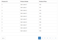
This is meant to be a zero configuration data table component for React.js in the spirit of plug and play.
Just feed it an array of equal JSON objects and it will create a template free table that can be customized easily with any framework (or custom CSS).
If you want more control over the data rendering process or don't need the smarts, check out react-very-simple-data-table
Features
It currently supports:
- Humanized column names based on object keys
- Sortable columns
- Rows filtering / searchable
- Search term highlight in the results
- Column visibility toggles
- Automatic pagination
- Server-side/remote data
- Control over row clicks
- Smart data rendering
- URLs and E-Mail addresses rendered as the href in an anchor tag
<a /> - boolean value parsing to yes/no word
- Image URLs rendered as the src for an image tag
<img />
- URLs and E-Mail addresses rendered as the href in an anchor tag
- Custom override if the default behavior is unwanted for some columns
- Custom components
- Paginator
Installation
$ npm install react-smart-data-table Props
| Name | Default | Type | Description |
|---|---|---|---|
| data | [] | {array|string} | An array of plain objects (can be nested) or a URL |
| dataKey | 'data' | {string} | The object key where the async data is available |
| headers | {} | {object} | The object that overrides default column behavior |
| name | reactsmartdatatable | {string} | The name for the table |
| sortable | false | {boolean} | Makes the columns of the table sortable |
| withToggles | false | {boolean} | Enables the column visibility toggles |
| withLinks | false | {boolean} | Converts e-mails and url addresses to links |
| withHeader | true | {boolean} | Can be used to disable the rendering of column headers |
| withFooter | false | {boolean} | Copy the header to the footer |
| filterValue | '' | {string} | Filters all columns by its value |
| perPage | 0 | {number} | Paginates the results with the value as rows per page |
| loader | null | {element} | Element to be rendered while fetching async data |
| onRowClick | undefined | {function} | If present, it will execute on every row click |
| parseBool | false | {boolean|object} | When true, boolean values will be converted to Yes/No |
| parseImg | false | {boolean|object} | When true, image URLs will be rendered as an img tag |
| dynamic | false | {boolean} | Use this if your column structure changes dynamically |
| emptyTable | null | {element} | Pass a renderable object to render when there is no data |
| paginator | elements | {element} | Pass a renderable object handle table pagination |
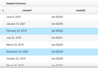
headers
/* Use the following structure to overwrite the default behavior for columns Undefined column keys will present the default behavior text: Humanized text based on the column key name invisible: Columns are visible by default sortable: Columns are sortable by default filterable: Columns are filterable by default isImg: Will force the render as an image, e.g. for dynamic URLs transform: Allows the custom rendering of the cells content Should be a function and these are the arguments passed: (value, index, row) The index is the position of the row as being rendered and not the index of the row in the original data Nested structures can be defined by a string-dot representation 'key1.key2.key3.[...].key99' */ const headers = { columnKey: { text: 'Column 1', invisible: false, sortable: true, filterable: true, }, 'nested.columnKey': { text: 'Nested Column', invisible: false, sortable: true, filterable: true, }, // If a dummy column is inserted into the data, it can be used to customize // the table by allowing actions per row to be implemented, for example tableActions: { text: 'Actions', invisible: false, sortable: false, filterable: false, transform: (value, index, row) => { // The following results should be identical console.log(value, row.tableActions) // Example of table actions: Delete row from data by row index return ( <button onClick={() => deleteRow(row)}> Delete Row </button> ) }, }, }onRowClick()
const onRowClick = (event, { rowData, rowIndex, tableData }) => { // The following results should be identical console.log(rowData, tableData[rowIndex]) }parseBool
// Default const parseBool = { yesWord: 'Yes', noWord: 'No', }parseImg
// You can pass a regular style object that will be passed down to <img /> // Or a Class Name const parseImg = { style: { border: '1px solid #ddd', borderRadius: '4px', padding: '5px', width: '150px', }, className: 'my-custom-image-style', }emptyTable
// Any renderable object can be passed const emptyTable = ( <div> There is no data available at the time. </div> )paginator
The CustomComponent passed down as a prop will be rendered with the following props which can be used to perform all the necessary calculations and makes it fully compatible with Semantic UI's Pagination component.
const CustomComponent = ({ activePage, totalPages, rows, perPage, onPageChange, }) => (/* ... */) <SmartDataTable ... paginator={CustomComponent} /> // To change the page, call the onPageChange function with the next activePage <MyCustomElement ... onClick={e => this.onPageChange(e, { activePage: nextActivePage })} />Examples
Async data loading (fetch)
By passing a string to the data prop, the component will interpret it as an URL and try to load the data from that location using fetch. If a successful request is returned, the data will be extracted from the data key in the response object. If it's in a different key, you can specify it with the dataKey prop.
response
{ "status": "success", "message": "", "data": [ { "id": 0, "other": "..." }, { "id": 1, "other": "..." }, "..." ] }component
<SmartDataTable data='/api/v1/data' dataKey='data' name='test-table' />Simple sortable table (with Semantic UI)
import React from 'react' import ReactDOM from 'react-dom' import faker from 'faker' import SmartDataTable from 'react-smart-data-table' var testData = [] var numResults = 100 for (var i=0; i<numResults; i++) { testData.push({ _id: i, fullName: faker.name.findName(), 'email.address': faker.internet.email(), phone_number: faker.phone.phoneNumber(), address: { city: faker.address.city(), state: faker.address.state(), country: faker.address.country() } }) } ReactDOM.render( <SmartDataTable data={testData} name='test-table' className='ui compact selectable table' sortable />, document.getElementById('app') )Demos
You can try react-smart-data-table with different UI libraries in the demo pages below. You can experiment with different features as well.
Take a look at the full featured example's source code.
Forking / Contributing
If you want to fork or contribute, it's easy to test your changes. Just run the following compilation commands in sequence and then the start command to run a development HTTP server in your computer accessible from your browser at the address http://localhost:3000/.
$ npm run build-dev $ npm run test-dev $ npm start 


