React Sliders
An collection of elegant slider components for React. Demo Page.
Installing
The library is available as npm package.
npm install reactrangeslider
Using The component
The component is easy to use. Import the library and add the component to your JSX:
import React from 'react'; import Slider from 'range-sliders'; const MyPage = () => <div> <Slider /> </div>;
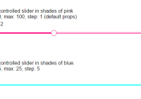
An example of uncontrolled slider with single handle, defaultValue and step passed in props:
import React from 'react'; import RangeSlider from 'reactrangeslider'; const MyPage = () => <div> <Slider defaultValue={20} step={ 5 } /> </div>;An example of controlled range slider with two handles, value and step passed in props:
import React from 'react'; import RangeSlider from 'reactrangeslider'; // value={ start: 20, end: 80 } const MyPage = (value, onChange) => <div> <RangeSlider value={ value } onChange={ onChange } min={ 20 } max={ 100 } step={ 5 } /> </div>;Check docs for more examples.
List of properties supported
| Option | Description |
|---|---|
id | id of the root div element |
name | name of the root div element |
min | minimum value in the range |
max | maximum value in the range |
step | amount by which the position of slider will change in one movement |
defaultValue | it is used to initialize uncontrolled components |
value | it is used to set value in a controlled component |
onChange | the function is executed whenever the value changes |
afterChange | the function is executed after the user has stopped moving the slider |
disabled | property used to disable component, disable component can not even receive focus |
readOnly | property used to make component readOnly, it can still be focused |
tabIndex | this is used to set the tabIndex of handles which are moved to change value of slider |
Custom styling
Styling of Range Slider is highly customizable. It supports styling using both inline styles and classes. Internally the libary used inline styles, I have preferred that for ease of installation for users.
If inline styles are used for styling, the inline styles passed to it will override the defaults. If classes are used for styling, you will be required to use !important to override corresponding default inline style.
| Style Property | Description |
|---|---|
wrapperStyle | style applied to wrapper div element |
trackStyle | style applied to track |
disabledTrackStyle | style applied to track of disabled component |
highlightedTrackStyle | style applied to highlighted track |
disabledHighlightedTrackStyle | style applied to highlighted track of disabled component |
handleStyle | style applied to handle |
focusedHandleStyle | style applied to focused handle |
hoveredHandleStyle | style applied to hovered handle |
activeHandleStyle | style applied to active handle |
disabledHandleStyle | style applied to disabled handle |
| Class Name | Description |
|---|---|
wrapperClassName | class applied to wrapper div element |
handleClassName / disabledHandleClassName | either of these classes is applied to the handle depending on whether its enabled or disabled |
trackClassName / highlightedTrackClassName | either of these classes is applied to the track depending on whether its enabled or disabled |
highlightedTrackClassName / disabledHighlightedTrackClassName | either of these classes is applied to the highlighted handle depending on whether its enabled or disabled |
| Styles applied to highlighted track are applicable only to Reage Slider with two handles and highlighted area between them. |
Device support
Range Slider is responsive to different sizes and resolutions. Its responsive to mouse, keyboard and touch events.
Future plans
Making it a complete range of slider components with addition of components like vertical slider, vertical range slider, etc motivation.
License
MIT.


