react-tisch
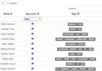
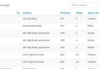
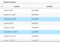
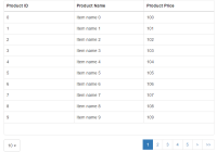
Simple table component for react and react-bootstrap. It supports filtering, searching, ordering, pagination, and you can use custom react components as the table's cells!
Example
See the demo
import {Table, Column} from "react-tisch"; import {Glyphicon, Label} from "react-bootstrap"; const sampleData = [ { "name": "Ida Roach", "eyeColor": "blue", "tags": ["magna", "in", "labore", "aliqua", "veniam"] }, ... ]; const EyeColor = function ({eyeColor}) { return <Glyphicon glyph="eye-open" style={{color: eyeColor}}/>; }; const Tags = function ({tags}) { return <div>{tags.map((tag, i) => <Label bsStyle="default" key={i}>{tag}</Label>)}</div>; }; ReactDOM.render( <Table data={sampleData}> <Column value={row => row.name}>Name</Column> <Column filter value={EyeColor} rawValue={row => row.eyeColor}>Eye color</Column> <Column value={Tags}>Tags</Column> </Table>, document.getElementById('example') );Documentation
See the documentation on gitbook.
Development
Build with npm run build.
Test with npm run test.
License
Copyright 2016 KAYAK Germany, GmbH
Licensed under the Apache License, Version 2.0 (the "License"); you may not use this file except in compliance with the License. You may obtain a copy of the License at
http://www.apache.org/licenses/LICENSE-2.0 Unless required by applicable law or agreed to in writing, software distributed under the License is distributed on an "AS IS" BASIS, WITHOUT WARRANTIES OR CONDITIONS OF ANY KIND, either express or implied. See the License for the specific language governing permissions and limitations under the License.
