react-simple-range
** NOT CURRENTLY MAINTAINED, don't use this in production **


A simple React slider component for inputting a number value within a range.

Examples
- For local examples check out the Development section below
- Or view examples online here
Install
npm install react-simple-range --save
Usage
Import React and this component using your chosen module bundler:
import React from 'react'; import ReactDOM from 'react-dom'; import ReactSimpleRange from 'react-simple-range'; const rootElement = document.getElementById('app'); ReactDOM.render(<ReactSimpleRange />, rootElement); Props
| Name | Type | Default | Description |
|---|---|---|---|
| min | number | 0 | Minimum slider value |
| max | number | 100 | Maximum slider value |
| step | number | 1 | Number inc/decremented when slider value is changed. The range of the slider (max - min) should be evenly divisible by this |
| id | string | null | Identifier that is passed to the onChange handler (see below) |
| onChange | function | NOOP | Function to be called when the slider value changes - your slider will have no effect without this! See below for more information |
| onChangeComplete | function | NOOP | Function to be called on mouseup or touchend, sends the same values as the onChange handler, the only difference is they get sent when the interaction has ended |
| value | number | props.defaultValue | Set current value of slider |
| defaultValue | number | 0 | Set initial value of slider |
| vertical | boolean | false | Set slider to vertical when true |
| verticalSliderHeight | string | 100px | Default slider height if vertical. If your slider already has a fixed height wrapper, just set this to 100% and the slider will fill the space |
| eventWrapperPadding | number | 8 | Px value to add padding to the wrapper to make small sliders easier to interact with |
| label | boolean | false | If true, adds a label displaying the slider's value when interacted with |
| disableThumb | boolean | false | Disables the thumb when true |
| disableTrack | boolean | false | Disables the track when true |
| sliderSize | number | 4 | Px height of slider if horizontal, width if vertical |
| thumbSize | number | sliderSize * 2 | Height and width of thumb in px |
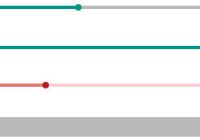
| sliderColor | string | #9E9E9E | Color of slider |
| trackColor | string | #03A9F4 | Color of track and label |
| thumbColor | string | #fff | Color of thumb |
| customThumb | element | undefined | Pass in a single React element to use as your thumb, replacing the default |
Change handlers
onChange
The onChange handler receives one argument: the new state of the component. It contains the following properties:
| Name | Type | Description |
|---|---|---|
| value | number | Current value |
| min | number | Minimum value (from props) |
| max | number | Maximum value (from props) |
| range | number | Difference between max and min |
| step | number | Step value (from props) |
| ratio | number | Percentage of bar filled |
| thumbSize | number | Thumb size value (from props) |
onChangeComplete
An alternative change handler which only sends the argument at the end of the mouse drag
Development
- Fork or clone the repo
- Run
npm installin its directory to install dependencies - Run
npm startto start webpack-dev-server and serve the examples.
Note: The examples import the babel-polyfill for compatibility in development, but the component itself doesn't.
Contributing
PRs are welcome.
This project uses semantic-release to automatically publish the NPM package and GitHub releases, as well as generate a changelog based on commit history and increment the semantic version number.
Commitizen is installed to assist in following the Angular commit guidelines.
When contributing, please run the following commands to commit your changes:
git add <your files>to stage changes as normalnpm run committo run tests then Git commit via Commitizen (if you've already run tests you can just usegit cz)
Commitizen will then walk you through the process of creating a commit using the guidelines to match the format.
Commands for local dev
| Name | Effect |
|---|---|
npm start | Starts a webpack-dev-server & serves the examples/ directory to http://localhost:8080/ |
npm run commit | Git commits using Commitizen to match commit format & runs tests as a precommit hook |
npm run test | Runs tests with mocha |
npm run test:watch | Runs tests in watch mode with mocha --watch |
npm run packdry | Bundles & runs npm pack, create test build of the package as react-simple-range-version.tgz |
Future
- Better test coverage
- Submit an issue to add to this list


