Functional Data Grid
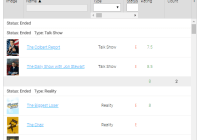
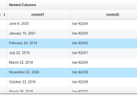
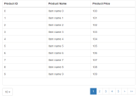
This is a library made with React and React-Virtualized for creating rich data grids with filtering, sorting, grouping and aggregates computation. It supports virtualization, and so it can handle very large amounts of data. It features also locked columns, custom renderers, multi-column headers, columns resize, hide / show columns and variable rows height. Filtering, sorting, grouping and aggregates computation are done client-side.
Functional Data Grid is written in functional programming style with ES2016 and Flow. It's really fast and is being used in production with tens of thousands of elements.
Installation
You can install the library with NPM:
npm install –-save functional-data-gridor with YARN:
yarn add functional-data-gridUsage
To use Functional Data Grid, you have to import the library and its base types you intend to use, for example:
import FunctionalDataGrid, { Column, Group } from 'functional-data-grid'then you can use it inside your component. For example:
import React from 'react' import FunctionalDataGrid, { Column } from 'functional-data-grid' let columns = [ new Column({ id : 'name', title: 'Name', width: 120, valueGetter: e => e.name }), new Column({ id : 'surname', title: 'Surname', width: 120, valueGetter: e => e.surname }) ] let data = [ { 'name': 'Donald', 'surname': 'Duck' }, { 'name': 'Mickey', 'surname': 'Mouse' } ] class MyGrid extends React.Component { render = () => <FunctionalDataGrid columns={columns} data={data} /> }Component Props
The FunctionalDataGrid component accepts the following props:
| Prop | Required / optional | Default | Description |
|---|---|---|---|
| columns | required | An array of Column with columns definitions | |
| columnGroups | optional | An array of ColumnGroup with column group definitions | |
| data | required | An array of elements to show in the grid, one per row | |
| initialFilter | optional | No filters | An array of Filter to filter the elements |
| initialSort | optional | No sorting | An array of Sort to sort the elements |
| groups | optional | No grouping | An array of Group to specify grouping of the elements |
| aggregatesCalculator | optional | No aggregates | A function to compute the aggregates from an array of elements |
| style | optional | {} | Allows to specify additional styles for the grid: accepts an object with the optional properties grid, cell, header, row. Row must be a function that accepts a DataRow and returns an Object, the other properties are plain Objects |
| rowHeight | optional | 26 | The height of the rows or a function that accepts an element and returns its row height |
| height | optional | 100% | The height of the FunctionalDataGrid component div (unit of measurement needed, f.e.: 800px) |
| showGroupHeaders | optional | true | Set to false to hide the headers for groups |
| includeFilteredElementsInAggregates | optional | false | It allows to calculate the aggregates based on all the elements, also the filtered ones |
| onColumnResize | optional | Allows to specify an event handler for the column resize event | |
| onColumnVisibilityChange | optional | Allows to specify an event handler for the column visibility change event | |
| onColumnsOrderChange | optional | Allows to specify an event handler for the column order change event | |
| showFooter | optional | true | Shows the footer of the grid with the elements count |
| enableColumnsShowAndHide | optional | false | Allows the user to show and hide columns |
| enableColumnsSorting | optional | false | Allows the user to change the order of the columns |
| overscanRowCount | optional | 10 | Number of rows to render above/below the visible bounds of the grid |
| className | optional | '' | Css classes to apply to the component |
Columns definition
Columns are defined by creating an instance of the class Column. Column constructor accepts an object with the following keys:
| Key | Required / optional | Default | Description |
|---|---|---|---|
| id | required | A unique id for the column | |
| title | optional | empty | The title shown on the column header |
| filterable | optional | false | Enables filtering on this column |
| sortable | optional | false | Enables sorting on this column |
| resizable | optional | true | Enables resizing for this column |
| locked | optional | false | Locks the column so that it doesn’t disappear on scrolling |
| hidden | optional | false | Hides the column |
| width | optional | The width of the column | |
| valueGetter | required | Specifies how to get the value to show in the column from the original row element | |
| aggregateValueGetter | optional | Specifies how to get the value to show in the column from the aggregate row element | |
| renderer | optional | v => v | Specifies how to render the column value |
| aggregateRenderer | optional | = renderer | Specifies how to render the aggregate column value |
| filterRenderer | optional | Specifies how to render the filter in the header | |
| headerRenderer | optional | (column) => column.title | Specifies how to render the header |
| headerStyle | optional | {} | Allows to specify additional styles for the column header |
| style | optional | {} | Allows to specify additional styles for the column |
| comparator | optional | (a, b) => a === b ? 0 : a < b ? -1 : 1 | Specifies a comparator for the sorting function |
| columnGroup | optional | null | The id of the column's column group |
| enableShowAndHide | optional | true | Allows the user to show and hide column |
Groups definition
Groups are defined by creating an instance of the class Group. Group constructor accepts an object with the following keys:
| Key | Required / optional | Default | Description |
|---|---|---|---|
| id | required | A unique id for the column | |
| title | optional | empty | The title shown on the group header |
| groupingFunction | required | A function that compute the takes an element and compute the corresponding key | |
| renderer | optional | (v, g) => { g.title }: { v } | The title shown on the group header |
| comparator | optional | (a: K, b: K) => a === b ? 0 : (a: any) < (b: any) ? -1 : 1 | The comparator used to sort the groups |
Demo
Check the examples here: https://energydrink9.github.io/functional-data-grid-examples
Conclusion
Pull requests are welcome, enjoy your functional data grids!
Contributors
This project exists thanks to all the people who contribute.
Backers
Thank you to all our backers!
Sponsors
Support this project by becoming a sponsor. Your logo will show up here with a link to your website. [Become a sponsor]
