react-intersection-observer
React implementation of the Intersection Observer API to tell you when an element enters or leaves the viewport. Contains both a Hooks, render props and plain children implementation.
Storybook Demo: https://thebuilder.github.io/react-intersection-observer/
Features
🎣 Hooks or Component API - WithuseInViewit's easier than ever to monitor elements⚡️ Optimized performance - Auto reuses Intersection Observer instances where possible⚙️ Matches native API - Intuitive to use🌳 Tree-shakeable - Only include the parts you use💥 Tiny bundle ~1.9 kB gzipped
Installation
Install using Yarn:
yarn add react-intersection-observeror NPM:
npm install react-intersection-observer --save
⚠️ You also want to add the intersection-observer polyfill for full browser support. Check out adding the polyfill for details about how you can include it.
Usage
Hooks 🎣
useInView
const [ref, inView, entry] = useInView(options)The new React Hooks, makes it easier then ever to monitor the inView state of your components. Call the useInView hook, with the (optional) options you need. It will return an array containing a ref, the inView status and the current IntersectionObserverEntry. Assign the ref to the DOM element you want to monitor, and the hook will report the status.
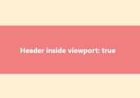
import React, { useRef } from 'react' import { useInView } from 'react-intersection-observer' const Component = () => { const [ref, inView, entry] = useInView({ /* Optional options */ threshold: 0, }) return ( <div ref={ref}> <h2>{`Header inside viewport ${inView}.`}</h2> </div> ) }Render props
To use the <InView> component, you pass it a function. It will be called whenever the state changes, with the new value of inView. In addition to the inView prop, children also receives a ref that should be set on the containing DOM element. This is the element that the IntersectionObserver will monitor.
If you need it, you can also access the IntersectionObserverEntry on entry, giving you access to all the details about the current intersection state.
import { InView } from 'react-intersection-observer' const Component = () => ( <InView> {({ inView, ref, entry }) => ( <div ref={ref}> <h2>{`Header inside viewport ${inView}.`}</h2> </div> )} </InView> ) export default ComponentPlain children
You can pass any element to the <InView />, and it will handle creating the wrapping DOM element. Add a handler to the onChange method, and control the state in your own component. Any extra props you add to <InView> will be passed to the HTML element, allowing you set the className, style, etc.
import { InView } from 'react-intersection-observer' const Component = () => ( <InView as="div" onChange={(inView, entry) => console.log('Inview:', inView)}> <h2>Plain children are always rendered. Use onChange to monitor state.</h2> </InView> ) export default Component
⚠️ When rendering a plain child, make sure you keep your HTML output semantic. Change theasto match the context, and add aclassNameto style the<InView />. The component does not support Ref Forwarding, so if you need arefto the HTML element, use the Render Props version instead.
API
Options
Provide these as props on the <InView /> component and as the options argument for the hooks.
| Name | Type | Default | Required | Description |
|---|---|---|---|---|
| root | Element | window | false | The Element that is used as the viewport for checking visibility of the target. Defaults to the browser viewport (window) if not specified or if null. |
| rootMargin | string | '0px' | false | Margin around the root. Can have values similar to the CSS margin property, e.g. "10px 20px 30px 40px" (top, right, bottom, left). |
| threshold | number | number[] | 0 | false | Number between 0 and 1 indicating the percentage that should be visible before triggering. Can also be an array of numbers, to create multiple trigger points. |
| triggerOnce | boolean | false | false | Only trigger this method once |
⚠️ When passing an array tothreshold, store the array in a constant to avoid the component re-rendering too often. For example:
const THRESHOLD = [0.25, 0.5, 0.75]; // Store multiple thresholds in a constant const MyComponent = () => { const [ref, inView, entry] = useInView({threshold: THRESHOLD}); return <div ref={ref}>Triggered at intersection ratio {entry.intersectionRatio}</div>; }InView Props
The <InView /> component also accepts the following props:
| Name | Type | Default | Required | Description |
|---|---|---|---|---|
| as | string | 'div' | false | Render the wrapping element as this element. Defaults to div. |
| children | ({ref, inView, entry}) => React.ReactNode, ReactNode | true | Children expects a function that receives an object containing the inView boolean and a ref that should be assigned to the element root. Alternatively pass a plain child, to have the <InView /> deal with the wrapping element. You will also get the IntersectionObserverEntry as `entry, giving you more details. | |
| onChange | (inView, entry) => void | false | Call this function whenever the in view state changes. It will receive the inView boolean, alongside the current IntersectionObserverEntry. |
Recipes
The IntersectionObserver itself is just a simple but powerful tool. Here's a few ideas for how you can use it.
- Lazy image load
- Trigger animations
- Track impressions (Google Analytics, Tag Manager, etc)
Testing
In order to write meaningful tests, the IntersectionObserver needs to be mocked. If you are writing your tests in Jest, you can use the included test-utils.js. It mocks the IntersectionObserver, and includes a few methods to assist with faking the inView state.
test-utils.js
Import the methods from react-intersection-observer/test-utils.
mockAllIsIntersecting(isIntersecting:boolean)
Set the isIntersecting on all current IntersectionObserver instances.
mockIsIntersecting(element:Element, isIntersecting:boolean)
Set the isIntersecting for the IntersectionObserver of a specific element.
intersectionMockInstance(element:Element): IntersectionObserver
Call the intersectionMockInstance method with an element, to get the (mocked) IntersectionObserver instance. You can use this to spy on the observe and unobserve methods.
Test Example
import React from 'react' import { render } from 'react-testing-library' import { useInView } from 'react-intersection-observer' import { mockAllIsIntersecting } from 'react-intersection-observer/test-utils' const HookComponent = ({ options }) => { const [ref, inView] = useInView(options) return <div ref={ref}>{inView.toString()}</div> } test('should create a hook inView', () => { const { getByText } = render(<HookComponent />) // This causes all (existing) IntersectionObservers to be set as intersecting mockAllIsIntersecting(true) getByText('true') })Built using react-intersection-observer
Sticks 'n' Sushi
The new brand site for Sticks 'n' Sushi is filled with scroll based animations. All of these are triggered by react-intersection-observer, with react-scroll-percentage controlling the animations.
Intersection Observer
Intersection Observer is the API is used to determine if an element is inside the viewport or not. Browser support is pretty good - With Safari adding support in 12.1, all major browsers now support Intersection Observers natively.
Polyfill
You can import the polyfill directly or use a service like polyfill.io to add it when needed.
yarn add intersection-observerThen import it in your app:
import 'intersection-observer'If you are using Webpack (or similar) you could use dynamic imports, to load the Polyfill only if needed. A basic implementation could look something like this:
/** * Do feature detection, to figure out which polyfills needs to be imported. **/ async function loadPolyfills() { if (typeof window.IntersectionObserver === 'undefined') { await import('intersection-observer') } }