react-filterable-table
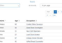
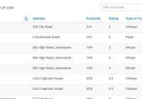
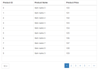
Extendable table with filtering, sorting, paging, and more. Hold down shift to sort on multiple fields.
Install
npm install react-filterable-table
Basic usage:
const FilterableTable = require('react-filterable-table'); // Data for the table to display; can be anything const data = [ { name: "Steve", age: 27, job: "Sandwich Eater" }, { name: "Gary", age: 35, job: "Falafeler" }, { name: "Greg", age: 24, job: "Jelly Bean Juggler" }, { name: "Jeb", age: 39, job: "Burrito Racer" }, { name: "Jeff", age: 48, job: "Hot Dog Wrangler" } ]; // Fields to show in the table, and what object properties in the data they bind to const fields = [ { name: 'name', displayName: "Name", inputFilterable: true, sortable: true }, { name: 'age', displayName: "Age", inputFilterable: true, exactFilterable: true, sortable: true }, { name: 'job', displayName: "Occupation", inputFilterable: true, exactFilterable: true, sortable: true } ]; <FilterableTable namespace="People" initialSort="name" data={data} fields={fields} noRecordsMessage="There are no people to display" noFilteredRecordsMessage="No people match your filters!" /> Props
There are a lot, but most are just for customization. The minimum you need to get running are data and fields
data-array- Static data to bind tofields-array- Array offields (see below) used for building the table. These fields have their own list of props detailed belowdataEndpoint-string- If not using a static dataset, this can be used to fetch data with AJAXonDataReceived-fn- This is called (passing the array of data) before the data is rendered. Any necessary data transformations (date parsing, etc) can be done hereclassName-string- Class name to apply to the component's root <div> elementtableClassName-string- Class name to apply to the component's <table> elementtrClassName-stringorfn- Class name to apply to the <tr> elements. If a function is passed, it's called with therecordandindexas parameters:function (record, index)footerTrClassName-string- Class name of the footer's <tr> elementiconSortAsc-object- Element to use for the asc sort icon next to a field nameiconSort-object- Element to use for the default sort icon next to a field name. If not provided, the default uses icons from FontAwesome.iconSortedDesc-object- Element to use for the desc sort icon next to a field name. If not provided, the default uses icons from FontAwesome.iconSortedDesc-object- Element to use for the desc sort icon next to a field name. If not provided, the default uses icons from FontAwesome.initialSort-string- The field name on which to sort on initiallyinitialSortDir-bool- The sort direction to use initially - true is ascending, false is descending. Default:truenoRecordsMessage-string- Message to show when there are no recordsnoFilteredRecordsMessage-string- Message to show when the user has applied filters which result in no records to showserverErrorMessage-stringorobject- Message to show when an error is encountered from thedataEndpoint(if used). Can be a string or a React componentloadingMessage-stringorobject- Message to show when the component is loading datarecordCountName-string- Verbiage to use at the top where it says "X results". For example, "1 giraffe"recordCountNamePlural-string- Verbiage to use when there are more than 1 results (or 0). For example, "3 giraffes"headerVisible-bool- Whether or not to show the headerpagersVisible-bool- Whether or not to show the pagerstopPagerVisible-bool- Whether or not to show the top pagerbottomPagerVisible-bool- Whether or not to show the bottom pagerpageSize-int- Page size (default: 10)pageSizes-Array- Array of numbers to use for the page size dropdown. Default is[10, 20, 30, 50]. Set tonullto hide the page size dropdownautofocusFilter-bool- Set totrueto focus the filter text box when the component loadspagerTitles-object- Specify the titles for the pager buttons. E.g.,pagerTitles={{ first: '<|', last: '>|' }}pagerTopClassName-string- Specify the className for the top pagerpagerBottomClassName-string- Specify the className for the bottom pagernamespace-string- The app saves settings (currently only page size) to localStorage. Namespace prevents overriding settings from other pages/apps where this is used. Use the same namespace across implementations that should share the settings. Default: 'react-filterable-table'onFilterRemoved-fn- Callback for when a filter is removed by clicking the 'x' next to it (or when called manually, e.g.,this.refs.FilterableTable.removeExactFilter). Function is called with the filter object that was removed, as well as the event that fired it
field Props
name-string- Name of the property on thedataobjectdisplayName-string- Field name as it will appear in the table header. If ommitted,nameis usedsortFieldName-string- Field to use when sorting if you want to sort using a different value from what's displayed. For example, A+, A, B, C would normally sort as A, A+, B, C. You could have a separate field that maps those values to an integer, then use that field for sortinginputFilterable-bool- Whether or not this field should be filtered when the user types in the Filter text box at the topexactFilterable-bool- Whether or not the user can click the field's value to filter on it exactlysortable-bool- Whether or not the user can sort on this fieldvisible-bool- Whether or not the field is visiblethClassName-string- Class name of the <th> elementtdClassName-stringorfn- Class name of the <td> element. If a function is passed, it's called with the same parameters asrender(see below)footerTdClassName-string- Class name of the footer's <td> elementemptyDisplay-string- Text to show when the field is empty, for example "---" or "Not Set"render-fn- Function called to render the field. Function is passed apropsobject which contains:props.value- the value of the field from thedataobject, andprops.field- this field object (Demo using field render functions)footerValue-fnorstring- Value for the footer cell. Can be a render function (for totaling, etc) or a static value. Tip: render functions receive bothfilteredRecords(your data, filtered if any filters are applied) andrecords(non-filtered data) objects in the props parameter. You can use these to show totals for filtered or unfiltered data
Example using a render function
const renderAge = (props) => { /* * This props object looks like this: * { * value: (value of the field in the data. In this case, it's the person's age.), * record: (the data record for the whole row, in this case it'd be: { name: "Steve", age: 27, job: "Sandwich Eater" }), * field: (the same field object that this render function was passed into. We'll have access to any props on it, including that 'someRandomProp' one we put on there. Those can be functions, too, so we can add custom onClick handlers to our return value) * } */ // If they are over 60, use the "blind" icon, otherwise use a motorcycle const iconClassName = "fa fa-" + (props.value > 60 ? "blind" : "motorcycle"); const personName = props.record.name; return ( <span title={personName + "'s Age"}> {props.value} <span className={iconClassName}></span> </span> ); }; const data = [ ... { name: "Steve", age: 27, job: "Sandwich Eater" }, ... ]; const fields = [ ... { name: 'age', displayName: "Age", inputFilterable: true, exactFilterable: true, sortable: true, someRandomProp: "Tacos!", render: renderAge }, ... ]The render function gets a few other props as well which may be useful. For example:
records- Your data arrayfilteredRecords- The current array of records that the table is showing (if there are any filters applied, this will be the filtered items)addExactFilter- function to add an exact filter on something. Use it in an onClick to filter on whatever you want.- Usage:
addExactFilter(value, fieldname, name = fieldname)
- Usage:
- Various other internal props which may or may not be useful. Check them out using
console.log(props)in a render function to see what else is available. These internal props could potentially change with updates, so use at your own risk.
Building
To build the main library: gulp build
To build the example: gulp example
