React Bootstrap Datatable


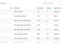
Inspired by react-data-components. This library uses react-bootstrap stylesheets and javascripts. In addition, this library also uses font-awesome for the table header, clear filter, and other stuffs.
Table of Contents
- Installation
- Key Features
- Props
- Styling
- Example Usage
- Extending the Table
- Next Features or Improvements
- Contributing
Installation
# With NPM npm install --save react-bs-datatable bootstrap-sass font-awesome # With Yarn yarn add react-bs-datatable bootstrap-sass font-awesome Key features
- Sort
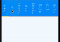
- Filter
- Pagination
- Custom Labels
- Presentational and raw data separation
- Custom column sort and column filter function
Props
- initialSort: Object, consists of
prop(String) andisAscending(Boolean). Default:undefined. - keyName (Required): String. It is used to prepend the key property of children elements.
- labels: Object, consists of keys and values. Default:
{}. Used to modify tabel labels such as:first: String. First page label button.last: String. Last page label button.prev: String. Previous page label button.next: String. Next page label button.show: String. The text before select option ofrowsPerPageOption.entries: String. The text after select option ofrowsPerPageOption.noResults: String. Displayed text if table has emptytableBodyor[].filterPlaceholder: String. Custom placeholder text on the search filter if at least one column hasfilterableprop.
- onSort: Object, consists of keys and values. Key is the prop name and value is the quantifier function. Each function has a parameter which is the real value of that column. Default:
undefined. - onFilter: see
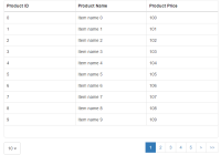
onSort. - tableBody (Required): Array of objects, each consists of
propNamesandpropValues, depends on how many columns you define in the header. - tableClass: String. Classes used in
<table>element tag. Default:''. - tableHeader (Required): Array of objects, each consists of:
cell: Function. Returns a React Component for the table to be rendered.filterable: Boolean. Enable/disable filtering on the column.prop(Required): String. Column name for the table body.sortable: Boolean. Enable/disable sorting on the column.title: String. Text for the header column.
- rowsPerPage: Integer. Initial rows per page. If this and
rowsPerPageOptionare provided butrowsPerPageis not a member ofrowsPerPageOption, thenrowsPerPageOption[0]will be chosen as the property instead. If not provided, then no pagination options will be rendered. Default:undefined. - rowsPerPageOption: Array of integers for pagination options. Default:
undefined.
Styling
This package doesn't include Bootstrap stylesheets. If you want to include it, you can do so by importing its CSS or its SCSS bootstrap-sass. You can also style the table yourself.
.table-datatable { .thead-default { .thead-tr-default { .thead-th-default { &.sortable { // If and only if a column is sortable &:hover { background: #000; // Your color of choice cursor: pointer; // Changes the cursor into a pointer on hover } } } } } .tbody-default { .tbody-tr-default { .tbody-td-default { // do what you want } } } }Example usage
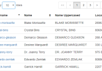
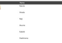
import moment from 'moment'; // Example for onSort prop import React from 'react'; // Import React import { render } from 'react-dom'; // Import render method import Datatable from 'react-bs-datatable'; // Import this package const header = [ { title: 'Username', prop: 'username', sortable: true, filterable: true }, { title: 'Name', prop: 'realname', sortable: true }, { title: 'Name Uppercased', prop: 'realnameuppercase', cell: (row) => row.realname.toUpperCase() }, { title: 'Location', prop: 'location' }, { title: 'Last Updated', prop: 'date', sortable: true }, ]; const body = [ { username: 'i-am-billy', realname: 'Billy', location: 'Mars', date: moment().subtract(1, 'days').format('Do MMMM YYYY'), }, { username: 'john-nhoj', realname: 'John', location: 'Saturn', date: moment().subtract(2, 'days').format('Do MMMM YYYY'), } ]; const onSortFunction = { date(columnValue) { // Convert the string date format to UTC timestamp // So the table could sort it by number instead of by string return moment(columnValue, 'Do MMMM YYYY').valueOf(); }, }; const customLabels = { first: '<<', last: '>>', prev: '<', next: '>', show: 'Display', entries: 'rows', noResults: 'There is no data to be displayed', }; // In your render method <Datatable tableHeader={header} tableBody={body} keyName="userTable" tableClass="striped hover responsive" rowsPerPage={5} rowsPerPageOption={[5, 10, 15, 20]} initialSort={{prop: "username", isAscending: true}} onSort={onSortFunction} labels={customLabels} />Extending the Table
You can extend the table if you want to create your own layout (position the text filter to the top right, etc). You'll have to import the components from react-bs-datatable/lib folder. CodeSandbox Example.
import Row from 'react-bootstrap/lib/Row'; import Col from 'react-bootstrap/lib/Col'; import Table from 'react-bootstrap/lib/Table'; import classNames from 'classnames'; import Datatable from 'react-bs-datatable'; import { sortData, filterData, paginateData, } from 'react-bs-datatable/lib/utils/ClassHelpers'; import Pagination from 'react-bs-datatable/lib/Pagination'; import PaginationOpts from 'react-bs-datatable/lib/PaginationOpts'; import TableHeader from 'react-bs-datatable/lib/TableHeader'; import TableBody from 'react-bs-datatable/lib/TableBody'; import Filter from 'react-bs-datatable/lib/Filter'; class CustomTable extends Datatable { render() { const { sortedProp, filterText, rowsPerPage, currentPage } = this.state; const { tableHeader, tableBody, onSort, onFilter, tableClass: customClass, keyName, labels, rowsPerPageOption, } = this.props; const filteredData = filterData(tableHeader, filterText, onFilter, tableBody); const sortedData = sortData(sortedProp, onSort, filteredData); const paginatedData = paginateData(rowsPerPage, currentPage, sortedData); const tableClass = classNames({ 'table-datatable': true, [`${customClass}`]: true, }); return ( <Row> <Col xs={12} md={4}> <PaginationOpts labels={labels} onRowsPerPageChange={this.onRowsPerPageChange} rowsPerPage={rowsPerPage} rowsPerPageOption={rowsPerPageOption} keyName={keyName} /> </Col> <Col xs={12} md={4}> <Pagination data={sortedData} rowsPerPage={rowsPerPage} keyName={keyName} currentPage={currentPage} onPageNavigate={this.onPageNavigate} labels={labels} /> </Col> <Col xs={12} md={4} className="text-right"> <Filter tableHeader={tableHeader} onChangeFilter={this.onChangeFilter} filterText={filterText} keyName={keyName} placeholder={labels.filterPlaceholder} /> </Col> <Col xs={12}> <Table className={tableClass}> <TableHeader tableHeader={tableHeader} keyName={keyName} sortedProp={sortedProp} onSortChange={this.onSortChange} /> <TableBody tableHeader={tableHeader} keyName={keyName} labels={labels} paginatedData={paginatedData} /> </Table> </Col> </Row> ); } }Next Features or Improvements
- Sortable props for each column instead of globally
- Custom sort function (eg. date is ordered by timestamp not by string)
- Filterable props for each column instead of globally
- Custom table classes (it's fixed to striped, responsive, and hover at the moment)
- More extensive unit testing
- Custom labels
- Option to separate presentational and raw data (by using
cellproperty intableHeader) - Lazy loading for big data (virtualization, asynchronous pagination)
- Better documentation, better demo page
- Webpack 4
- Reduce the bundle size
Contributing
Feel free to contribute by creating issues and/or pull requests. I will do my best to address them as fast as I can.


