A Grid and Tree Component written in React using the Redux Pattern with plenty of open source examples , and an interesting backstory .
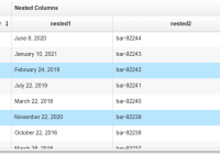
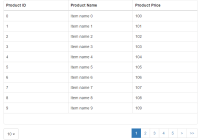
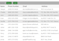
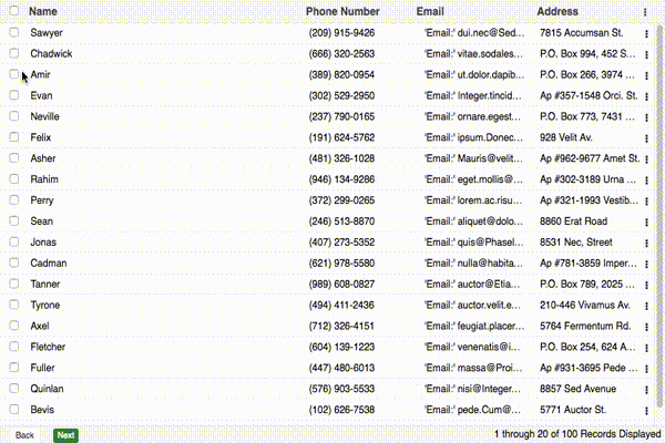
Flat List or Tree Structure ➖ 🌲 Local and/or Remote Data Source Local and/or Remote Pagination Extensive Column Definitions 💪 Draggable Column Width/Resizing Draggable Column Ordering Sortable Columns Grid Action Menus Bulk Action Toolbar Selection Model (Single, MultiSelect, Checkbox) Event Handling for all kinds of DOM Events (List Below) Extendable and Modular Style Built with JavaScript Loading Mask Built-in Error Handling Module Handles Huge amount of Records (1000000+) ⭐️ $ npm install react-redux-grid --save If you would like to build and run the demo in your browser:
$ git clone https://github.com/bencripps/react-redux-grid.git $ cd react-redux-grid $ npm install $ npm run start Open your browser to: http://localhost:3000
Examples Github
import React from ' react' import { render } from ' react-dom' import { Grid } from ' react-redux-grid' render ( < Grid data= {data} stateKey= {stateKey} / > , document .getElementById (' grid-mount' Prop Type Description stateful bool the grid will store column configuration in browser local storage (based off of stateKey, so the key must be unique across all grids in a single application) height oneOfType([number, string, bool]) the height of the grid container, if false, then no height will be set stateKey string unique id for grid, more information available showTreeRootNode bool used with tree-grid, to determine if root node should be displayed classNames array a list of strings to be applied to the grid container as classes events object grid event object, more information below reducerKeys object object describing custom named reducers, more information below pageSize int number of records to shown on a single grid page emptyDataMessage any can be a string or a react component, which will be displayed if no grid data is available dragAndDrop bool whether drag and drop of rows should be enabled gridType oneOf(['grid', 'tree']) whether the grid will be a flat list or a tree view data arrayOf(object) local data for grid to display, more information available dataSource func function which returns data to display, more information available filterFields object optional object describing additional values to filter grid data
export const columns = [ { name: ' Name' : ' name' : ' <input type="text" required />' : ' 10%' : ' additional-class' renderer : ({ column, value, row }) => ( < span> Name: { value } < / span> ), hidden: false , placeholder: ' Name' validator : ({ value, values }) => value .length > 0 , change : ({ values }) => ({ otherColDataIndex: ' newValue' editable : ({ value, values }) => { if (value === ' ShouldDisabled' return true ; } return false ; }, hideable: false , resizable: false , moveable: false , HANDLE_CLICK : () => { console .log (' Header Click' : true } ]; Prop Type Description name string title of column to be displayed dataIndex oneOfType([string, array]) the key accessor for the column value (required parameter). more information available editor jsx when an editor is used, this element will be rendered in place of the edited cell, more information available width int width of column (if none is provided, a default width will be applied) className array additional class names to apply to header of this column renderer func a function which returns the cell contents for this column, more information available hidden bool whether the column is hidden or visible hideable bool whether the column can be hidden moveable bool whether this column can be moved placeholder string the placeholder that will be used for the editor input validator func a func that should return a boolean, to determine if the newly input value is valid change func a func that should return an object where keys are the dataIndex of affected columns, and the values will be the new values associated with that dataIndex. editable oneOfType([func, bool]) whether the field should be disabled while in edit mode. createKeyFrom bool see full documentation on createKeyFrom sortFn func when a local sort action occurs, you can provide a method that will be passed to sort
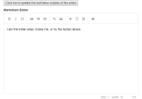
export const plugins = { EDITOR : { type: ' inline' : true , focusOnEdit: true } } Prop Type Description type oneOf(['inline', 'grid']) two editors are available by default. in grid mode, all fields are editable. in inline mode, only a single line is editable at a time enabled bool if true, the grid will have an editor available focusOnEdit bool focus the first editable input when an edit event occurs (defaults to true)
export const plugins = { COLUMN_MANAGER : { resizable: false defaultColumnWidth: ` ${ 100 / columns .length } ` : 10 , moveable: true , headerActionItemBuilder : () => {}, sortable: { enabled: true , method: ' local' : ' http://url/to/sortingSource' Prop Type Description resizable bool will set all columns to resizable. This parameter will not override columns that have declared they are not resizable from the columns array defaultColumnWidth int if no column width is provided, columns will be divided equally. this can be overwritten by providing a new string template minColumnWidth int the minimum width a column can be dragged to moveable bool whether the columns can be reordered by drag headerActionItemBuilder func build a custom jsx component to be used as the header action items sortable object an object that describes whether columns can be sorted sortable.enabled bool an object that describes whether columns can be sorted sortable.method oneOf(['local', 'remote']) whether sorting will execute locally, or remotely sortable.sortingSource string where sorting data will be retrieved (a required parameter for remote sorting)
Pagination export const plugins = { PAGER : { enabled: true , pagingType: ' remote' toolbarRenderer : (pageIndex , pageSize , total , currentRecords , recordType ) => { return ` ${ pageIndex * pageSize} ${ pageIndex * pageSize + currentRecords} ${ total} ${ recordType} ` : false } }; Prop Type Description enabled bool whether a pager will be used, defaults to true pagingType oneOf(['local', 'remote']) defaults to local toolbarRenderer func a function which which returns the description of the current pager state, ex: 'Viewing Records 10 of 100' pagerComponent jsx if you'd like to pass your own pager in, you can supply a jsx element which will replace the pager entirely
export const plugins = { GRID_ACTIONS : { iconCls: ' action-icon' onMenuShow : ({ columns, rowData }) => { console .log (' This event fires before menushow' if (rowData .isDisabled ) { return [' menu-item-key' // this field will now be disabled: [ { text: ' Menu Item' : ' menu-item-key' EVENT_HANDLER : () => { alert (' Im a menu Item Action' Prop Type Description iconCls string class to be used for the action icon menu arrayOf(object) menuItems, with text, key, EVENT_HANDLER properties. each object must contain a unique key relative to it's parent array. These keys will be used as the JSX element key. onMenuShow func a method that fires upon menu action click. @return an array of keys to disable menu items that correspond with these keys.
export const plugins = { SELECTION_MODEL : { mode: ' single' : true , editEvent: ' singleclick' : true , activeCls: ' active-class' : ' singleclick' Prop Type Description mode oneOf(['single', 'multi', 'checkbox-single', 'checkbox-multi']) determines whether a single value, or multiple values can be selected editEvent oneOf(['singleclick', 'doubleclick', 'none']) what type of mouse event will trigger the editor enabled bool whether the selection model class is initialized allowDeselect bool whether a value can be deselected activeCls string the class applied to active rows upon selection selectionEvent oneOf(['singleclick', 'doubleclick']) the browser event which triggers the selection event
export const plugins = { ERROR_HANDLER : { defaultErrorMessage: ' AN ERROR OCURRED' : true } }; Prop Type Description defaultErrorMessage string the default error message to display when no error information is available enabled bool whether the error handler should be initialized
export const plugins = { LOADER : { enabled: true } }; Prop Type Description enabled bool whether the loading mask should be initialized
export const plugins = { BULK_ACTIONS : { enabled: true , actions: [ { text: ' Bulk Action Button' EVENT_HANDLER : () => { console .log (' Doing a bulk action' Prop Type Description enabled bool whether the bulk action toolbar should be used actions arrayOf(object) the actions (including button text, and event handler) that will be displayed in the bar
export const plugins = { ROW : { enabled: true , renderer : ({rowProps, cells, row}) => { return ( < tr { ... rowProps }> { cells } < / tr> ); } } }; Prop Type Description enabled bool whether the bulk action toolbar should be used renderer func function which returns the row contents for this row
All grid events are passed in as a single object.
export const events = { HANDLE_CELL_CLICK : () => {}, HANDLE_CELL_DOUBLE_CLICK : () => {}, HANDLE_BEFORE_ROW_CLICK : () => {}, HANDLE_ROW_CLICK : () => {}, HANDLE_ROW_DOUBLE_CLICK : () => {}, HANDLE_BEFORE_SELECTION : () => {}, HANDLE_AFTER_SELECTION : () => {}, HANDLE_BEFORE_INLINE_EDITOR_SAVE : () => {}, HANDLE_AFTER_INLINE_EDITOR_SAVE : () => {}, HANDLE_BEFORE_BULKACTION_SHOW : () => {}, HANDLE_AFTER_BULKACTION_SHOW : () => {}, HANDLE_BEFORE_SORT : () => {}, HANLE_BEFORE_EDIT : () => {}, HANDLE_AFTER_SELECT_ALL : () => {}, HANDLE_AFTER_DESELECT_ALL : () => {}, HANDLE_AFTER_ROW_DROP : () => {}, HANDLE_BEFORE_TREE_CHILD_CREATE : () => {}, HANDLE_EDITOR_FOCUS : () => {}, HANDLE_EDITOR_BLUR : () => {} };Each function is passed two arguments, the first is a context object which will contain metadata about the event, and the second argument is the browser event if applicable.
HANDLE_CELL_CLICK = ({ row, rowId, rowIndex }, e ) => {}All core components and plugins have corresponding .styl files that can be extended or overwritten. Class names have also been modularized and are available to modify or extend within src/constants/gridConstants.js
To update CLASS_NAMES or the CSS_PREFIX dynamically, you can use the applyGridConfig function. More information is available here .
export const CSS_PREFIX = ' react-grid' export const CLASS_NAMES = { ACTIVE_CLASS : ' active' DRAG_HANDLE : ' drag-handle' SORT_HANDLE : ' sort-handle' SECONDARY_CLASS : ' secondary' CONTAINER : ' container' TABLE : ' table' HEADER : ' header' ROW : ' row' CELL : ' cell' PAGERTOOLBAR : ' pager-toolbar' EMPTY_ROW : ' empty-row' LOADING_BAR : ' loading-bar' DRAGGABLE_COLUMN : ' draggable-column' COLUMN : ' column' SORT_HANDLE_VISIBLE : ' sort-handle-visible' BUTTONS : { PAGER : ' page-buttons' SELECTION_MODEL : { CHECKBOX : ' checkbox' CHECKBOX_CONTAINER : ' checkbox-container' ERROR_HANDLER : { CONTAINER : ' error-container' MESSAGE : ' error-message' EDITOR : { INLINE : { CONTAINER : ' inline-editor' SHOWN : ' shown' HIDDEN : ' hidden' SAVE_BUTTON : ' save-button' CANCEL_BUTTON : ' cancel-button' BUTTON_CONTAINER : ' button-container' GRID_ACTIONS : { CONTAINER : ' action-container' SELECTED_CLASS : ' action-menu-selected' MENU : { CONTAINER : ' action-menu-container' ITEM : ' action-menu-item' BULK_ACTIONS : { CONTAINER : ' bulkaction-container' DESCRIPTION : ' bulkaction-description' SHOWN : ' shown' HIDDEN : ' hidden'


