react-full-page
Full screen scrolling with React

DEMO
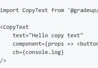
import React from 'react'; import { FullPage, Slide } from 'react-full-page'; export default class FullPageExample extends React.Component { render() { return ( <FullPage controls> <Slide> <h1>Inner slide content</h1> </Slide> <Slide> <h1>Another slide content</h1> </Slide> </FullPage> ); } });Props
initialSlidedefaults to0duration- scroll duration [ms] defaults to700controlsdefaults tofalsetrueadds built-in controls- Pass React component if you want to use your own controls
controlsPropsadditional props for controls componentbeforeChangecallback executed before scrollafterChangecallback executed after scrollscrollModefull-pageornormal- defaults tofull-page
Both beforeChange and afterChange will receive as parameter an object like:
{ "from": 0, // the index of the slide react-full-page is scrolling _from_ "to": 1, // the index of the slide react-full-page is scrolling _to_ }Slider Controls
Basic controls props (passed automatically)
getCurrentSlideIndex: PropTypes.func.isRequired, onNext: PropTypes.func.isRequired, onPrev: PropTypes.func.isRequired, scrollToSlide: PropTypes.func.isRequired, slidesCount: PropTypes.number.isRequired,Default controls example
<FullPage controls controlsProps={{className: 'class-name'}}> ... </FullPage>Custom controls example
<FullPage controls={CustomControls} controlsProps={controlsProps}> ... </FullPage>


