react-taco-table
A React component for creating tables configured by a set of columns.
Examples with live demos are available here: http://pbeshai.github.io/react-taco-table/examples.html
Installation
Install via NPM by running
npm install react-taco-table --save Then including in your application as:
import { TacoTable } from 'react-taco-table'; // Include CSS with webpack or equivalent -- or use your own import 'react-taco-table/dist/react-taco-table.css';Usage
An almost minimal example is as follows:
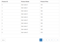
import React from 'react'; import { TacoTable, DataType, Formatters } from 'react-taco-table'; const data = [ { label: 'The first item', value: 12, rating: 5.3216 }, { label: 'Another item', value: 8, rating: 4.9173 }, { label: 'The end of the road', value: 94, rating: 2.6139 }, ]; const columns = [ { id: 'label', type: DataType.String, header: 'Label', }, { id: 'value', type: DataType.Number, header: 'Value', }, { id: 'rating', type: DataType.Number, header: 'Rating', renderer: Formatters.decFormat(2), }, ]; class ExampleAlmostMinimal extends React.Component { render() { return <TacoTable columns={columns} data={data} />; } } export default ExampleAlmostMinimal;Outputs a table equivalent to:
| Label | Value | Rating |
|---|---|---|
| The first item | 12 | 5.32 |
| Another item | 8 | 4.92 |
| The end of the road | 94 | 2.61 |
For full configuration options for columns, see Column Definition below or the docs.
Column Definition
Columns are defined by objects with the following format:
| Name | Type | Description |
|---|---|---|
id | String | The id of the column. Typically corresponds to a key in the rowData object. |
[bottomDataRender] | Function or Function[] or String or String[] | function(columnSummary, { column, rowData, tableData, columns, bottomData })A function that specifies how to render the bottom data (if enabled on the table). Use an array for multiple rows. The rowData is only populated if bottomData of the TacoTable is an array. If a string is provided, it is rendered directly. |
[className] | String | The class name to be applied to both <td> and <th> |
[firstSortDirection] | Boolean | The direction which this column gets sorted by on first click |
[header] | Renderable | What is rendered in the column header. If not provided, uses the columnId. |
[renderer] | Function | function (cellData, { columnSummary, column, rowData, rowNumber, tableData, columns })The function that renders the value in the table. Can return anything React can render. |
[rendererOptions] | Object | Object of options that can be read by the renderer |
[renderOnNull] | Boolean | Whether the cell should render if the cellData is null (default: false) |
[simpleRenderer] | Function | function (cellData, { column, rowData, rowNumber, tableData, columns })The function that render the cell's value in a simpler format. Must return a String or Number. |
[sortType] | String | The DataType of the column to be used strictly for sorting, if not provided, uses type - number, string, etc |
[sortValue] | Function | function (cellData, rowData)Function to use when sorting instead of value. |
[summarize] | Function | function (column, tableData, columns)Produces an object representing a summary of the column (e.g., min and max) to be used in the |
[tdClassName] | Function or String | function (cellData, { columnSummary, column, rowData, highlightedColumn, highlightedRow, rowNumber, tableData, columns, isBottomData })A function that returns a class name based on the cell data and column summary or other information. If a string is provided, it is used directly as the class name. |
[tdStyle] | Function or Object | function (cellData, { columnSummary, column, rowData, highlightedColumn, highlightedRow, rowNumber, tableData, columns, isBottomData })A function that returns the style to be applied to the cell. If an object is provided, it is used directly as the style attribute. |
[thClassName] | String | The class name to be applied to <th> only |
[type] | String | The DataType of the column - number, string, etc |
[value] | Function or String | function (rowData, { rowNumber, tableData, columns })Function to produce cellData's value. If a String, reads that as a key into the rowData object. If not provided, columnId is used as a key into the rowData object. |
[width] | Number or String | The value to set for the style width property on the column. |
Column Groups
Column groups are defined by objects with the following format:
| Name | Type | Description |
|---|---|---|
[className] | String | The className to apply to cells and headers in this group |
columns | String[] | The column IDs to render |
[header] | Renderable | What shows up in the table header if provided |
Plugins
Plugins are defined by objects with the following format:
| Name | Type | Description |
|---|---|---|
[columnTest] | Function | A function that takes a column and returns true or false if it the plugin should be run on this column. Default is true for everything. |
id | String | The ID of the plugin |
[summarize] | Function | A column summarizer function |
[tdStyle] | Function or Object | The TD style function |
[tdClassName] | Function or String | The TD class name function |
Features
- sort
- th classes
- td classes
- fixed widths
- striping
- anything as a th (component, string)
- formatting
- value, sort value, render
- row specific formatting
- row highlighting
- column hover
- highlighting a max or min value
- column grouping
- group headers
- sort indicators
- heatmap
- auxiliary data section at bottom of table
Feature Roadmap
- search within table to filter rows?
- loading view
- selecting rows
- fixed headers
- fixed columns
- repeat headers every N
- CSV export
- paging
- showing row numbers on hover
- ImmutableJS support?
- hiding rows below threshold
- hiding cells below threshold
- expandable rows?
- support external callbacks for cell, column, and row highlighting
- support prop for persistent highlighting of cell/column/row
Developing
Set up
Install dependencies with npm install
Building
To build files for production, run grunt build
Documentation
To generate the documentation, run npm run docs. They will appear in /docs.
Site Dev
To run the webpack-dev-server for the site, run grunt site
Building the Site
To build the prod files for the site, run grunt site-build
To deploy to github pages, run npm run gh-pages -- it will do the grunt site-build automatically.
Testing
To run the tests, run npm test


