React Spreadsheet Grid
An Excel-like grid component for React with custom cell editors, performant scroll & resizable columns
The key features
This is an Excel-like Spreadsheet Grid component that supports:
Table of contents
- Live playground
- Installation
- The primitive example
- The pattern of regular usage
- Props
- Customizing cells & header content
- Performant scroll
- Resizable columns
- Control by mouse & from keyboard
- Lazy loading support
- Customizing CSS styles
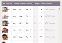
Live playground
For examples of the grid in action, you can run the demo on your own computer:
- Clone this repository
npm installnpm run storybook- Visit http://localhost:6006/
Installation
This module is distributed via npm and should be installed as one of your project's dependencies:
npm install --save react-spreadsheet-grid
⚠️ IMPORTANT! This package also depends onreact,react-domandprop-types. Please make sure you have those installed as well.
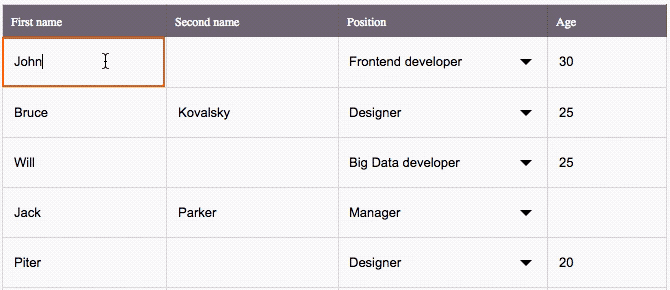
The primitive example
import { Grid, Input, Select } from 'react-spreadsheet-grid' const rows=[ { id: 'user1', name: 'John Doe', positionId: 'position1' }, // and so on... ]; class MyAwesomeGrid extends React.Component { render() { return ( <Grid columns={[ { title: () => 'Name', value: (row, { focus }) => { return ( <Input value={row.name} focus={focus} /> ); } }, { title: () => 'Position', value: (row, { focus }) => { return ( <Select value={row.positionId} isOpen={focus} items={somePositions} /> ); } } ]} getRowKey={row => row.id} /> ) } }The pattern of regular usage
Take a closer look at 2 main thing: a definition of columns and work with the state of a high-order component.
To get the correct behavior of the grid you should:
- Store rows and columns of the grid in the state of a high-order component.
- Describe how the grid has render values of the cells.
- Have a callback that will change values of rows in the state.
Let's see how it works:
import { Grid, Input, Select } from 'react-spreadsheet-grid' import AwesomeAutocomplete from 'awesome-autocomplete' const rows=[ { id: 'user1', name: 'John Doe', positionId: 'position1', managerId: 'manager1' }, // and so on... ]; class MyAwesomeGrid extends React.Component { constructor(props) { super(props); // Rows are stored in the state. this.state = { rows, columns: this.initColumns() }; } // A callback called every time a value changed. // Every time it save a new value to the state. onFieldChange(rowId, field, value) { // Find a row that is being change const row = rows.find({ id } => id === rowId); // Change a value of a field row[field] = value; this.setState({ rows: [].concat(rows), // Blurring focus from the current cell is necessary for a correct behavior of the Grid. blurCurrentFocus: true }); } initColumns() { return [ { title: () => 'Name', value: (row, { focus }) => { // You can use the built-in Input. return ( <Input value={row.name} focus={focus} onChange={this.onFieldChange.bind(this, row.id, 'name')} /> ); } }, { title: () => 'Position', value: (row, { focus }) => { // You can use the built-in Select. return ( <Select value={row.positionId} isOpen={focus} items={somePositions} onChange={this.onFieldChange.bind(this, row.id, 'positionId')} /> ); } }, { title: () => 'Manager', value: (row, { active, focus }) => { // You can use whatever component you want to change a value. return ( <AwesomeAutocomplete value={row.managerId} active={active} focus={focus} onSelectItem={this.onFieldChange.bind(this, row.id, 'managerId')} /> ); } } ] } render() { return ( <Grid columns={this.state.columns} rows={this.state.rows} getRowKey={row => row.id} // Don't forget to blur focused cell after a value has been changed. blurCurrentFocus={this.state.blurCurrentFocus} /> ) } }Props
columns
arrayOf({ id: string / number, title: string / func, value: string / func(row, { active, focused, disabled }), getCellClassName: func(row) }) defaults to
[]
required
This is the most important prop that defines columns of the table. Every item of the array is responsible for the corresponding column.
| key | Required | Mission |
|---|---|---|
id | yes | An identifier of a row. |
title | yes | This is what you want to put in the header of the column, it could be passed as a string or as a func returning a React element. |
value | yes | This is content of the cell. Works the same way as title, but func receives row and current state of the cell ({ active, focused, disabled }) as parameters, so you can create an output based on them. |
getCellClassName | no | An additional class name getter for a row. |
rows
arrayOf(any)| defaults to[]
required
This is an array of rows for the table. Every row will be passed to a column.value func (if you use it).
getRowKey
func(row)
required
This is a func that must return unique key for a row based on this row in a parameter.
placeholder
string| defaults to"There are no rows"
Used as a placeholder text when the rows array is empty.
focusedCell
{ x: number, y: number }| defaults tonull
The cell with this x, y coordinates (starting from 0) will be rendered as a focused cell initially.
disabledCellChecker
func(row, columnId): bool
Use this func to define what cells are disabled in the table. It gets row and columnId (defined as column.id in a columns array) as parameters and identifiers of a cell. It should return boolean true / false. A disabled cell gets special CSS-class and styles. Also, you can define a column.value output based on the disabled state parameter.
onCellClick
func(row, columnId)
A click handler function for a cell. It gets row and columnId (defined as column.id in the columns array) as parameters and identifiers of a cell.
headerHeight
number| defaults to40
The height of the header of the table in pixels.
rowHeight
number| defaults to48
The height of a row of the table in pixels.
focusOnSingleClick
boolean
defaults to
false
By default, double clicking a cell sets the focus on the cell's input. Pass true if you want to set the focus on the cell's input upon single clicking it.
isColumnsResizable
bool| defaults tofalse
Switch this on if you want the table provides an opportunity to resize column width.
onColumnResize
func(widthValues: object)
A callback called every time the width of a column was resized. Gets widthValues object as a parameter. widthValues is a map of values of width for all the columns in percents (columnId - value).
columnWidthValues
object
Pass this object if you want initialize width of columns. It should be a map of values of width for all the columns in percents (columnId - value). For example, it could be { firstName: 50, secondName: 25, age: 25 }. You can set width not for all of the columns, then the rest of table width would be distributed between unspecified columns.
Also, you can get it from onColumnResize callback to store somewhere and use for the next render to make columns stay with the same width.
isScrollable
boolean
defaults to
true
This defines should a grid has a scrollable container inside of a DOM-element where it was rendered, or not. When it turned on (by default), only visible rows are rendered and that improves performance. If you pass false, all the rows will be rendered at once (that is not a good way to handle with a big amount of them), but you will have opportunity to set up a scroll area where you want it to be and have other components (before or after the grid) included in this area.
onScroll
func(scrollPosition: number)
A callback called every time the position of the scroll of the grid was changed.
onScrollReachesBottom
func()
A callback called when the scroll of the grid reaches its bottom value. Usually, it could be used to implement the lazy loading feature in your grid (see the Lazy loading support section for details).
resetScroll
boolean
defaults to
false
Pass true to reset the scroll to the top of the container. Usually, you may need this if you want to re-render a grid with a new array of rows.
blurCurrentFocus
boolean
defaults to
false
true to blur the focused cell of the table after a value of any of cells has been changed. This will ensure the correct behaviour for the table. Usually it should be passed after the onFieldChange callback if we are talking about the regular pattern of usage.
Customizing cells & header content
You can customize content of titles and cells using title and value keys of elements of the columns property. Setting these components using row and { active, focus, disabled } parameters of the functions.
title could be a string or a func returning any React element.
value works the same way, but func receives current row and current state of the cell ({ active, focused, disabled }) as parameters, so you can create an output based on them.
For the basic usage, the library provide 2 default components that you can use out-of-the-box: Input and Select. Perhaps, they will be enough for you. However, you can use any other React components for that purpose: autocompletes, checkboxes, etc.
Built-in Input
Input prop types:
| Prop | Type | Mission |
|---|---|---|
value | string | The value of the input |
placeholder | string | Placeholder displaying when there is no value |
focus | bool | Should the input has focus or not |
onChange | func | Blur callback. Use it to catch a changed value |
Usage:
import { Grid, Input } from 'react-spreadsheet-grid' <Grid columns={[ { id: 'name', title: () => { return <span>Name</span> }, value: (row, { focus }) => { return ( <Input value={row.name} focus={focus} onChange={this.onFieldChange.bind(this, 'name')} /> ); } } ]} />Built-in Select
Select prop types:
| Prop | Type | Mission |
|---|---|---|
items | arrayOf({ id: string / number, name: string }) | Items for select |
selectedId | string / number | Id of a selected item |
placeholder | string | Placeholder displaying when there is no selected item |
isOpen | bool | Should the select be open or not |
onChange | func | Change item callback. Use it to catch a changed value |
Usage:
import { Grid, Select } from 'react-spreadsheet-grid' const positions = [{ id: 1, name: 'Frontend developer' }, { id: 2, name: 'Backend developer' }]; <Grid columns={[ { id: 'position', title: () => { return <span>Position</span> }, value: (row, { focus }) => { return ( <Select items={positions} selectedId={row.positionId} isOpen={focus} onChange={this.onFieldChange.bind(this, 'positionId')} /> ); } } ]} />Another component
Let's suggest you need to use an autocomplete as a content of a cell. This is how it could be done:
import { Grid } from 'react-spreadsheet-grid' import AwesomeAutocomplete from 'awesome-autocomplete' <Grid columns={[ { id: 'manager', title: () => { return <span>Manager</span> }, value: (row, { focus, active }) => { return ( <AwesomeAutocomplete value={row.managerId} active={active} focus={focus} onSelectItem={this.onFieldChange.bind(this, row.id, 'managerId')} /> ); } } ]} />Performant scroll
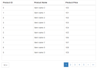
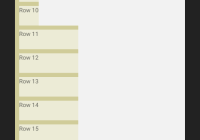
react-spreadsheet-grid always renders only the rows that are visible for the user. Therefore, you can pass to it as many rows as you want - it will work fine without any problems with rendering and scroll.
Resizable columns
react-spreadsheet-grid provides the opportunity to set initial width values for columns, to resize them from the UI and to react on these changes. Use relevant columnWidthValues, isColumnsResizable and onColumnResize properties for that purpose.
Control by mouse & from keyboard
react-spreadsheet-grid could be controlled by a mouse and from keyboard (just like Excel-table could). When a mouse is used, single click make a cell active, double click make a cell focused. When a keyboard used, ← → ↑ ↓ move active cell, ENTER and TAB make a cell focused.
Customizing CSS styles
Right now, the easiest way to tweak react-spreadsheet-grid is to create another stylesheet to override the default styles. For example, you could create a file named react_spreadsheet_grid_overrides.css with the following contents:
.SpreadsheetGrid__cell_active { box-shadow: inset 0 0 0 2px green; }This would override the color of borders for the table active cell.
headerHeight and rowHeight props to redefine height of the header and rows to not broke the scroll of the table.
Lazy loading support
react-spreadsheet-grid provides the opportunity to implement the lazy loading feature in your grid. Use the onScrollReachesBottom callback to handle a situation when the scroll position reaches its bottom. Load a new portion of the rows and put them in the state of a high-order component.
This is how it could be done:
import { Grid } from 'react-spreadsheet-grid' class LazyLoadingGrid extends React.Component { onScrollReachesBottom() { this.loadNewPortionOfRows().then((newRows) => { this.setState({ rows: this.state.rows.concat(newRows) }); }); } loadNewPortionOfRows() { /* an ajax request here */ } render() { return ( <Grid columns={/* some columns here */} row={/* the initial portion of the rows */} getRowKey={row => row.id} onScrollReachesBottom={this.onScrollReachesBottom.bind(this)} /> ) } }


