react-awesome-scroll
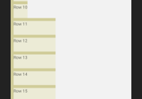
- Custom styled scrollbar with exact native behavior.
- Easily customisable
- No external dependencies
- Has 2 style presets out of the box: You can use it out of box or just with the styles needed for component to scroll content properly. (Or disable all of the styles and add them manually in your project stylesheet system).
Installation
npm
npm install react-awesome-scroll --saveyarn
yarn add react-awesome-scrollUsage
Basic
In order to use the component with it out-of-the-box design, you'll need to just call the component in your React app. You will also need to limit the height of its wrapper, so that the component can get its size limits.
import Scroll from 'react-awesome-scroll'; class CustomScroll extends Component { // Contains demo wrapper render() { return ( <div style={{ height: 300 }}> <Scroll> /* Any content here */ </Scroll> </div> ); } } Customised
import Scroll from 'react-awesome-scroll'; class CustomScroll extends Component { // Contains demo wrapper render() { return ( <div style={{ height: 300 }}> <Scroll className="scroll" containerClassName="scroll-container" innerClassName="scroll-inner" scrollClassName="scroll-track" barClassName="scroll-bar" barActiveClassName="scroll-bar-active" disableStyles disableUIStyles > /* Any content here */ </Scroll> </div> ); } }