vue-autosuggest


Table of Contents
Examples
-
Storybook Helpful to see all variations of component's props.
-
JSFiddle Helpful for playing around and sharing.
-
Codesandbox Demos:
-
Integration with Algolia thanks to @haroenv!
Features
- WAI-ARIA complete autosuggest component built with the power of Vue.
- Full control over rendering with built in defaults or custom components for rendering.
- Easily integrate AJAX data fetching for list presentation.
- Supports multiple sections.
- No opinions on CSS, full control over styling.
- Rigorously tested.
Installation
This module is distributed via npm which is bundled with node and should be installed as one of your project's dependencies:
npm install --save vue-autosuggest or
yarn add vue-autosuggest Usage
Load VueAutosuggest into your vue app globally.
import VueAutosuggest from "vue-autosuggest"; Vue.use(VueAutosuggest);or locally inside a component:
import { VueAutosuggest } from 'vue-autosuggest'; export default { ... components: { VueAutosuggest } ... };Place the component into your app!
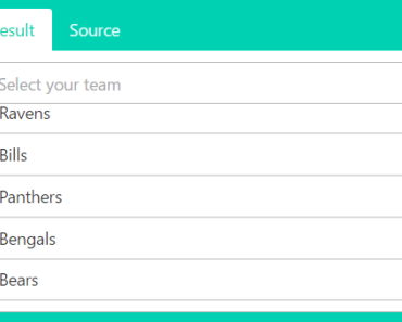
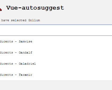
<vue-autosuggest :suggestions="[{data:['Frodo', 'Samwise', 'Gandalf', 'Galadriel', 'Faramir', 'Éowyn']}]" :input-props="{id:'autosuggest__input', placeholder:'Do you feel lucky, punk?'}" @input="onInputChange" @selected="selectHandler" @click="clickHandler" > <template slot-scope="{suggestion}"> <span class="my-suggestion-item">{{suggestion.item}}</span> </template> </vue-autosuggest> Advanced usage:
Click to expand
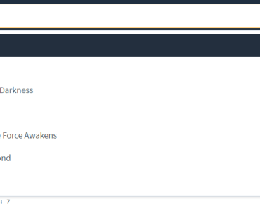
<template> <div class="demo"> <div v-if="selected" style="padding-top:10px; width: 100%;"> You have selected <code>{{selected.name}}, the {{selected.race}}</code> </div> <div class="autosuggest-container"> <vue-autosuggest v-model="query" :suggestions="filteredOptions" @focus="focusMe" @click="clickHandler" @input="onInputChange" @selected="onSelected" :get-suggestion-value="getSuggestionValue" :input-props="{id:'autosuggest__input', placeholder:'Do you feel lucky, punk?'}"> <div slot-scope="{suggestion}" style="display: flex; align-items: center;"> <img :style="{ display: 'flex', width: '25px', height: '25px', borderRadius: '15px', marginRight: '10px'}" :src="suggestion.item.avatar" /> <div style="{ display: 'flex', color: 'navyblue'}">{{suggestion.item.name}}</div> </div> </vue-autosuggest> </div> </div> </template> <script> import { VueAutosuggest } from "vue-autosuggest"; export default { components: { VueAutosuggest }, data() { return { query: "", selected: "", suggestions: [ { data: [ { id: 1, name: "Frodo", race: "Hobbit", avatar: "https://upload.wikimedia.org/wikipedia/en/thumb/4/4e/Elijah_Wood_as_Frodo_Baggins.png/220px-Elijah_Wood_as_Frodo_Baggins.png" }, { id: 2, name: "Samwise", race: "Hobbit", avatar: "https://upload.wikimedia.org/wikipedia/en/thumb/7/7b/Sean_Astin_as_Samwise_Gamgee.png/200px-Sean_Astin_as_Samwise_Gamgee.png" }, { id: 3, name: "Gandalf", race: "Maia", avatar: "https://upload.wikimedia.org/wikipedia/en/thumb/e/e9/Gandalf600ppx.jpg/220px-Gandalf600ppx.jpg" }, { id: 4, name: "Aragorn", race: "Human", avatar: "https://upload.wikimedia.org/wikipedia/en/thumb/3/35/Aragorn300ppx.png/150px-Aragorn300ppx.png" } ] } ] }; }, computed: { filteredOptions() { return [ { data: this.suggestions[0].data.filter(option => { return option.name.toLowerCase().indexOf(this.query.toLowerCase()) > -1; }) } ]; } }, methods: { clickHandler(item) { // event fired when clicking on the input }, onSelected(item) { this.selected = item.item; }, onInputChange(text) { // event fired when the input changes console.log(text) }, /** * This is what the <input/> value is set to when you are selecting a suggestion. */ getSuggestionValue(suggestion) { return suggestion.item.name; }, focusMe(e) { console.log(e) // FocusEvent } } } </script> <style> .demo { font-family: -apple-system, BlinkMacSystemFont, 'Segoe UI', Roboto, Oxygen, Ubuntu, Cantarell, 'Open Sans', 'Helvetica Neue', sans-serif; } input { width: 260px; padding: 0.5rem; } ul { width: 100%; color: rgba(30, 39, 46,1.0); list-style: none; margin: 0; padding: 0.5rem 0 .5rem 0; } li { margin: 0 0 0 0; border-radius: 5px; padding: 0.75rem 0 0.75rem 0.75rem; display: flex; align-items: center; } li:hover { cursor: pointer; } .autosuggest-container { display: flex; justify-content: center; width: 280px; } #autosuggest { width: 100%; display: block;} .autosuggest__results-item--highlighted { background-color: rgba(51, 217, 178,0.2); } </style>For more advanced usage, check out the examples below, and explore the properties you can use.
Slots
header/footer
Slots for injecting content around the results/input. Useful for header/footer like slots or empty state.
<vue-autosuggest ...> <template slot="before-input"> content before the <input /> goes here </template> <template slot="after-input"> content after the <input /> goes here </template> <template slot="before-suggestions"> content before the <ul> goes here </template> <template slot="before-section-<section.name e.g. 'default'>"> section header content for specific section goes here </template> <template slot="after-section-<section.name e.g. 'default'>"> footer content goes here for specific section. </template> <template slot="after-section"> Default footer content for all sections </template> <template slot="after-suggestions"> content after the <ul> goes here </template> </vue-autosuggest>suggestion item (i.e. default slot)
Used to style each suggestion inside the <li> tag. Using scoped slots you have access to the suggestion item inside the v-for suggestions loop. This gives you the power of Vue templating, since vue-autosuggest does not have an opinion about how you render the items in your list.
<vue-autosuggest> <template slot-scope="{suggestion}"> <!-- suggestion.name corresponds to which section the item is in --> <div v-if="suggestion.name === 'blog'"> <!-- suggestion.item corresponds to the suggestion object --> <a target="_blank" :href="suggestion.item.url">{{suggestion.item.value}}</a> </div> <div v-else>{{suggestion.item}}</div> </template> </vue-autosuggest>This slot will be overridden when the
render-suggestionprop is used.
Props
| Prop | Type | Required | Description |
|---|---|---|---|
suggestions | Array | ✓ | Suggestions to be rendered. e.g.suggestions: [{data: ['harry','ron','hermione']}] |
input-props | Object | ✓ | Add props to the <input>. |
section-configs | Object | Define multiple sections <input>. | |
render-suggestion | Function | Tell vue-autosuggest how to render inside the <li> tag. Overrides what is inside the default suggestion template slot. | |
get-suggestion-value | Function | Tells vue-autosuggest what to put in the <input/> value | |
should-render-suggestions | Function | Tell vue-autosuggest if it should render the suggestions results popover | |
@selected | Function | ✓ | suggestion select handler. equivalent to sectionConfigs on-selected but for all items |
component-attr-id-autosuggest | String | id of entire component | |
component-attr-class-autosuggest-results-container | String | class of container of results container | |
component-attr-class-autosuggest-results | String | class of results container |
inputProps
| Prop | Type | Required | Description |
|---|---|---|---|
id | String | ✓ | id attribute on <input>. |
| Any DOM Props | * | You can add any props to <input> as the component will v-bind inputProps. Similar to rest spread in JSX. See more details here: https://vuejs.org/v2/api/#v-bind. The name attribute is set to "q" by default. |
sectionConfigs
Multiple sections can be defined in the sectionConfigs prop which defines the control behavior for each section.
| Prop | Type | Required | Description |
|---|---|---|---|
on-selected | Function | ✓ | Determine behavior for what should happen when a suggestion is selected. e.g. Submit a form, open a link, update a vue model, tweet at Ken Wheeler etc. |
limit | Number | Limit each section by some value. Default: Infinity |
Below we have defined a default section and a blog section. The blog section has a component type of url-section which corresponds to which component the Autosuggest loads. When type is not defined, Vue-autosuggest will use a built in DefaultSection.vue component.
sectionConfigs: { 'default': { limit: 6, onSelected: function(item, originalInput) { console.log(item, originalInput, `Selected "${item.item}"`); } }, 'blog': { limit: 3, type: "url-section", onSelected: function() { console.log("url: " + item.item.url); } } }renderSuggestion
This function can be used to tell vue-autosuggest how to render the html inside the <li> tag when you do not want to use the default template slot for suggestions but would rather have the power of javascript / jsx.
In its most basic form it just returns an object property:
renderSuggestion(suggestion) { return suggestion.name; },But usually it returns a JSX fragment, which is transformed into a virtual node description with babel-plugin-transform-vue-jsx:
renderSuggestion(suggestion) { return <div style={{ color: "red" }}>{suggestion.name}</div>; },If you're not using babel-plugin-transform-vue-jsx, you can create the virtual node description yourself:
renderSuggestion(suggestion) { return this.$createElement('div', { 'style': { color: 'red'} }, suggestion.name); },getSuggestionValue
This function will tell vue-autosuggest what to put in the <input/> as the value.
getSuggestionValue(suggestion) { return suggestion.item.name; },shouldRenderSuggestions
This function will tell vue-autosuggest if it should display the suggestions popover
/** * @param {Array} size - total results displayed * @param {Boolean} loading - value that indicates if vue-autosuggest _thinks_ that the * the popover should be open (e.g. if user hit escape, or * user clicked away) * @returns {Boolean} */ shouldRenderSuggestions (size, loading) { // This is the default behavior return size >= 0 && !loading }Inspiration
- Misha Moroshko's react-autosuggest component inspired the api + WAI-ARIA completeness https://github.com/moroshko/react-autosuggest
Contributors
Thanks goes to these people (emoji key):
Darren Jennings | Evgeniy Kulish | Scott Smith | Fernando Machuca |
|---|
Thanks to @chuca for the logo design.
This project follows the all-contributors specification. Contributions of any kind welcome!
LICENSE
MIT