Vue 2 Autocomplete
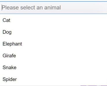
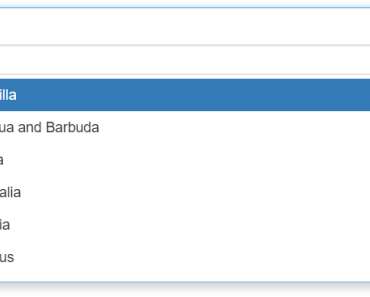
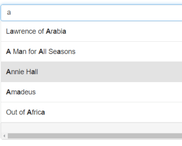
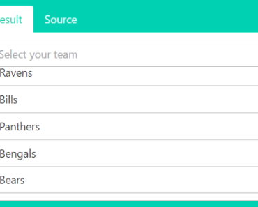
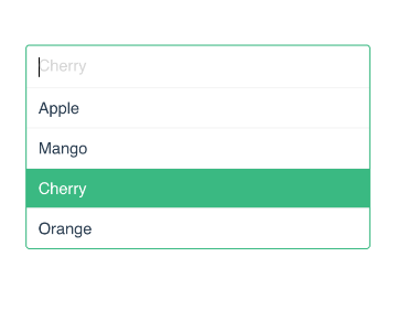
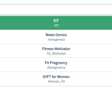
Autocomplete Component For Vue 2. It's based on vue-autocomplete. LIVE DEMO HERE!
Install
You can import vue2-autocomplete.vue to your vue component file like this and process it with your preprocessor.
You can install it via NPM
npm install vue2-autocomplete-jsOr Just put it after Vue JS~
<script src="https://vuejs.org/js/vue.min.js"></script> <script src="./dist/vue2-autocomplete.js"></script> <script> // Don't Forget to register it new Vue({ components: { autocomplete: Vue2Autocomplete } }); </script>Import Style
Don't forget to import vue 2 css. You can link it via html
<link rel="stylesheet" href="vue2-autocomplete-js/dist/style/vue2-autocomplete.css">Or You can import it using commonJS
require('vue2-autocomplete-js/dist/style/vue2-autocomplete.css')Its style is very customizable. You can put any CSS over it. And You can add custom class via its prop.
Import Module
import Autocomplete from 'vue2-autocomplete-js' // Or var Autocomplete = require('vue2-autocomplete-js');Usage
<template> <autocomplete url="http://localhost/proyek/goodmovie/api/api/v1/search" anchor="title" label="writer" :on-select="getData"> </autocomplete> </template> <script> import Autocomplete from 'vue2-autocomplete-js'; export default { components: { Autocomplete }, methods: { getData(obj){ console.log(obj); } } }; </script>Available Props
<template> <autocomplete url="http://localhost/proyek/goodmovie/api/api/v1/search" anchor="title" label="writer" :onSelect="getData" :customParams="{ token: 'dev' }" :customHeaders="{ Authorization: 'bearer abc123' }" :required="true" id="custom id" className="custom class name" :classes="{ wrapper: 'form-wrapper', input: 'form-control', list: 'data-list', item: 'data-list-item' }" placeholder="placeholder" :initValue="initial value" :options="[]" :min="3" :debounce="2000" :filterByAnchor="true" :encodeParams="true" :onShouldGetData="getData" :onInput="callbackEvent" :onShow="callbackEvent" :onBlur="callbackEvent" :onHide="callbackEvent" :onFocus="callbackEvent" :onSelect="callbackEvent" :onBeforeAjax="callbackEvent" :onAjaxProgress="callbackEvent" :onAjaxLoaded="callbackEvent" :onShouldRenderChild="renderChild" > </autocomplete> </template>Props
url* (String)
the URL must be active (not from file). the component will fetch JSON from this URL and passing one params (default : q) query. like:
http://some-url.com/API/list?q= There are no filter and limit action inside the component. So, do it in your API logic.
param (String: "q")
name of the search parameter to query in Ajax call. default is q
min (Number: 0)
Minimum input typed chars before performing the search query. default is 0
anchor* (String)
It's a object property path that used for Anchor in suggestions list. Example anchor="name" will get the name property of your JSON object. Like ("Bambang", "Sukijan", "Bejo") in the demo above. Or you can reach the deep value of your object. Like anchor="geometry.location.lat"
label (String)
Same as anchor but it's used for subtitle or description of list
options (Array)
Manual pass an Array of list options to the autocomplete.
filterByAnchor (Boolean: true)
When you're using options props, you can have autocomplete to filter your data. Or you can just show your data directly without any filter from autocomplete. The options will be filtered by anchor and it according to the user input.
encodeParams (Boolean: true)
Autocomplete will encodeURIComponent all your params before ajax send, When this props sets to true. Default is true #35
debounce (Number)
Delay time before do the ajax for the data
required (Boolean)
Required attribute for input
placeholder (String)
Placeholder for input
className (String)
Custom class name for autocomplete component
classes (Object)
Spesific custom class for each part. available: wrapper, input, list, and item
id (String)
Custom id name for autocomplete component
debounce (number)
Number of milliseconds the user should stop typing for before the request is sent. Default is 0, meaning all requests are sent immediately.
process (Function)
Function to process the API result with. Should return an array of entries or an object whose properties can be enumerated.
template (Function)
Function to process each result with. Takes the type of an API reply element and should return HTML data.
Callback Events
You can make a callback event via props.
onInput (Function)
On Input event in autocomplete
onShow (Function)
On Show event in autocomplete list
onBlur (Function)
When autocomplete is blured
onHide (Function)
When autocomplete list is hidden
onFocus (Function)
When autocomplete input in focus mode
onSelect (Function)
When user has selected one item in the list
onBeforeAjax (Function)
Before the ajax send
onAjaxProgress (Function)
While ajax is fetching the data
onAjaxLoaded (Function)
When ajax process is totally loaded
onShouldGetData (Function)
Manually Process the whole ajax process. If it's a Promise, it should resolve the options for the list of autocomplete. If it isn't a Promise, you can manually pass the options to the props of autocomplete
<autocomplete anchor="formatted_address" label="formatted_address" :onShouldGetData="getData" > </autocomplete>methods: { promise(value) { return new Promise((resolve, reject) => { let ajax = new XMLHttpRequest(); ajax.open('GET', `https://maps.googleapis.com/maps/api/geocode/json?address=${value}`, true); // On Done ajax.addEventListener('loadend', (e) => { const { responseText } = e.target let response = JSON.parse(responseText); // The options to pass in the autocomplete resolve(response.results) }); ajax.send(); }) }, nonPromise() { getData(value) { let ajax = new XMLHttpRequest(); ajax.open('GET', `https://maps.googleapis.com/maps/api/geocode/json?address=${value}`, true); // On Done ajax.addEventListener('loadend', (e) => { const { responseText } = e.target let response = JSON.parse(responseText); // The options to pass in the autocomplete props this.options = response.results; }); ajax.send(); }, } }process (Function)
Process the result before retrieveng the result array. You can shape your data here before it's passed to the autocomplete
onShouldRenderChild (Function)
Wanna use custom template for the list? Now, you can do it!
<autocomplete anchor="formatted_address" label="formatted_address" :onShouldRenderChild="renderChild" > </autocomplete>methods: { renderChild(data) { return ` <img src="${data.src}" /> <span>${data.something}</span> ` }, }Methods
You can do some methods by accessing the component via javascript.
this.$refs.autocomplete.someMethod()setValue (String)
To set the value of the autocomplete input
Thank You for Making this useful~
Let's talk about some projects with me
Just Contact Me At:
- Email: [email protected]
- Skype Id: bosnaufal254
- twitter: @BosNaufal
License
MIT Copyright (c) 2016 - forever Naufal Rabbani
