Vue Switches


A Vue.js component for simple switches with theme support for bulma, bootstrap and custom themes. See a live demo here.

Installation
npm install vue-switches --saveBasic Usage
import Switches from 'vue-switches'; new Vue({ components: { Switches }, data () { return { enabled: false } } };<switches v-model="enabled"></switches> Props
| Prop | Description |
|---|---|
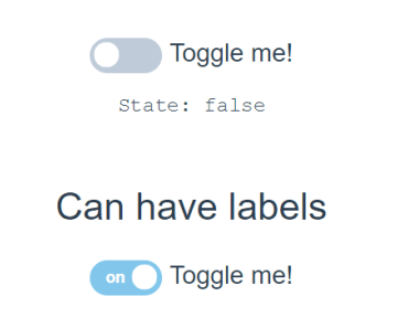
| label | A static label to always display whether on or off. |
| text-enabled | The text that displays when enabled. |
| text-disabled | The text that displays when disabled. |
| theme | Which theme to use. |
| color | Which color to use. |
| type-bold | Bigger style. |
| emit-on-mount | By default, a "changed" event is emitted when the component mounts. To disable this, set this to false. |
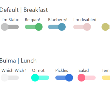
Theme Support
Out of the box vue-switches supports a default, bulma, bootstrap themes. To use them you can do as follows:
Providing no theme or color props would render a switch of default theme and color.
<switches v-model="enabled"></switches> Available colors for default are default, red, blue, green, and yellow, and orange.
<switches v-model="enabled" theme="bulma" color="default"></switches> Available colors for Bulma are default, primary, red, blue, green, and yellow.
In addition support for bootstrap can be used as follows:
<switches v-model="enabled" theme="bootstrap" color="danger"></switches> Available colors for bootstrap are default, primary, success, info, warning, and danger.
Styles
Out of the box vue-switches has two styles: default and bold. By default the switch is not bold. To enable the bold style you can set type-bold to true like this:
<switches v-model="enabled" type-bold="true"></switches> A demo of all themes and styles can be seen here.
Making Your Own Themes
Vue Switcher has a base class of .vue-switcher. For an unchecked switch a class of .vue-switcher--unchecked is applied. Lastly, for the theme and color props a class is also applied. So for a bulma theme of color primary the classes .vue-switcher-theme--bulma and .vue-switcher-color--primary.
This:
<switches v-model="enabled" type-bold="false" theme="custom" color="blue"></switches> Would render the classes .vue-switcher-theme--custom and .vue-switcher-color--blue. Sass for this theme could look like:
.vue-switcher-theme--custom { &.vue-switcher-color--blue { div { background-color: lighten(blue, 10%); &:after { // for the circle on the switch background-color: darken(blue, 5%); } } &.vue-switcher--unchecked { div { background-color: lighten(blue, 30%); &:after { background-color: lighten(blue, 10%); } } } } }For better understanding, below is how the class object is rendered.
classObject () { const {color, enabled, theme, typeBold, disabled} = this; return { 'vue-switcher': true, ['vue-switcher--unchecked']: !enabled, ['vue-switcher--disabled']: disabled, ['vue-switcher--bold']: typeBold, ['vue-switcher--bold--unchecked']: typeBold && !enabled, [`vue-switcher-theme--${theme}`]: color, [`vue-switcher-color--${color}`]: color, }; }