vue-password 2.x
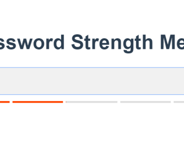
A Vue.js password input component that includes a toggle to show the password and a strength meter using the Dropbox zxcvbn library.
Please note, the password has various breaking changes in the 2.x version compared to 1.x.
Install
Install the package using npm.
npm install --save vue-passwordvue-password includes two components. The default VuePassword component requires a custom strength library and value passed to the component using the :strength property.
An optional VuePasswordAuto component is also included. This component requires the Dropbox zxcvbn library to be added and will automatically calculate the strength of the password.
npm install --save zxcvbnThe Dropbox zxcvbn library is very large at over 900kb, so it is no longer included by default.
Globally register the component.
import VuePassword from 'vue-password' Vue.component( VuePassword, { name: 'MyPassword', // Optional component name. type: 'auto', // Use the auto version with zxcvbn. } );Locally register the components.
import { VuePassword, VuePasswordAuto } from 'vue-password'; export default { ... components: { VuePassword, VuePasswordAuto, }, ... };Usage
Use the props in your HTML and apply a v-model attribute for the password and any additional props for the desired configuration. The password input uses the $attrs attributes, so form validation props such as required, minlength, and maxlength will function on the input element. The following example shows how vue-password could be used in a registration form using Tailwind CSS.
Javascript
import Vue from 'vue' import { VuePassword } from 'vue-password' new Vue({ el: '#app', components: { VuePassword }, data { user: { email: '', password: '' } } })HTML
<form> <div class="mb-4"> <label for="password">Password</label> <VuePassword v-model="password1" id="password1" :strength="strength" type="text" /> </div> </form>Props
Use the following props to configure the password input.
| Prop | Default | Description |
|---|---|---|
| classes | 'form-control' | Set the classes for the input element. The default is the 'form-control' class used by Twitter Bootstrap. A string or array of classes can be passed in the prop. |
| disableStrength | false | Disable the password strength meter and messages. |
| disableToggle | false | Disable the password input toggle to show/hide the password. |
| strengthClasses | ['VuePassword--very-weak', 'VuePassword--weak', 'VuePassword--medium', 'VuePassword--good', 'VuePassword--great'] | Set the classes used to style the strength message and strength meter. This should be an array of five classes. The classes are applied depending on the current strength score of the password (0-4). |
| strengthMessages | ['Very Weak Password', 'Weak Password', 'Medium Password', 'Strong Password' 'Very Strong Password'] | Set the messages that appear depending on the strength score of the password. This should be an array of five messages. |
| userInputs | [] | VuePasswordAuto Only Set any additional strings for improving the strength calculation. For example, add values for username or email fields so if the password contains those items, it will receive a lower strength. Click here for more information. |
Events
The password input emits an input event to use with v-model. Other events are binded use v-on="listeners".
Slots
Named slots can be used to change the layout of the password toggle, strength meter, and strength messages.
| Slot | Scope | Description |
|---|---|---|
| password-input |
| Use this to replace the input element. The content provided by the slot must include an input field, preferably of type password. |
| password-toggle | toggle: Method to change the input type attribute from 'password' to 'type' | Use this named slot to change the layout of the password toggle. |
| password-hide | Use this named slot to change the password hide icon. | |
| password-show | Use this named slot to change the password show icon. | |
| strength-meter |
| Use this named slot to change the layout of the password strength meter. |
Example: Use custom input
<VuePassword v-model="user.password" > <div v-slot:password-input="props" class="control has-icons-left" > <input class="input" type="password" placeholder="Text input" :value="props.value" @input="props.updatePassword" /> </div> </VuePassword>Custom Strength Example
HTML
<form> <label for="password">Password</label> <VuePassword v-model="user.password" :strength="score" @input="updateStrength" /> </form>Javascript
import { VuePassword } from 'vue-password' new Vue({ el: '#app', components: { VuePassword, }, data: { score: 0, user: { password: '' } }, methods: { updateStrength(password) { /** * The input event sends the current password and * any included user inputs (email in this case). * * Calculate the score here either using a custom * javascript library or a request to the server. * * The strength must be an integer between 0 and 4. */ } } });