vuejs-toggle-switch
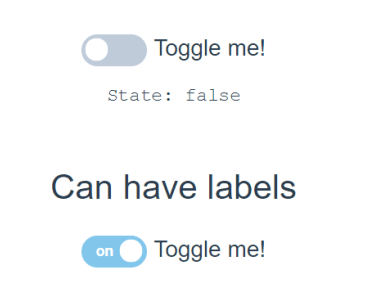
Toggle switch for vue.js
v1.3.0

Do you have questions or want a new feature? Use the "Issues" section
NB! Version 1.2.32 now use rem instead of px
Setup
install:
npm install vuejs-toggle-switch --saveImport: (in your main.js)
import ToggleSwitch from 'vuejs-toggle-switch' Vue.use(ToggleSwitch)Usage
Use: (in your local .vue file/component, html section)
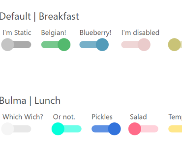
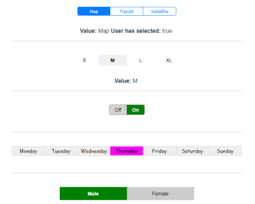
<toggle-switch :options="myOptions" :disabled="false" // optional, can use here on top level or in items section @change="updateMap($event.value)" // This is optional @selected="selectedMethod()" // This is optional v-model="selectedMapOption" // This is optional 2-way binding (try not to use both 1-way and 2-way) :value="selectedMapOption" // This is optional 1-way binding (try not to use both 1-way and 2-way) :name="name" // This is optional for input block :group="switchGroup" // This is optional, use if multiple toggle-switch on same page with same label names /> <!-- Options struct: --> myOptions: { layout: { color: 'black', backgroundColor: 'lightgray', selectedColor: 'white', selectedBackgroundColor: 'green', borderColor: 'black', fontFamily: 'Arial', fontWeight: 'normal', fontWeightSelected: 'bold', squareCorners: false, noBorder: false }, size: { fontSize: 14, height: 34, padding: 7, width: 100 }, items: { delay: .4, preSelected: 'unknown', disabled: false, labels: [ {name: 'Off', color: 'white', backgroundColor: 'red'}, {name: 'On', color: 'white', backgroundColor: 'green'} ] } }Properties
| Name | Type | Default | Description |
|---|---|---|---|
| width | Number | 10 | Width of labels |
| height | Number | 3.25 | Height |
| padding | Number | 0.5 | Adjust text location in label with this |
| backgroundColor | String | lightgray | Background color (not selected) |
| color | String | black | Text color (not selected) |
| borderColor | String | gray | border color |
| selectedColor | String | white | Text color selected label |
| selectedBackgroundColor | String | green | Selected label background color |
| fontFamily | String | Arial | Font of label text |
| fontWeight | String | normal | Font weight item (not selected) |
| fontWeightSelected | String | bold | Font weight selected item |
| fontSize | Number | 1.5 | Text size |
| disabled | Boolean | false | Disable switch |
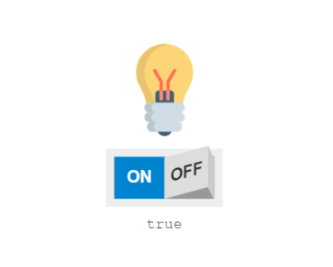
| preSelected | String | On | Set (pre) selected label |
| labels | Array | Off/On | Labels for switch, name property is mandatory |
| value | String | n/a | Value, ie: v-model="selectedMapOption" |
| delay | Number | .4 | Transition delay between labels is seconds |
| squareCorners | Boolean | false | Rounded corners of switch |
| noBorder | Boolean | false | Remove border |
| group | String | '' | Switch key/group name (optional) |
| name | String | '' | Name for input field (optional) can be used as ref for forms etc |
| disabled (prop) | Boolean | false | Disable switch on top level (prop) |
Labels prop can be used with or without color and backgroundColor attr, if not used the common prop: selectedColor and selectedBackgroundColor will be used for all labels.
Events
| Name | Description |
|---|---|
| change | Triggered on toggle, user selects switch option, returns current value. @change="vmValueItem = $event.value" |
| selected | Triggered whenever user select switch item |
| input | Triggered on mount if preSelected is set or value is set, and on toggle/change |
Todo 📌
- Pass class name to switch
- Option to use id for labels not only name
Add disabled to top levelAdd coditional class "slected" to label if selected