点击查看中文文档 | Have a glance at Demo
Intro
<input type="file" />like, only support single image- auto-upload support
- drop-select / preview / use as
<img />as well - optional skins
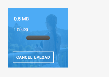
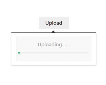
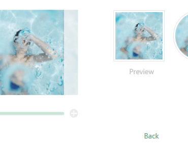
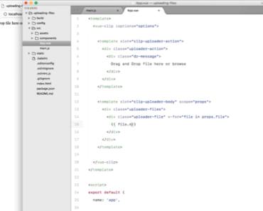
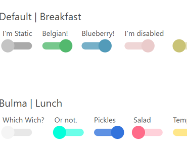
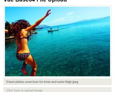
Screenshots

Install and Usage
npm install vue-img-inputerimport ImgInputer from 'vue-img-inputer' import 'vue-img-inputer/dist/index.css' Vue.component('ImgInputer', ImgInputer)<img-inputer v-model="file" theme="light" size="large"/>API
Auto upload related
-
auto-upload: Boolean
set to enable auto-upload -
action: String
request URL -
upload-key: String
default:file
key name in form-data -
extra-data: Object
extra data been appended in request's form-data -
headers: Object
additional headers of request -
with-cookie: Boolean
whether cookies will been sent -
on-start: Function
params: func ( file )
hook function when upload start -
on-progress: Function
params: func ( event, file )
hook function when uploading, get progress byevent.percent -
on-success: Function
params: func ( res, file )
hook function when upload success,resis response from server -
on-error: Function
params: func ( err, file )
hook function when upload failed
Input tag related
-
accept: String
default:image/*,video/*;
suggest to set a specific value likeimage/jpg,image/gif;for wildcard will lead to a serious delay -
placeholder: String
default:Drop file here or click -
id: String
default: random string in 4 length
id of input tag -
readonly: Boolean -
capture: Boolean
default:false
whether use camera directly in mobile -
max-size: Number
default: 5120
max-size of image (KB) -
name: Boolean
name of input tag -
any input's attribute
any input's original attributes set on component will be inherited by inner input tag
UI related
-
img-src: String
image resource let component behavior like<img /> -
theme: String
default:materialtwo themes optional (light / material) -
size: String small / normal / large -
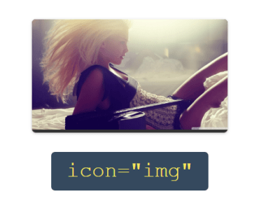
icon: String
clip / img / img2 -
ali-icon: String
if you use iconfont.cn, set unicode of any icon to custom -
no-mask: Boolean
remove mask when hover -
no-hover-effect: Boolean
remove all hover effect (include text) when hover -
bottom-text: String
default:Drop file here or click to change
text in the bottom when hover -
no-multiple-text: String
default:Not support multiple files
visible only the state isreadonly, cover bottom-text -
exceed-size-text: String
default:The size of file should less than: ${maxSize}
visible only the state isreadonly, cover bottom-text -
no-action-text: String
default:Action hasn't set up yet
visible only the state isreadonly, cover bottom-text -
readonly-tip-text: String
default:Readonly
visible only the state isreadonly, cover bottom-text
Events
-
onChange: Function
params: func ( file, fileName )
hook function when file selected -
onExceed: Function
params: func ( file )
hook function when file exceed max-size
Methods
reset
reset componet but will not clearimg-src