
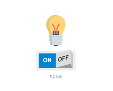
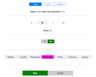
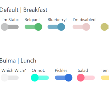
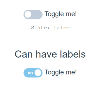
Vue.js toggle/switch button.


Install
npm install vue-js-toggle-button --saveImport
Import plugin:
import ToggleButton from 'vue-js-toggle-button' Vue.use(ToggleButton)OR
Import component:
import { ToggleButton } from 'vue-js-toggle-button' Vue.component('ToggleButton', ToggleButton)Use
<toggle-button @change="onChangeEventHandler"/> <toggle-button v-model="myDataVariable"/> <toggle-button :value="false" color="#82C7EB" :sync="true" :labels="true"/> <toggle-button :value="true" :labels="{checked: 'Foo', unchecked: 'Bar'}"/>Properties
| Name | Type | Default | Description |
|---|---|---|---|
| value | Boolean | false | Initial state of the toggle button |
| sync | Boolean | false | If set to true, will be watching changes in value property and overwrite the current state of the button whenever value prop changes |
| speed | Number | 300 | Transition time for the animation |
| disabled | Boolean | false | Button does not react on mouse events |
| color | [String, Object] | #75C791 | If String - color of the button when checked If Object - colors for the button when checked/unchecked or disabledExample: {checked: '#00FF00', unchecked: '#FF0000', disabled: '#CCCCCC'} |
| css-colors | Boolean | false | If true - deactivates the setting of colors through inline styles in favor of using CSS styling |
| labels | [Boolean, Object] | false | If Boolean - shows/hides default labels ("on" and "off") If Object - sets custom labels for both states. Example: {checked: 'Foo', unchecked: 'Bar'} |
| switch-color | [String, Object] | #BFCBD9 | If String - color or background property of the switch when checked If Object - colors or background property for the switch when checked/uncheked Example: {checked: '#25EF02', unchecked: 'linear-gradient(red, yellow)'} |
| width | Number | 50 | Width of the button |
| height | Number | 22 | Height of the button |
| margin | Number | 3 | Space between the switch and background border |
| name | String | undefined | Name to attach to the generated input field |
| font-size | Number | undefined | Font size |
Events
| Name | Description |
|---|---|
| change | Triggered whenever state of the component changes. Contains: value - state of the object srcEvent - source click event |
| input | Input event for v-model |
SSR
Include plugin in your nuxt.config.js file:
module.exports = { plugins: ['~plugins/vue-js-toggle-button'] }And your plugins/vue-js-toggle-button.js will look like:
import Vue from 'vue' import Button from 'vue-js-toggle-button' Vue.use(Button)Browser compatibility
- Chrome: 40+
- Firefox: 25+
- Safari: 10+
- IE: 11+