vue-float-label
Float label pattern for Vue.js. Cross-browser compatible and easy to customize with CSS.

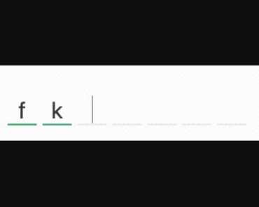
<float-label> <input type="text" placeholder="Label"> </float-label>Installation
yarn / npm
Install package using yarn or npm:
$ yarn add vue-float-label # or $ npm install --save vue-float-labelGlobal
Load the plugin by calling Vue.use():
import Vue from "vue"; import VueFloatLabel from "vue-float-label"; Vue.use(VueFloatLabel);Now you have access in your templates to the <float-label> component.
Local
You may prefer to explicitly import the plugin and use it inside your components:
<template> <float-label> ... </float-label> </template> <script> import FloatLabel from "vue-float-label/components/FloatLabel"; export default { components: { FloatLabel } }; </script>CDN
Load the script file from CDN:
<div id="root"></div> <script src="//cdnjs.cloudflare.com/ajax/libs/vue/2.2.1/vue.min.js"></script> <script src="//unpkg.com/vue-float-label"></script> <script> new Vue({ el: '#root', template: '<float-label>...</float-label>' }) </script>Usage
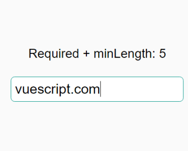
Wrap input, textarea or select with <float-label>:
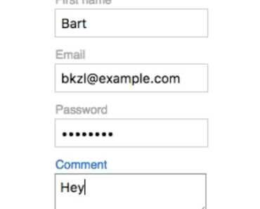
<float-label> <input type="email" placeholder="E-mail"> </float-label> <float-label> <textarea placeholder="Comment"></textarea> </float-label> <float-label :dispatch="false"> <select> <option disabled selected>Framework</option> <option>Vue</option> <option>React</option> <option>Angular</option> <option>Ember</option> </select> </float-label>See more examples at Demo.vue.
Customization
Design
Style .vfl-label, .vfl-label-on-input and .vfl-label-on-focus to meet your design requirements:

.vfl-label { text-transform: uppercase; } .vfl-label-on-input { top: -1em; } .vfl-label-on-focus { color: #ff851b; } .vfl-label + input { padding-left: 0; font-size: 100%; border: 0; border-bottom: 2px solid #aaa; transition: border 0.2s; } .vfl-label-on-focus + input { border-bottom: 2px solid #ff851b; }Props
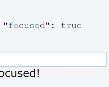
Set :on prop to add an additional condition for label activation:
<template> <float-label :on="isActive"> <input type="text" placeholder="Inactive"> </float-label> </template> <script> export default { computed: { isActive() { return false; } }, components: { FloatLabel } }; </script>Set :label prop to override placeholder attribute for input/textarea or option[disabled][selected] for select:
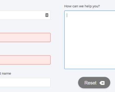
<float-label label="Last name"> <input type="text" placeholder="Surname"> </float-label><template> <float-label label="Version"> <select v-model="version"> <option v-for="option in options" :value="option.value"> {{ option.text }} </option> </select> </float-label> </template> <script> export default { data() { return { version: "beta", options: [ { value: "alpha", text: "Alpha" }, { value: "beta", text: "Beta" }, { value: "stable", text: "Stable" } ] }; }, components: { FloatLabel } }; </script>Set :fixed to true to make label permanently active:
<template> <float-label fixed> <input type="text" placeholder="Fixed"> </float-label> </template>Set :dispatch to false to disable triggering input event once the component is mounted:
By default it's set to true to activate label when form element has value.
<template> <float-label :dispatch="false"> <input type="email" placeholder="Email" v-model="email"> </float-label> </template> <script> export default { data() { return { email: "[email protected]" }; }, components: { FloatLabel } }; </script>Development
-
Clone the repository:
$ git clone [email protected]:bkzl/vue-float-label.git
-
Install dependencies:
$ yarn install
-
Start development:
$ yarn start
Code is open sourced on GitHub. Up to date changelog is available under the releases section.