advanced-select
What's this
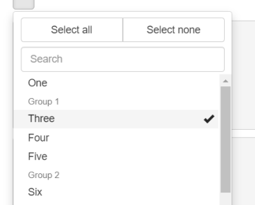
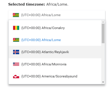
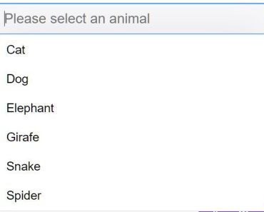
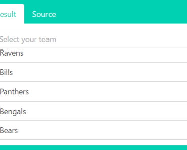
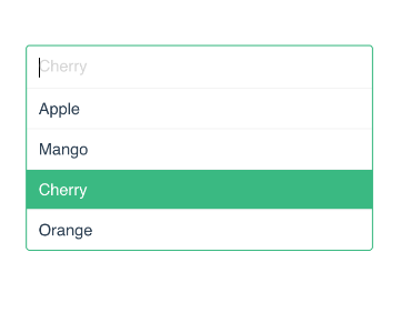
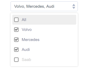
Component to render a "select" with advanced interactions (search, select/deselect all, etc) for websites built with Vue and Bootstrap 3
Install
npm install @myena/advanced-select Dependencies
- Vue 2
- Bootstrap 3
Demo
https://vueadvancedselect.firebaseapp.com/
Usage
Options can be passed as props
<AdvancedSelect v-model="value" :options="options" :disabled="disabled" />Or as the default slot
<AdvancedSelect v-model="secondValue" :disabled="disabled" > <option value="1">Text</option> <option value="2">Text 2</option> </AdvancedSelect>import AdvancedSelect from 'advanced-select'; export default { components: { AdvancedSelect, }, data: () => ({ options: [ { value: 1, text: 'One' }, { value: 2, text: 'Two' }, ], value: null, secondValue: '1', disabled: false, }), };Props
| Prop | Type | Default | Description |
|---|---|---|---|
v-model | any | null | Pass v-model to the component to have the reference to the current selected value |
:options | Array | [] | The options to display. A list of objects in the form: { value: 1, text: 'One' } or { label: 'Group 1', options: [ { value: 1, text: 'One' } ]. If not passed as prop, it tries to read them from the component default slot, where they can be specified as HTML standard `option |
:search | Boolean | false | Show or not a search field to filter the options |
:multiple | Boolean | false | Single or multiple select |
:controls | Boolean | false | Show or not a couple control buttons at the top for (de)selecting all items |
:collapseHeaders | Boolean | false | Show or not a link on the headers to toggle items under them |
:displayMax | Number | 0 | How many selected items to display on the button in multiple mode. 0 means all |
:displayText | String | "{0} items selected" | Text to display if displayMax is reached. "{0}" will be replaced by the total number |
:texts | Object | { placeholder: 'Nothing selected', empty: 'No results', selectAll: 'Select all', selectNone: 'Select none', } | Texts used |
All other DOM attributes are inherited by the component button. For example: :disabled="true" will disable the button.
