vue-radio-checkbox
A set of custom radio and checkbox components for Vue.js
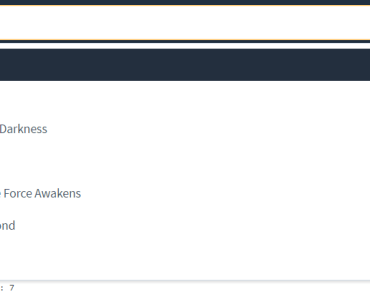
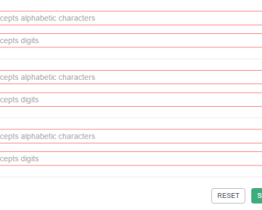
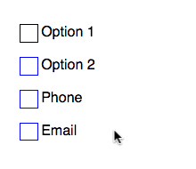
Example
Here is a demo using the styling below:
Installation
npm install vue-radio-checkbox These components are tied to the Vue window object, so all you need to do is require them where they have access to the window.Vue object.
require('vue-radio-checkbox'); Using the checkbox
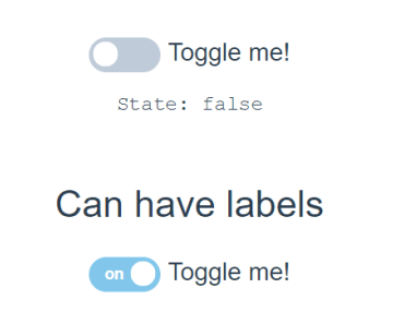
<checkbox name="subscribe" value="1" label="Newsletter Sign Up" v-model="someBool"></checkbox>This will set someBool to the state of the checked attribute.
Full example:
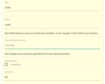
<checkbox name="email_subscribe" id="email-check" className="another-class" value="1" label="Newsletter Sign Up" v-bind:inverted="false" v-model="someBool" v-bind:checked="someBool" v-bind:required="true"></checkbox>Using the radio
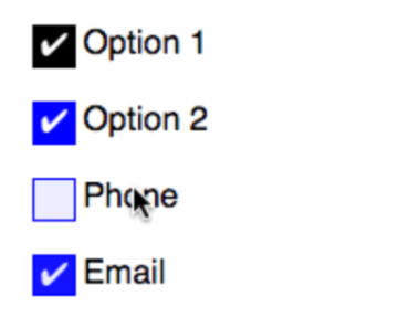
<radio name="method" value="phone" label="Phone"></radio> <radio name="method" value="email" label="Email"></radio>Full example:
<radio name="method" id="phone-method-check" value="phone" label="Phone" v-bind:inverted="true" v-bind:checked="false" v-bind:required="true"></radio> <radio name="method" id="email-method-check" value="email" label="Email" v-bind:inverted="true" v-bind:checked="false" v-bind:required="true"></radio>Events
Both the radio and checkbox can emit input events. Those are used like so:
<checkbox name="subscribe" value="1" label="Newsletter Sign Up" v-on:input="someMethodInYourApp"></checkbox>This allows you to have things happen when the elements change/update. An example might be having different elements show or hide, or triggering another change on some other property.
Styling
// all boxes and radios have these parent wrappers .custom-checkbox, .custom-radio { // easy inline labels display: flex; input[type=checkbox], input[type=radio], label { // dont highlight text when double clicking user-select: none; } input[type=checkbox], input[type=radio] { position: relative; border: 1px solid blue; margin: 0 0.2em 0 0; padding: 0; text-align: center; width: 1.3rem; height: 1.3rem; background: white; -webkit-appearance: none; -webkit-border-radius: 0; border-radius: 0; color: rgba(white, 0); transition: all 0.2s ease; // Better Font Rendering -webkit-font-smoothing: antialiased; -moz-osx-font-smoothing: grayscale; &:before { // checkmark content: "✔"; } &:focus { outline: 0; border: 1px solid darken(blue, 5%); } &:active { outline: none; } &:hover { outline: none; } &:checked { background: blue; // the color is what hides the checkmark color: rgba(white, 1); } } // an `inverted` class is there for making simple alternative styles &.inverted { input[type=checkbox], input[type=radio] { border: 1px solid black; &:focus { border: 1px solid darken(black, 5%); } &:checked { background: black; } } } }