vue-circle-slider
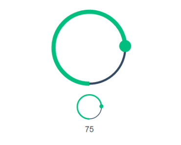
Circle slider component for Vue.js
Table of contents
Installation
npm install --save vue-circle-slider Adding into app
import Vue from 'vue' import VueCircleSlider from 'vue-circle-slider' Vue.use(VueCircleSlider)Usage
Functionality
- svg based view
- binding via
v-model - defining min & max values
- defining step size
- animation while updating to new value on click by circle
- touch devices support (
touchmove) - sizes customization: exact and relative definitions
- colors customization
Examples
Plugin will register a global component with name CircleSlider so you can just use it right away:
... <circle-slider v-model="sliderValue"></circle-slider> ...or customize some properties:
... <circle-slider v-model="sliderValue" :side="150" :min="0" :max="10000" :step-size="100" :circle-width-rel="20" :progress-width-rel="10" :knob-radius="10" ></circle-slider> ...Interface
Props
| Props | Type | Default | Description |
|---|---|---|---|
| side | Number | 100 | size of a side of a svg square in px |
| min | Number | 0 | the minimum value |
| max | Number | 100 | the maximum value |
| stepSize | Number | 1 | the gap between the values |
| circleColor | String | #334860 | color of slider circumference |
| progressColor | String | #00be7e | color of progress curve |
| knobColor | String | #00be7e | knob color |
| knobRadius | Number | null | exact knob radius in px |
| knobRadiusRel | Number | 7 | relative knob radius. radius value in px will be calculated as (side/2) / knobRadiusRel |
| circleWidth | Number | null | exact width of circle in px |
| circleWidthRel | Number | 20 | relative circle width. width value in px will be calculated as (side/2) / circleWidthRel |
| progressWidth | Number | null | exact progress curve width in px |
| progressWidthRel | Number | 10 | relative progress curve width. width value in px will be calculated as (side/2) / progressWidthRel |
Events
| Name | Params | Description |
|---|---|---|
| touchmove | none | fires on touch devices |
Slots
There is no any slots available
Demo
TODO
- add plugin options for defining custom defaults via
Vue.use(VueCircleSlider, options)- globalComponent[Boolean] - enable/disable global component registration
- componentName[String] - ability to define custom name for component
- options with defaults for all props (with same names)
- add
limitMinandlimitMaxprops to limit an accessible slider range
