


🎢 Vue Slide Bar
A Simple Vue Slider Bar Component.
Docs
Document & Demo Page
Install
npm install vue-slide-bar --saveor
yarn add vue-slide-barUsage
// main.js import Vue from 'vue' import VueSlideBar from 'vue-slide-bar' Vue.component('VueSlideBar', VueSlideBar)or
// xxx.vue import VueSlideBar from 'vue-slide-bar' export default { components: { VueSlideBar } }Simple

<template> <VueSlideBar v-model="value"/> </template> <script> export default { data () { return { value: 50 } } } </script>With Label

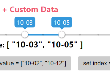
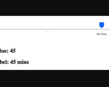
<template> <div> <VueSlideBar v-model="slider.value" :data="slider.data" :range="slider.range" :labelStyles="{ color: '#4a4a4a', backgroundColor: '#4a4a4a' }" :processStyle="{ backgroundColor: '#d8d8d8' }" @callbackRange="callbackRange"> <template slot="tooltip" slot-scope="tooltip"> <img src="static/images/rectangle-slider.svg"> </template> </VueSlideBar> <h2>Value: {{slider.value}}</h2> <h2>Label: {{rangeValue.label}}</h2> </div> </template> <script> import VueSlideBar from 'vue-slide-bar' export default { data () { return { rangeValue: {}, slider: { value: 45, data: [ 15, 30, 45, 60, 75, 90, 120 ], range: [ { label: '15 mins' }, { label: '30 mins', isHide: true }, { label: '45 mins' }, { label: '1 hr', isHide: true }, { label: '1 hr 15 mins' }, { label: '1 hr 30 mins', isHide: true }, { label: '2 hrs' } ] } } }, methods: { callbackRange (val) { this.rangeValue = val } }, components: { VueSlideBar } } </script>Custom Style & Min-Max

<template> <div> <VueSlideBar v-model="value2" :min="1" :max="10" :processStyle="slider.processStyle" :lineHeight="slider.lineHeight" :tooltipStyles="{ backgroundColor: 'red', borderColor: 'red' }"> </VueSlideBar> <h2>Value: {{value2}}</h2> </div> </template> <script> import VueSlideBar from 'vue-slide-bar' export default { data () { return { value2: 8, slider: { lineHeight: 10, processStyle: { backgroundColor: 'red' } } } }, components: { VueSlideBar } } </script>Loading

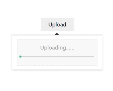
<template> <div> <VueSlideBar v-model="loading" :showTooltip="false" :lineHeight="20" :isDisabled="true"/> <br> <button type="button" name="button" @click="startLoad()"> Click to start load </button> <h2>Loading: {{loading}}%</h2> </div> </template> <script> import VueSlideBar from 'vue-slide-bar' export default { data () { return { loader: null, loading: 0 } }, methods: { startLoad () { this.loader = setInterval(() => { this.loading++ if (this.loading === 100) { console.log('clear', this.loading) clearInterval(this.loader) } }, 100) } } components: { VueSlideBar } } </script>Options
Props
| Props | Type | Default | Description |
|---|---|---|---|
| v-model | Number,String | 0 | Initial value (v-model) |
| min | Number | 0 | Minimum value |
| max | Number | 100 | Maximum value |
| process-style | Object | null | Process bar style. |
| tooltip-styles | Object | null | Tooltip style. |
| label-style | Object | null | Label style. |
| data | Array | null | Custom data. |
| is-disabled | Boolean | false | Flag for disable slider bar |
| draggable | Boolean | true | Flag for active/disable draggable |
| show-tooltip | Boolean | true | Flag display tooltip |
| icon-width | Number | 20 | Icon width |
| line-height | Number | 5 | Line height |
| speed | Number | 0.5 | Transition time |
| paddingless | Boolean | false | Remove padding and min-height |
Events
| Name | Description |
|---|---|
| input | triggered on value change |
| callbackRange | triggered on range value change |
| dragStart | triggered on start drag |
| dragEnd | triggered on stop drag |
Slot
| Name | Description |
|---|---|
| tooltip | Customize the tooltip slot. |
# When using the template element as a slot, can add special properties slot-scope to get the value.
Contributing
- Fork this repository.
- Create new branch with feature name.
- Run
npm installandnpm run dev. - Create your feature.
- Commit and set commit message with feature name.
- Push your code to your fork repository.
- Create pull request.
🙂
Support
If you like this project, You can support me with starring ⭐ this repository. License
Developed with